Graphic Designer Resume Template with Photo and Coral Blob
Let's be honest: as a designer, a plain resume is a missed brief. The people reading yours will notice the type, the spacing, and the color before the words. This template gives you a confident, playful layout that still behaves like a proper resume, so a creative director and an applicant tracking system can both read it.
What You See First
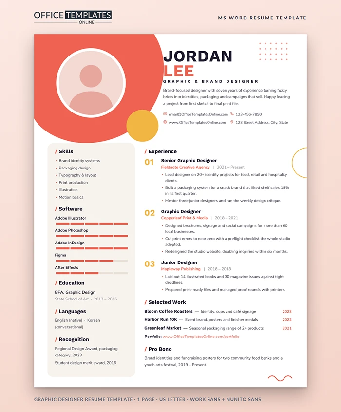
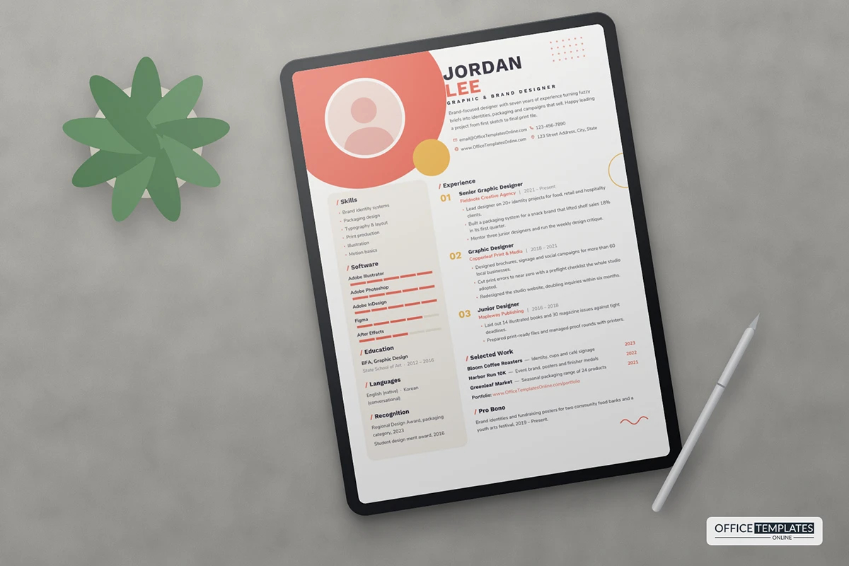
A big coral shape spills in from the top-left corner and cradles a round photo inside a white ring. A mustard disc overlaps its edge, and a small grid of coral dots balances the top-right. Your first name is set in heavy Work Sans in deep ink with your surname in coral underneath, followed by a widely spaced title, a two-line intro, and four contact details with outline icons.
Below that, a soft linen panel with rounded corners holds skills, software, education, languages, and recognition. The right column runs your experience with large mustard numbers, 01 to 03, then selected work, a portfolio link, and a short pro bono note. A coral squiggle signs off the bottom corner.
Palette Swaps That Still Look Designed
Coral and mustard suit branding and packaging work. If your style is different, swap the four colors together so the page keeps its balance.
| Mood | Main shape | Accent disc | Name and numbers |
| Calm editorial | Sage #8FAE9B | Sand #E6CFA3 | Forest #2F4A3E |
| Tech and UI | Electric blue #3D5AFE | Lime #C6F36B | Midnight #121530 |
| Luxury packaging | Plum #6B3A5B | Gold #D8B26E | Charcoal #262326 |
| Playful kids' brands | Sky #6EC6F0 | Sunshine #FFD23F | Navy #1D2A55 |
How to Recolor Everything in Word
- Double-click near the top of the page to open the header, where the blob, disc, dots, ring, and squiggle live.
- Click a shape, open Shape Format, and pick a new Shape Fill or Shape Outline.
- Close the header, select your name and the section slashes, and change their font color.
- Click a software bar segment, open Table Design, and change its shading. Each bar is a five-cell table, so shade as many cells as your level.
Your Photo, Your Call
Right-click the round placeholder and choose Change Picture. A head-and-shoulders shot on a plain background works best inside the white ring. If you prefer not to include a photo, which is common in the United States, delete it and the coral shape becomes a pure graphic element; the layout still holds.
Portfolio Link Checklist
- Use one short address that you own, not a long file-sharing link.
- Put your three strongest projects first, and match them to the Selected Work.
- Make sure the link opens on a phone, because many recruiters first look there.
- Check the link again the day you send each application.
Early in Your Career? Rework the Numbers
If you are a recent graduate, the numbered experience column still works. Use 01 for your strongest internship, 02 for freelance or studio work, and 03 for a student role such as yearbook designer or campus events. Lean on the Selected Work section: list three projects with a one-line brief and the year, and make sure each one is in your portfolio. In the skills panel, trade years of experience for evidence, such as a competition shortlist or a client who hired you twice. Recruiters for junior roles look for taste, curiosity, and finished work, and this layout lets all three show.
Type and Files
Headings use Work Sans and the body uses Nunito Sans, both free on Google Fonts. Install them before editing so the bold name keeps its weight. The page is one US Letter sheet; export a PDF for applications, which also keeps the coral shapes exactly where they belong.