Free Excel Business KPI & Monthly Performance Dashboard Template
Running a business means watching numbers that live in different places: revenue in the accounting package, attendance in an HR sheet, delivery performance in the warehouse log, satisfaction scores in a survey tool. At month-end, owners end up copying figures from all of them into one document just to answer a simple question: are we on track?
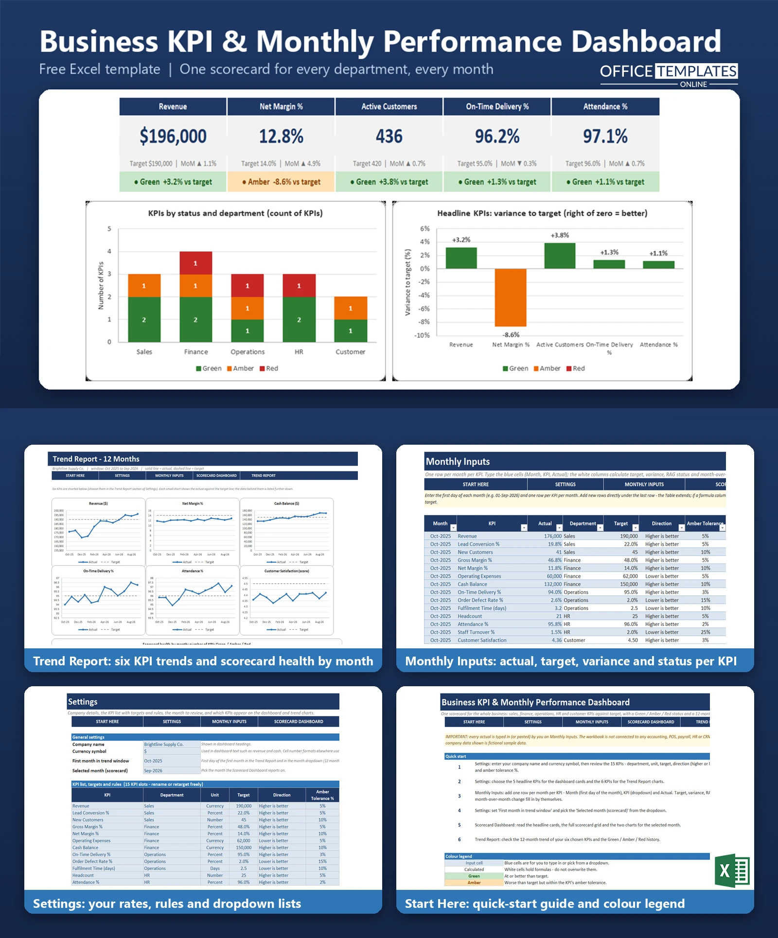
This Excel template gives small business owners and managers a single monthly scorecard for the whole company. You type each month's actual figure for 15 KPIs across Sales, Finance, Operations, HR, and Customer, set a target and a tolerance once, and the workbook does the rest: variance against target that respects whether higher or lower is better, a Green, Amber, or Red status for every KPI, month-over-month change, and a 12-month trend.
Everything is built with standard Excel formulas and charts. There are no macros and no connections to other software, so you can keep the file private, adapt the KPI list to your business, and reuse it every month.
Key Features
- 15 pre-set KPIs across five departments (Sales, Finance, Operations, HR, Customer), each with its own unit, target, direction, and amber tolerance
- Variance against target that treats lower-is-better KPIs (such as expenses or defect rate) correctly
- Green, Amber and Red status per KPI, driven by a tolerance you set for each one
- Month-over-month change with up and down arrows, coloured by whether the move is good or bad
- Scorecard Dashboard for any selected month with five headline KPI cards and a full scorecard grid
- Trend Report with six small line charts (actual versus target) and a Green/Amber/Red history chart
- Monthly Inputs Excel Table with dropdowns, a data check for duplicate rows, and 12 months of fictional sample data
What You Can Track
- Sales: revenue, lead conversion %, new customers
- Finance: gross margin %, net margin %, operating expenses, cash balance
- Operations: on-time delivery %, order defect rate %, fulfilment time in days
- HR: headcount, attendance %, staff turnover %
- Customer: customer satisfaction score, active customers
All 15 names, departments, units, targets and rules can be edited on the Settings sheet, so you can swap in the measures your business cares about.
Dashboard & Reports
The Scorecard Dashboard shows one month at a time. Five headline cards display the actual value, the target, the change from the previous month, and a coloured status. Below them, a scorecard grid lists every KPI with department, actual, target, variance %, status, and month-over-month arrow, plus a running count such as 8 Green, 4 Amber, 3 Red. Two charts show how many KPIs are Green, Amber, or Red in each department, and how far the headline KPIs are from target.
The Trend Report plots six KPIs of your choice as small line charts, with the target as a dashed line, over a 12-month window. A stacked column chart shows how the number of Green, Amber and Red KPIs has moved month by month, and the underlying data is laid out in tables you can read or copy.
Who Is This Template For
- Small business owners who want one monthly review page instead of five reports
- General managers preparing a monthly management or board pack
- Consultants and accountants who report on several clients' performance
- Teams that agree targets by department and want a simple, visible way to review them
How to Use the Template
- Open Settings and enter your company name and currency symbol.
- Review the 15 KPIs: set the department, unit, target, direction (higher or lower is better), and amber tolerance for each.
- Choose the five headline KPIs for the dashboard cards and the six KPIs for the trend charts.
- On Monthly Inputs, add a row for each KPI each month: the first day of the month, the KPI from the dropdown, and the actual figure.
- On Settings, pick the month you want to review.
- Read the Scorecard Dashboard and the Trend Report. To start with your own data, delete the sample rows on Monthly Inputs and enter your own.
Benefits
- One consistent place for the monthly review, so nothing is forgotten
- Targets and tolerances are stated once and applied the same way every month
- Problems stand out through colour and arrows without reading every number
- Trends over 12 months show whether things are improving, not just where they stand today
- You own the file: no subscription and no data leaves your computer
Excel Requirements
The template is a standard .xlsx workbook that uses no macros. It is built for modern desktop Excel on Windows or Mac (Excel 2010 or later). Figures are entered manually; the workbook does not connect to accounting, payroll, or other systems. Number formats use the dollar sign; the currency symbol in Settings appears in headings and dashboard text.
Frequently Asked Questions
Do I need to know Excel formulas?
No. You only type in the blue cells (month, KPI, and actual on Monthly Inputs, and settings). All other cells calculate automatically.
Can I change the KPIs?
Yes. The 15 KPI slots on Settings can be renamed and given a new department, unit, target, direction, and tolerance. The number of slots is fixed at 15.
How is Green, Amber, or Red decided?
Variance % is positive when a KPI is better than the target. Zero or above is Green; worse but within that KPI's tolerance is Amber, and beyond the tolerance is Red.
Does it handle KPIs where lower is better?
Yes. For expenses, defect rate, fulfilment time, and turnover, being below target counts as favourable.
How do I show a different month?
Choose it in the Selected month dropdown on Settings. The dashboard updates immediately.
Can I add more than 12 months of data?
Yes. Monthly Inputs accepts new rows down to row 2000. The trend charts show a 12-month window that you move by changing the first month in Settings.
Does it pull data from my accounting software?
No. All actuals are entered by hand or pasted in.
Is the sample data real?
No. The company and all figures are fictional and are there to show how the dashboard works. Delete them before you start.

← Previous Article
Free Excel Asset Register & Equipment Maintenance Tracker TemplateNext Article →
You may also like