Data Analyst Resume Template with Dashboard Layout
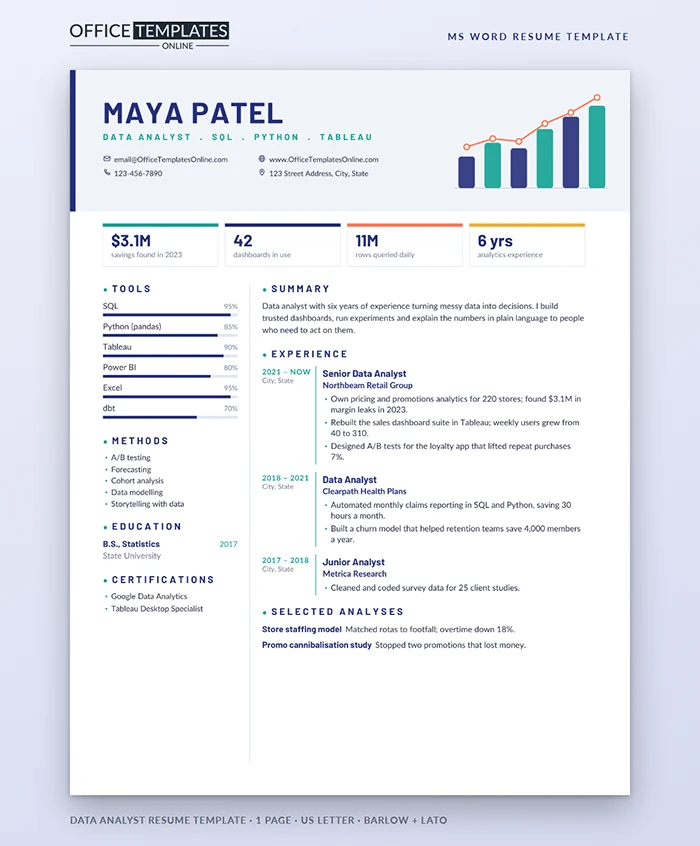
Hiring managers for analytics roles look at dashboards all day. This resume speaks their language: a header with a small chart, a row of KPI tiles, and clear, labelled sections. It shows that you can present information as well as you can query it.
The Dashboard at a Glance
A pale lavender panel runs across the top with a slim indigo edge on the left. Your name sits in bold indigo Barlow, followed by a teal line listing your role and core tools, and your contact details in a two-by-two grid. On the right, six rounded bars in indigo and teal rise along a baseline, with a coral trend line and white data points climbing over them.
Four KPI tiles follow, each topped with a different color: teal, indigo, coral, and amber. Below them, a narrow left column lists tools with percentage bars, methods, education, and certifications. The wider right column holds your summary, a dated experience timeline with a teal edge, and a short list of selected analyses.
Data Dictionary: What Goes in Each Field
| Field | Location | What to enter |
| Headline tools | Under your name | Your title and the three tools named in the posting |
| KPI tiles | Row under the header | Savings found, dashboards used, data volume, years |
| Tool bars | Left column | Six tools with honest percentages |
| Methods | Left column | Techniques such as A/B testing or forecasting |
| Experience timeline | Right column | Dates, employer, and two or three results per role |
| Selected analyses | End of right column | Named studies with one result each |
Write Bullets Like Findings
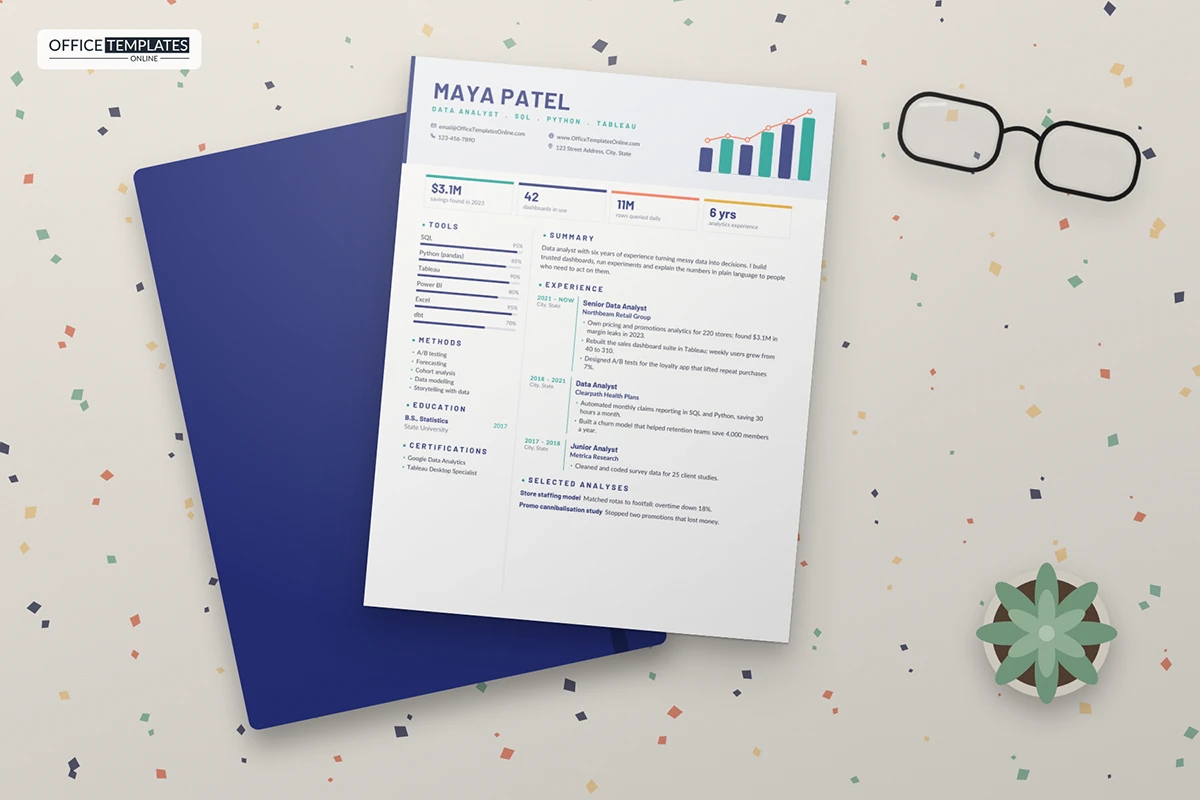
A good analysis ends with a decision, so a good bullet should too. Name what you looked at, what you found, and what changed. Rebuilt the sales dashboard suite in Tableau; weekly users grew from 40 to 310, showing both skill and adoption. Found $3.1M in margin leaks is stronger still because it puts a value on your work. Keep the method short; the interview is where you explain the joins and the models.
Honest Percentages on the Tool Bars
Recruiters know that nobody is 100% at anything, so keep the bars believable. A useful rule: 90% or more for tools you use daily and could teach, 70-85% for tools you use confidently, and leave out anything you have only touched in a course. If you are early in your career, swap the percentages for daily, weekly, or learning.
Recoloring the Charts in Word
- The header panel, bars, trend line, points, edge, and divider are shapes in the page header. Double-click near the top of the page and use Shape Fill or Shape Outline to match a company's brand colors.
- Tool bars are two-cell tables; drag the boundary between the colored and grey cells and edit the percentage text.
- KPI tiles are table cells with a thick colored top border; change it in Table Design.
Early-Career and Senior Variations
If you are applying for your first analyst job, the KPI tiles can hold course projects, a capstone result, or the size of a dataset you cleaned. Replace the experience timeline with an internship, a research assistant post, and a strong portfolio project. Senior analysts should go the other way: lead with business impact, mention stakeholders you advised, and add a line about mentoring or building the team's data standards. In both cases, keep the selected analyses short and specific, and link to a portfolio if you have one.
Good Fit For
Data analysts, business intelligence analysts, reporting analysts, marketing and product analysts, and graduates moving into analytics. Barlow and Lato are free on Google Fonts. The template is one US Letter page; export a PDF for applications.