A Plain Letterhead That Fits Almost Any Job
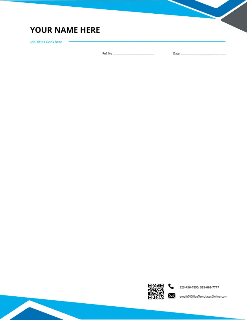
Not everyone needs a themed letterhead with a stethoscope or a bouquet. A freelancer, a consultant, a teacher or a self employed trades person often wants a clean page with a name on it. This generic design has blue angles at the corners and a name block at the top, and nothing else that ties it to an industry. It is a good starting point if you are unsure which style you want.
The Name Block at the Top
The page is 8.5 x 11 inches, portrait, one page. In the header, the words YOUR NAME HERE are set in large bold capitals, and a smaller line below reads Job Titles Goes here. Click each line and type your own details. Short names look best in the large style, and a long name can be reduced by a point or two. The grammar of the sample job title line is off, so retype it, for example Electrical Contractor or Senior Accountant.
The Blue Angles
Overlapping blue shapes cross the upper and lower corners. They are simple, modern and easy to print, and they add colour without carrying any meaning of their own. The shapes are graphics and cannot be edited like text. If you want a different colour, choose another design in the letterhead category.
Reference Number and Date
A line under the header reads Ref. No and Date. If you use references, write them in a short, consistent pattern, such as initials and a number. If you do not, delete the words Ref. No and keep the date alone. A tidy page looks more professional than one with empty fields.
Contact Details Without a Footer Clutter
This version has a compact set of contact lines: a phone line with two numbers and an email address. There is no long address line, which suits a home based business that does not want to publish a street address. Add a website in the same style if you have one.
Who Uses a Generic Letterhead
- Freelancers who write proposals and invoices.
- Tutors and trainers who send fee letters to parents or companies.
- Tradespeople writing quotes and completion notices.
- Job seekers who want a smart page for a cover letter.
- Landlords and agents writing to tenants.
Turning It Into Your Own Brand
Add a small logo at the top left, or a signature image at the foot of the letter. Use the same blue in your invoices and email signature if you can. A consistent colour makes a modest page look like a complete brand.
Print Quality for a Simple Page
Because the page has light graphics, a home printer will manage well. Use standard quality on 80 to 100 gsm paper, and check that the corners are not clipped. For email, export to PDF so the angles stay in place.
When to Choose a Themed Page Instead
If your work is easy to picture, such as a dentist, a florist or an event planner, a themed page may help clients recognise you. A generic page works better when you serve many industries and want a neutral look.
For a personal brand page, see the personal brand letterhead. For freelancers, try the freelance letterhead. For a company page, see the company letterhead. More are in letterheads.