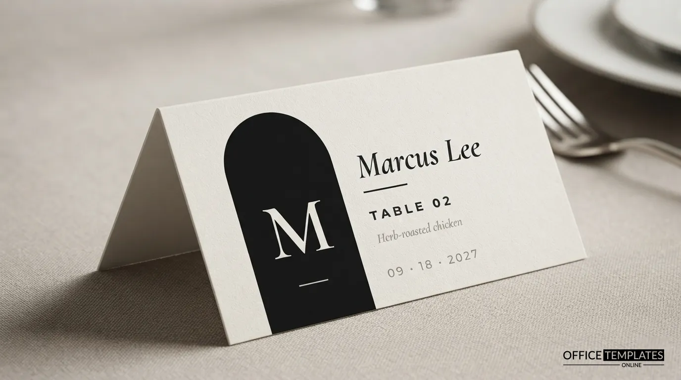
Arches are everywhere in modern weddings: arched mirrors for welcome signs, arched backdrops for ceremonies, arched windows in converted warehouses and galleries. This place card borrows that silhouette and turns it into a bold graphic. A tall black arch rises from the bottom edge of the card, holding the guest’s first initial in large white serif type. Beside it, the name, table, and meal choice are set in a quiet, editorial layout. It is a card for couples who like architecture, black-and-white photography, and a clean, confident table.
The Arch, the Initial and the Details
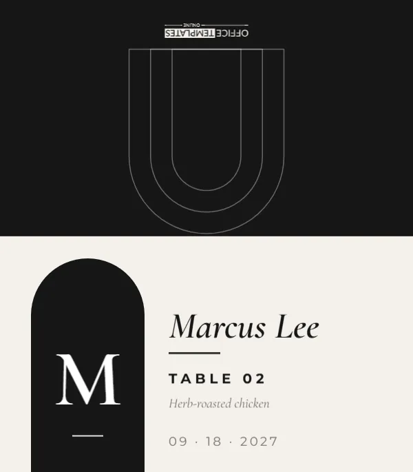
The card is 3.5 x 4 inches flat and folds to a 3.5 x 2 inch tent. On the front, which is a warm off-white, a black arch stands on the left, reaching from the bottom edge almost to the fold. Inside it, a large white M in Cormorant Garamond sits above a short white rule. To the right, the name Marcus Lee is set in italic Cormorant Garamond, followed by a short black rule, Table 02 in bold spaced capitals, the meal choice Herb-roasted chicken in grey italic, and the date 09 · 18 · 2027 in small spaced figures. The back is solid black with three nested white arch outlines, arranged so they appear the right way up from across the table once the card is folded.
Why the Meal Line Matters
At plated receptions, servers need to know which entrée goes where. Many couples collect meal choices with their RSVPs, then print them discreetly on the place card so staff can serve without asking every guest. The italic grey line on this card does exactly that while still looking like part of the design. If your caterer prefers colour-coded stickers or icons, you can replace the line with Beef, Fish, or Vegetarian, or delete it for a buffet.
Filling In a Card, Step by Step
- Change the initial in the arch to the guest’s first initial.
- Type the guest’s name over Marcus Lee.
- Update the table number; leading zeros (02) keep the column of numbers tidy.
- Write the meal choice exactly as your caterer names it on the menu.
- Check the date, then download the card and move on to the next guest.
Initials as a Design Device
Using a single large initial gives every card a different focal point, which looks striking when a whole table is set. Some couples use the guest’s last initial instead, which works well for families seated together. Others put their own monogram initial in the arch on every card, turning the arch into a wedding logo. All three approaches work; just be consistent across the room.
Colour Swaps That Keep the Modern Feel
| Arch colour | Page colour | Mood |
|---|---|---|
| Black | Warm off-white | Gallery minimal (as designed) |
| Terracotta | Sand | Desert modern |
| Forest green | Ivory | Botanical modern |
| Navy | Pale grey | Coastal modern |
| Dusty rose | Cream | Soft romantic |
The arch is one shape; select it to change its fill. The back panel and its outlines change the same way.
Typography Notes
Cormorant Garamond is a display serif with elegant contrast between thick and thin strokes, and its italic is particularly fine. Pairing it with bold Montserrat capitals for the table number creates a classic editorial contrast, like a magazine headline over a caption. Keep the name in italic for warmth; the upright capitals do the organising work.
Printing Solid Black Areas Cleanly
Large black areas can look slightly grey or streaky on inkjet printers set to plain paper. Choose a matte cardstock setting or best quality, and let the cards dry before stacking them. Laser printers produce a deeper, more even black. If you are printing many cards, a local print shop can produce them on heavy card for a reasonable price, and a crisp black arch on thick stock looks expensive.
Trimming the Arch Edge
The arch runs to the bottom edge of the card, so trim carefully along that edge. If your printer leaves a thin white margin, trim a hair inside the printed area so the black reaches the edge cleanly. Score the fold line between the front and the black back panel, then fold with the off-white front facing out.
Setting a Table With Arch Cards
Because each card carries a bold black shape, a full table of them creates rhythm, like a row of doorways. Line them up at the same distance from the plate edge, ideally centred above each plate, so the arches align down a long banquet table. White plates, black-handled cutlery and clear glassware let the cards lead. A single bud vase with one white ranunculus or a sculptural stem every few seats completes the gallery feel without competing with the graphics.
Planning Your Print Run
Count guests, then add about five percent for late changes and printing mistakes. With a meal line on every card, changes are more likely than usual: guests swap entrées, plus-ones appear, children are added. Print once your caterer confirms final numbers, usually seven to ten days before the event, and keep a few cards with the name and meal lines blank so a coordinator can hand-letter emergency replacements with a fine white or black pen.
Where It Works Beyond Weddings
The arch design suits rehearsal dinners, engagement parties, milestone birthdays held in restaurants, and corporate dinners at design-led venues. For a business event, use the initial for the company’s name, replace the meal line with the guest’s job title, and change the date to the event date.
Common Questions About the Arch Card
Can I put a full monogram in the arch?
Yes. Two initials with an ampersand fit if you reduce the size a little.
Does the back really show right way up?
The arch outlines on the back are drawn upside down on the flat sheet, so they read correctly when the card is folded and viewed from the other side of the table.
What if a guest has no meal choice?
Delete the meal line on that card, or write Chef’s selection.