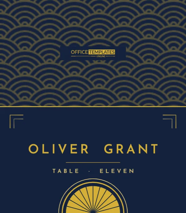
The Roaring Twenties never really left wedding design. Art Deco’s gold geometry, sunbursts, and tall capital letters still say glamour like nothing else, which is why Gatsby-themed weddings, New Year’s Eve weddings, and black-tie hotel receptions keep returning to it. This place card is pure deco: midnight navy, a golden fan rising from the bottom edge, stepped corner brackets, and the guest’s name in widely spaced capitals, all backed by a shimmering pattern of gold scallops.
A Sunburst on Midnight Blue
Flat, the card is 3.5 x 4 inches; folded, it is a 3.5 x 2 inch tent. The front is deep navy. A gold half-sun fan, divided by navy rays, rises from the centre of the bottom edge, ringed by a solid gold arc and a lighter gold hairline. In the top corners, L-shaped double brackets in gold and pale gold frame the space like the corners of a deco mirror. The name, OLIVER GRANT, is set in Josefin Sans, a geometric typeface with the slender proportions of 1920s lettering, in gold capitals with generous spacing. A thin gold rule sits beneath it, followed by Table · Eleven in paler gold. The back is navy, covered with overlapping gold scallops, separated from the front by a bright gold fold line.
The Back Is an Editable Background Texture
The gold scallop pattern on the back is one of the editor’s built-in background textures, Endless Clouds, applied from the Backgrounds panel’s Pattern tab. That means you can change it without redrawing anything. Open Backgrounds, choose Pattern, and adjust the foreground colour, the size slider, or the opacity slider. You can also pick a different texture, such as Overlapping Diamonds or Formal Invitation for a different deco feel, or press Remove Pattern for a plain navy back. The navy front panel sits above the texture, so the pattern only shows on the back.
Deco Typography Rules
- Use capitals for names; deco lettering is almost always uppercase.
- Keep the letter spacing wide, but reduce it for very long names so they stay on one line.
- Use a double space between first and last name, as the sample does, for an elegant gap.
- Spell numbers as words (Eleven) for formality.
Personalising the Set
Click the name and type the guest’s name in capitals. Update the table line. The brackets and fan are separate shapes, so they stay put as you edit. After each name, download the card. If you are creating a large set, work through your seating chart table by table so the cards are already grouped when you print them.
Palette Variations in the Deco Spirit
| Background | Metal | Feels like |
|---|---|---|
| Navy | Gold | Classic Gatsby (as designed) |
| Black | Gold | Black-tie ballroom |
| Emerald | Gold | Jewel-toned hotel bar |
| Black | Silver | Winter or New Year’s Eve |
| Burgundy | Champagne | Speakeasy |
To switch, change the canvas background colour and the front navy panel, then update the gold elements. Remember to change the texture’s colour in the Pattern drawer too.
Gold Ink and Metallic Options
Standard printers render gold as a warm mustard tone. On navy, that reads convincingly golden, especially in candlelight. For real shine, take the PDF to a print shop offering metallic toner or digital foil; deco designs with clean shapes like this fan foil beautifully. Another budget trick is to print normally and hand-add a few strokes of a gold paint pen along the fan’s outer arc.
Dark Card Printing Advice
Large navy areas use a lot of ink. A laser printer gives the most even, saturated navy. On an inkjet, choose a matte photo or cardstock setting and best quality, and print a single test first. Allow the cards to dry flat for at least half an hour before folding, or the ink may crack along the crease. Trim slightly inside the printed edge if your printer leaves a white border.
Setting a Gatsby Table
Place each card centred above the plate. Gold chargers, crystal coupes, black napkins and tall feathers or white orchids complete the look. Deco cards also look striking clipped to the stems of champagne glasses with small gold clips, a fun alternative for a cocktail-style reception with high tables.
Other Glamorous Uses
Use this card for New Year’s Eve dinners, casino nights, milestone birthdays with a Roaring Twenties theme, company award dinners, and murder-mystery parties set in the 1920s. Replace the table line with a character name for a mystery party, and your guests will know who they are playing as soon as they sit down.
A Short History of the Deco Fan
The fan or sunburst became a signature of Art Deco after the 1925 Paris exhibition that gave the style its name. Designers loved it because it combined the ancient symbol of the rising sun with the clean geometry of the machine age. It appeared on cinema facades, skyscraper spires such as the Chrysler Building, compact mirrors and cocktail menus. Placing it at the foot of a place card recalls the sunbursts above old theatre doors, as if each guest were arriving at a premiere.
Making the Names Readable in Low Light
Deco receptions tend to be lit by candles and low chandeliers. Gold on navy has good contrast, but very thin letters can disappear in dim light. If your venue is particularly dark, increase the name weight to bold, enlarge it a little, and reduce the letter spacing to compensate. Test by printing one card and looking at it under a single candle.
Art Deco Card FAQs
Can I use lowercase names?
You can, but capitals suit the deco style better. If you prefer mixed case, reduce the spacing.
Why can’t I select the scallops on the back?
The texture is a locked page background. Change it from Backgrounds ? Pattern instead of clicking on it.
What size is it once folded?
3.5 inches wide and 2 inches high.
Can the fan be moved to the top of the front?
It is grouped, so you can drag it anywhere. At the top, it looks like a crown over the name; just leave space below the fold so it does not get hidden by the crease.