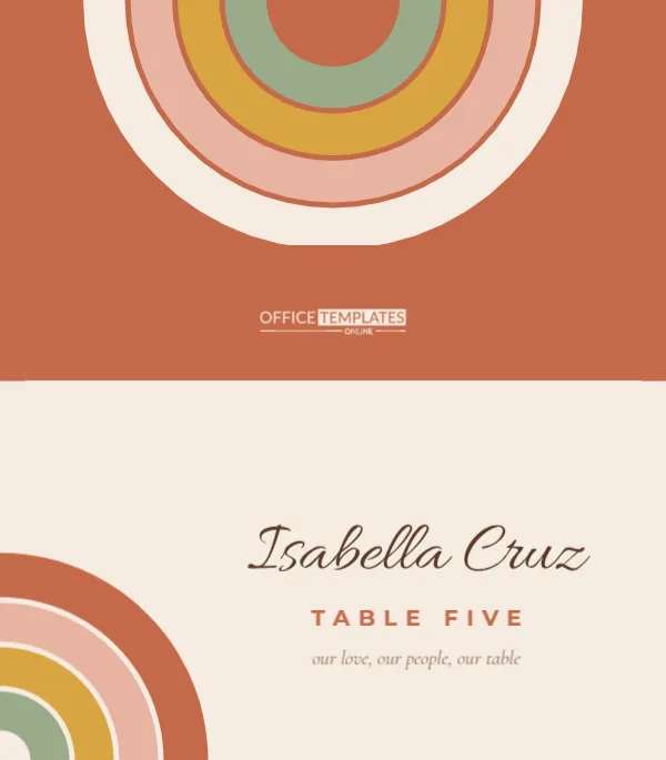
Boho weddings have a colour palette all their own: terracotta pots, dried pampas grass, mustard velvet, faded rose and sage. This place card captures it with a motif that has become the unofficial symbol of the style: the stacked rainbow arc. A quarter rainbow rises from the bottom left corner of the front in four earthy bands, and a larger half rainbow hangs from the top of the back like a setting sun. Between them, each guest’s name is written in a soft, flowing script.
Arcs in Four Earth Tones
Printed flat, the card is 3.5 x 4 inches; folded, it stands 3.5 inches wide and 2 inches high. The front background is a warm cream. In the lower left corner, four curved bands step inward: terracotta on the outside, then blush pink, mustard yellow, and sage green. The guest’s name, Isabella Cruz in the sample, is set in Allura in a deep brown to the right of the arcs. Below it, Table Five appears in terracotta capitals, and a small italic line reads our love, our people, our table. The back is solid terracotta with a large cream-edged rainbow of blush, mustard and sage descending from the top edge, plus the logo in cream.
The Seventies Influence
Rainbow arcs, warm oranges and rounded type all draw on 1970s graphic design, the era of sun-faded posters and macramé wall hangings. Modern boho weddings borrow that warmth without the kitsch, using muted, dusty versions of the colours. The result feels relaxed, sunny and personal, ideal for desert venues, ranches, backyard receptions, greenhouses and beach bonfires.
Personal Touches for Every Guest
- Swap the italic line for a short personal note: So glad you’re here, Bella, or Thank you for flying in from Denver.
- Use first names only at a laid-back wedding; boho celebrations are often informal.
- Replace Table Five with a table name inspired by your theme, such as Juniper, Sage, or Golden Hour.
- For children, add a tiny illustration from the editor’s library, such as a sun or a star.
Editing the Card
Click the name to type your guest’s name, then click the table line and the italic line to change them. When the first card looks right, download it; then edit the name for the next guest and download again. The arcs are grouped, so they stay perfectly aligned if you move or resize them. If a long name runs close to the arcs, nudge the name slightly to the right or reduce its size.
Changing the Rainbow Colours
| Palette name | Outer band | Second band | Third band | Inner band |
|---|---|---|---|---|
| Desert (as designed) | Terracotta | Blush | Mustard | Sage |
| Sunset | Burnt orange | Coral | Peach | Butter yellow |
| Dusty pastel | Mauve | Dusty pink | Sand | Pale blue |
| Autumn | Rust | Cinnamon | Ochre | Olive |
| Moody | Plum | Rust | Camel | Forest |
To recolour, ungroup the arcs, click each band and choose a new fill, then regroup them so they move as one.
A Script That Feels Handwritten
Allura has a light, natural slant that looks like careful handwriting rather than formal calligraphy, which suits the boho mood. The brown ink colour is softer than black and harmonises with the terracotta. For extra warmth, try a deep rust colour for the names; for more contrast on a dimly lit tent reception, use near-black.
Paper Choices for an Earthy Look
Natural, slightly warm papers enhance this design. A cream or “natural white” cardstock keeps the cream background soft, while a recycled stock with tiny fibres adds texture. Avoid bright, blue-white paper, which makes the earth tones look harsh. A weight of around 80 to 100 lb cover is sturdy enough to stand even on an outdoor table where a breeze might catch it.
Outdoor Table Tips
Boho receptions are often outside, and wind is the enemy of tent cards. Fold them firmly and press the crease well. Weigh them down with something on theme: a small stone, a dried orange slice, a clay votive or a sprig of dried lavender laid across the base. Some couples tuck each card into a slit cut in a small wooden round or into the crown of a mini succulent pot, which doubles as a favour.
Printing the Terracotta Back Evenly
Download the PDF and print at actual size, using a matte cardstock setting so the large terracotta back prints evenly. Trim the card to its 3.5 x 4 inch outline, score across the centre where the cream front meets the terracotta back, and fold with the cream side outward. The rainbow on the back will then face guests sitting opposite, the right way up.
Matching Pieces for the Same Wedding
The rainbow motif is easy to repeat across your stationery. Use the same four colours in your seating chart headings, your menu borders or a welcome sign. Ribbons in rust or mustard tied around napkins echo the bands. A table runner of dried pampas grass and bunny tails, with terracotta candle holders, completes the look around these cards.
A Seating Chart in the Same Colours
Guests find their place card only after they find their table, so the seating chart is the first piece of stationery they see at the reception. Carry the rainbow there too: list each table under a heading in one of the four arc colours, cycling terracotta, blush, mustard and sage. If you print table numbers, a large version of the corner arcs on each number card ties the whole room together. Guests subconsciously connect the colours, and the reception feels designed rather than assembled.
Boho Place Card Questions
Can I flip the arcs to the right side?
Yes. Ungroup, mirror the arrangement by moving the bands, or simply move the group to the right corner and shift the text left.
Is the italic line required?
No. Delete it for a simpler card with just the name and table.
Does this work for a baby shower or birthday?
The rainbow arcs suit boho baby showers especially well. Change the table line to Baby Shower or the event name.
Can I print the cards on kraft paper?
Yes, but the cream background will look darker, and the blush band may fade into it. Test one card before printing the full set.