Mistakes to Avoid When Mailing Holiday Cards
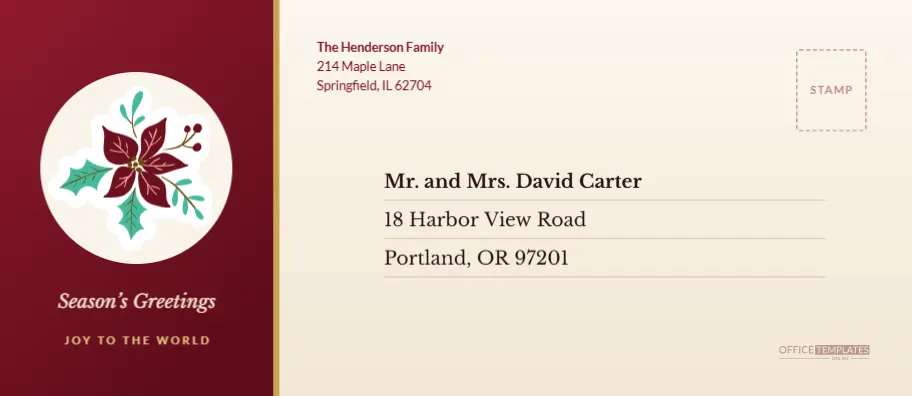
Most holiday mail problems are small, and most can be avoided before the envelope is sealed. This page walks through the usual mistakes and shows how this burgundy and ivory poinsettia envelope helps you avoid them.
Mistake One: Writing the Address Too Small
Elegant envelopes sometimes tempt designers into tiny lettering. Here the recipient block uses Libre Baskerville at 14 points with a bold first line, set on pale rules, so the address is easy to read from arm’s length. A postal worker does not have to squint, and neither does the recipient.
Mistake Two: Letting Decoration Cover the Address
The design separates decoration from information. A deep burgundy panel on the left carries the art, and the ivory body on the right carries the address. A thin gold line divides them. The address never touches the panel, so nothing competes with it.
Mistake Three: Forgetting the Return Address
A return address matters when a card goes astray. The sender’s details sit at the top of the ivory area in Lato, in burgundy, where they are easy to find but do not dominate. Replace the sample with your own.
Mistake Four: A Greeting That Does Not Match the Card
The burgundy panel carries the words Season’s Greetings in italic Libre Baskerville and JOY TO THE WORLD in spaced gold capitals. They suit a traditional card. Change them to match the card inside, since a mismatch between the envelope and the card is one of the quickest ways to make a mailing feel unplanned.
What the Poinsettia Envelope Looks Like
The envelope is a #10, 9.5 by 4.125 inches. About a third of the width, the left 2.85 inches, is a burgundy gradient panel that fades from a rich wine red at the top to a darker shade at the bottom. In the centre of the panel sits an ivory circle holding a large poinsettia sticker, with red petals, teal leaves and tiny berries. The remaining two thirds of the page is a soft ivory gradient with a pale stamp box in the top right and the address block in the middle.
| Part | Colour | Editable? |
|---|---|---|
| Side panel | Burgundy gradient | Yes, change the two gradient colours |
| Gold edge | Antique gold | Yes, a thin rectangle |
| Poinsettia | Red, teal and cream | Yes, an editable vector |
| Ivory body | Soft cream gradient | Yes |
| Text | Burgundy and near black | Yes, all text boxes |
Changing the Poinsettia Envelope Step by Step
- Click the greeting in the burgundy panel and type your own words.
- Click the return address and replace the sample.
- Click each recipient line and type the name, street and city.
- If you want a different flower, select the poinsettia and delete it, then insert another vector from the library.
- Download as PDF or PNG.
Colour Changes for Other Seasons
A burgundy panel suits Christmas, but it also suits autumn, winter weddings and Valentine’s Day. Change the gradient to forest green for a classic Christmas, navy for winter, or deep rose for a romantic mailing. Replace the poinsettia with another flower or a monogram. The ivory body and the type will not need to change.
Printing the Panel Cleanly
A large block of dark colour is the hardest part of this design to print at home. Ask a print shop for a coated or silk stock and request a proof. If you print at home, use an envelope blank with a slightly smooth finish, set the printer to best quality, and let the sheet rest before handling. The panel is a gradient, so avoid draft mode, which can create banding.
Quick Replies About the Burgundy Panel
Can I swap the panel to the right side?
Yes. Select the panel, the gold line, the circle and the art, group them and drag the group to the right, then move the address block to the left.
Does the poinsettia change colour?
You can recolour its parts, or ungroup it to edit petals one at a time.
Pairing the Poinsettia Envelope With a Card and a Letter
A burgundy and ivory envelope pairs best with a cream card printed in burgundy ink, or a plain white card with a thin gold border. If you are sending a family letter as well, fold it in thirds and tuck it behind the card so the poinsettia appears first when the envelope is opened. For a gift card, slip it into a small ivory sleeve inside the envelope. Keep photographs in a separate small envelope so the main one stays flat and easy to handle in the post.
Why Burgundy Works Beyond Christmas
Burgundy is a flexible colour. With the poinsettia removed and a different greeting, the same panel works for Thanksgiving thank you notes, winter weddings and a wine club mailing. Replace the circle with a monogram, change the gold line to rose gold and you have a different envelope from the same file. Save a few versions under clear names in your account, and you will have a set of matching envelopes ready for each season.
Folding, Sealing and Posting the Finished Envelope
Once the cards are inside, press the flap flat and seal it with a damp sponge or a glue stick rather than licking it, which leaves a rough edge on a coloured flap. For a keepsake feel, add a round gold sticker where the flap meets the body. Weigh one finished envelope with its contents before you buy stamps in bulk, since a card with a photo and a letter inside can sit just over the standard weight. Post early in December, and mark any overseas envelopes clearly with the country in capitals.
Making Matching Place Cards and Gift Tags
The same burgundy and ivory scheme can run through the whole table. Reuse the poinsettia circle on a small tag for presents, and cut the panel colour into a place card for the dinner table. A matched set looks as if it was planned at the start of the season, and because every piece comes from the same palette, you can mix and match without a clash. Keep a short list of the hex colours you used so any later printing stays consistent from year to year.