Red Corners and Black Lines for a Confident Studio Page
A creative business needs stationery that already looks like part of its brand. This letterhead does that with a few strong shapes: red triangles in the corners, thin black lines that frame the page, and a bold logo area at the top. It is made for studios, small agencies, makers and consultants who want a page with personality, while still leaving a wide, clean area for the letter.
How the Red Triangles and Black Frame Work
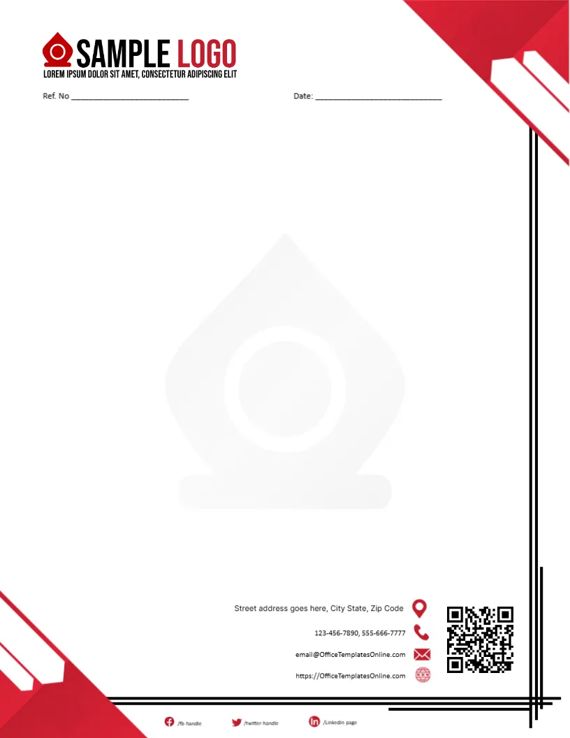
The page is 8.5 x 11 inches in portrait. Red triangles sit in the upper and lower corners, and thin black lines run along the edges to suggest a frame. The shapes point the eye inward, towards the text. At the top, the words SAMPLE LOGO mark where your own logo goes. Everything is drawn in just two colours plus white, which makes the page easy to photocopy and easy to read in black and white.
Putting Your Own Logo in the Top Block
The logo area is a picture. Click it and choose Replace Image to upload your own file. A logo with a transparent background looks best, because the page behind it is white. If your logo is wide, keep it inside the black lines, so the header does not look crowded. If it is square, place it left and use the space beside it for your trade name in a text box.
Contact Details Without Clutter
The footer holds a street address line, two phone numbers, an email address and a website, followed by the handles /fbhandle, /twitterhandle and /LinkedInpage. Creative businesses often work through social platforms, so the handles are worth keeping. Replace the sample details with the real ones, and delete any handle that you do not use.
The Ref. No and Date Line for Proposals
Under the header a short line reads Ref. No and Date. Creative work often runs on proposals, change requests and invoices, and a reference number ties them together. Use a code like the client initials and the month, followed by a number. If a letter is a one off, leave the reference blank or delete it.
Which Letters Suit a Creative Page
- Project proposals and scope letters sent to new clients.
- Thank you notes after a launch or an event.
- Invitations to exhibitions, workshops and open studio days.
- Reference letters for freelancers and interns.
- Letters to landlords, suppliers and printers.
Changing the Page Without Losing the Look
The text boxes are editable, so you can change the font size and the words. The red triangles and black lines are part of the page graphics, so they stay as designed. If you want another colour, the quickest route is to choose a different design from the letterhead category instead of fighting the shapes.
Printing a Letterhead With Heavy Corners
Red corners that reach the edge of the sheet need a printer that can print to the border. A desktop printer usually leaves a margin of about a quarter inch, which would show as a white strip. In that case, print on a shop machine with full bleed, or print only the content at the office and order pre printed sheets for the corners.
Keeping the Brand Consistent
Use the same typeface and colours in your letters as on your website and cards. Type your letter in the font that the page already uses, which is Inter. Save a blank master, and always start new letters from that file, never from an old letter, so that no old names or dates remain by accident.
For a simpler header, see the business letterhead. For another bold look, try the creative agency letterhead. A softer page is the creative portfolio letterhead. More are in letterheads.