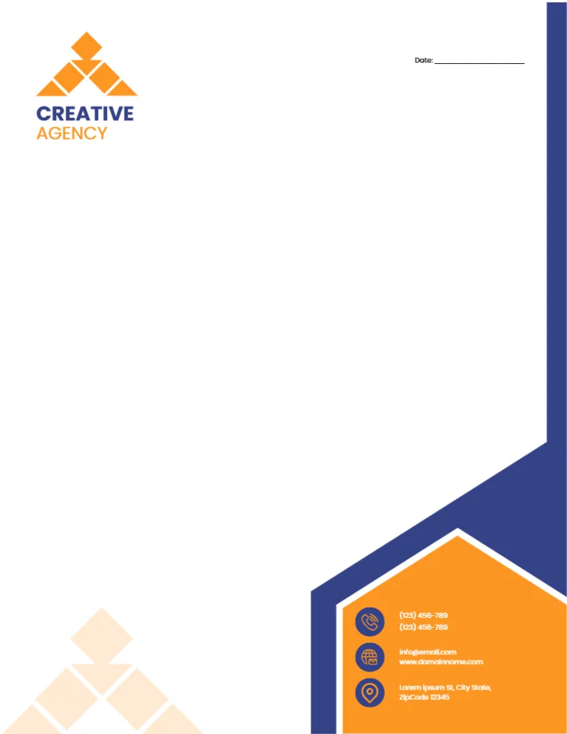
An Agency Letterhead With a Contact Panel You Cannot Miss
Many agency letters end with a client asking for a phone number that was hidden in a footer. This design avoids that by placing the contact details inside an orange hexagon shaped panel that is easy to find. Beside it, an indigo edge gives the page a strong spine. It suits design studios, advertising agencies, branding houses and production companies.
The Header Title in Poppins
The page is 8.5 x 11 inches, portrait, one page. At the top, the words CREATIVE and AGENCY are set in bold Poppins capitals, one above the other. This is a placeholder for your own agency name. Click it, type the name, and adjust the size if the name is longer. Poppins is a geometric typeface with round letters, which gives the page a friendly modern voice. The rest of the text uses Inter.
The Orange Hexagon Panel
The contact panel is the main feature. A hexagon shape in orange holds three lines: the address, the phone numbers and the email with the website. White text on orange reads well at a larger size, but small print can look weak, so keep the lines short. If your address is long, break it at a comma onto a second line.
The Indigo Edge
An indigo strip runs along one side of the page. It balances the orange panel, and the two colours sit opposite each other on the colour wheel, which makes the page vibrant. The strip is a graphic, so it stays fixed while you edit the text. Use a logo that has some white or a light tone, so it reads against the indigo.
Date Line and Open Writing Area
A single Date line sits near the top. There is no reference number in this version, which suits a studio that writes fewer, more personal letters. Under the date, the writing area is wide and clear, enough for a full page of a pitch or a proposal in 11 point text.
Letters an Agency Sends on This Page
- Pitch letters that go with a creative deck.
- Terms and conditions letters for new clients.
- Invoices explained with a cover letter.
- Thank you letters to freelancers and printers.
- Award entry statements and press introductions.
Editing the Placeholder Text
All lines of text are editable, including the placeholder phone and email lines. The hexagon, the strip and the icons are graphics. To add a logo, place an image over the empty area at the top and resize it by dragging the corner handle. Hold the shift key to keep the proportions.
Printing and Exporting
A colour laser or a print shop handles the orange panel best. If your letters leave the office as PDFs, check that the export looks right at 100 percent zoom, because thin lines in small text can blur at lower zoom levels. Keep the file size under a few megabytes so that email systems accept it.
Making It Match Your Cards and Slides
An agency page works best when it matches the rest of the brand. If you change the title font, use the same font on the business cards and slides. Save the colours you use as a short list, so your team can match them without guessing.
For a red and black design, see the creative business letterhead. For another colourful page, try the colorful letterhead for designers. A softer option is the creative portfolio letterhead. More are in letterheads.