Reward Results, Not Just Attendance
Performance awards say something different from appreciation awards. They say the result was measurable: sales hit, targets reached, grades raised, times beaten. The certificate should feel serious but modern, and this one does that with clean diagonal stripes and a restrained blue and gold palette.
Stripes, Scrolls and a Gold Title
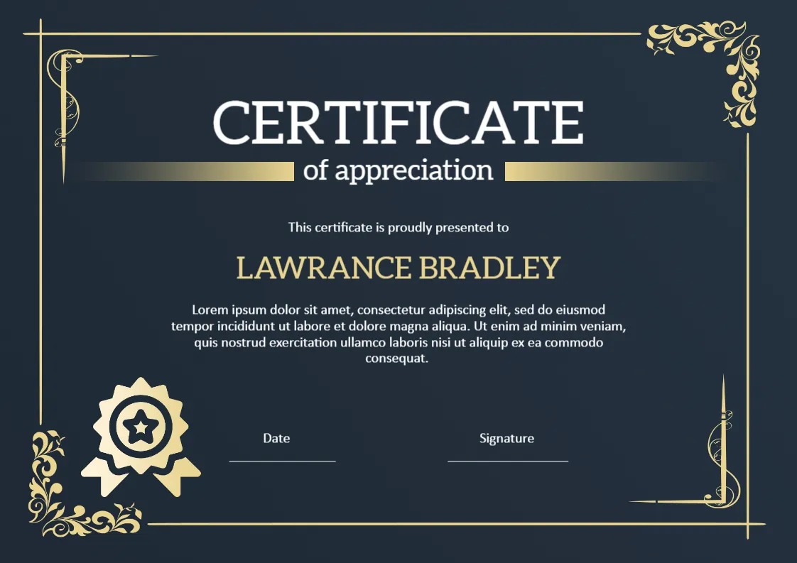
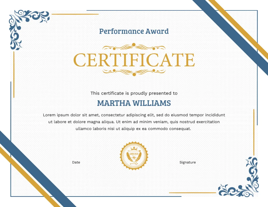
The certificate is Letter size landscape, 11 x 8.5 inches. The white page has a very fine texture. Two diagonal stripes, one blue and one gold, run across the top right corner, and two more cross the bottom left corner. Blue floral scrollwork decorates the top left and bottom right, with thin gold and blue lines running along the edges, as though the corners have been folded.
The heading begins with the words Performance Award in blue. Below it, CERTIFICATE appears in large gold serif capitals, framed by a gold ornamental flourish above and below. Then comes This certificate is proudly presented to, followed by the name, MARTHA WILLIAMS, in blue capitals. A paragraph follows, then a small gold seal with a crest at the bottom centre, with Date and Signature on either side.
Performance in Different Settings
- Sales teams: top seller of the quarter.
- Customer service: highest satisfaction scores.
- Schools: greatest improvement in a subject.
- Sports clubs: best performer of the season.
- Operations: zero errors for a full year.
Wording With Numbers
The more concrete the paragraph, the more valuable the certificate feels. Compare “For excellent performance” with “For increasing regional sales by twenty two percent in the third quarter.” Put the figure and the period in the paragraph, and the recipient will quote it for years.
Blue and Gold in the Office
This palette is calm and corporate. It will look natural in an office or a school corridor. If your organisation uses other colours, you can still use the design by changing the logo and the text, and the blue and gold will frame the page neutrally.
Printing the Stripes
The stripes reach the edge of the page. For a polished result, use a print shop for borderless output, or choose Fit to page and trim the margin. Print on matte paper, 120 to 200 gsm. Test one copy to check that the gold does not look yellow.
Quarterly and Annual Cycles
Many organisations give performance awards every quarter and a bigger award at the end of the year. Use the same certificate for both, and change the heading to Quarterly Performance Award or Annual Performance Award. Keep a record of past winners, so that the annual winner can be chosen from the quarterly ones. A consistent design builds a tradition over time.
Presenting in Public or in Private
Some people love applause and some dislike it. If you are not sure, ask the person beforehand or present the certificate in a small team meeting. Recognition should feel good for the person receiving it, not just for the organiser.
Adding a Short Quote From a Colleague
A single sentence from a colleague or a customer can sit under the main paragraph in smaller text. For example: “She is the first person I call when something needs to be done well.” Quotes make a performance award feel rooted in real experience, and they are often the sentence the recipient remembers.
For a more decorative first place version, see the first place award certificate. For staff recognition, see the employee excellence certificate. More are in appreciation and award certificates.