A Thank You That Looks Like It Cost Something
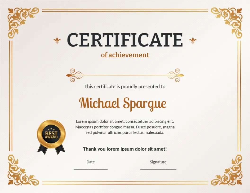
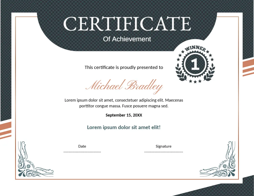
Appreciation certificates are often handed out in bulk, and many of them look it. This one avoids that. A bold gold curve divides a white writing area from a dark, textured charcoal panel, and a gold thumbs up seal sits right on the curve like a medal. The first impression is of a certificate that was designed for the person receiving it, which is what a thank you should feel like.
What the Page Looks Like
The certificate is A4 landscape, 297 x 210 mm. The left two thirds are white. A thin gold frame runs inside the edge, and at the top left and bottom left corners a gold Greek key pattern turns the line into a square spiral. The right third is charcoal with a fine woven texture. Between the two, a gold band curves like the edge of a wheel, and on it sits a round gold seal with a white thumbs up and a dotted ring.
The title is set in two tiers. CERTIFICATE is large black serif capitals, and of Appreciation follows in gold. A small ornamental divider with curls sits between the title and the line This certificate is proudly presented to. The recipient name, Mr. Aaron Howes, is printed in gold, with a paragraph in black beneath it, and a final line that reads Thank you with an exclamation mark. Below that are Date and Signature lines. A gold LOGO with a slogan placeholder sits at the bottom right, on the dark panel.
Writing the Message
The paragraph is placeholder text. Replace it with two or three sentences that say what the person did. Specific thanks lands better than general praise. Compare “Thank you for your hard work” with “Thank you for staying late three nights to finish the audit.” Keep the last line short and warm, since it is the line the person reads last.
| Occasion | Sample opening line |
|---|---|
| Team project | For leading the spring launch with patience and humour |
| Long service | For ten years of steady and generous work |
| Volunteer help | For giving your Saturdays to the community garden |
| Guest speaker | For sharing your time and knowledge with our members |
Branding the Dark Panel
The charcoal panel is the place for your identity. Replace the gold LOGO placeholder with your own logo. A light or gold logo works best on the dark texture. If your logo is dark, place it on a small white shape. The thumbs up seal is artwork, so it stays as it is, which gives the certificate its friendly tone.
Printing an A4 Certificate Well
A4 is the standard office paper size outside North America, so any office printer can handle it. Choose 120 to 160 gsm matte or parchment paper for a certificate feel, or 200 gsm card stock if your printer supports it. Check the dark panel with one test print, because a large dark area can leave streaks on cheaper printers. If you work with letter paper, choose Fit to page and accept a thin border.
Set a pen aside for the Signature line. A blue ink pen looks personal and shows that the certificate was signed by a real person.
Related Appreciation Designs
If you prefer a dark certificate with a gold frame, try the navy and gold certificate of appreciation. For a lighter navy design with a thumbs up ribbon, see the appreciation certificate template. All are in appreciation and award certificates.