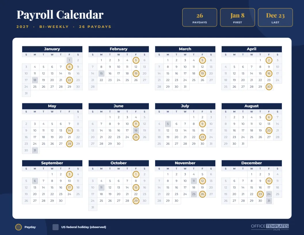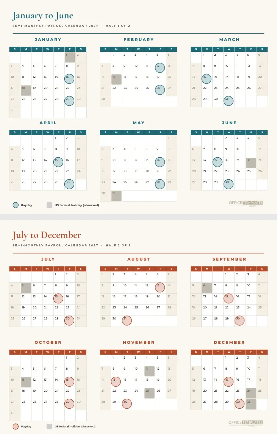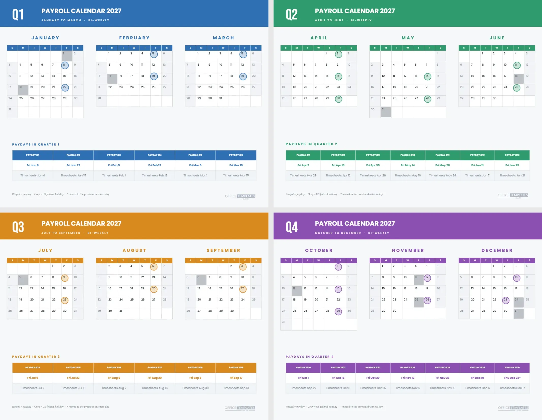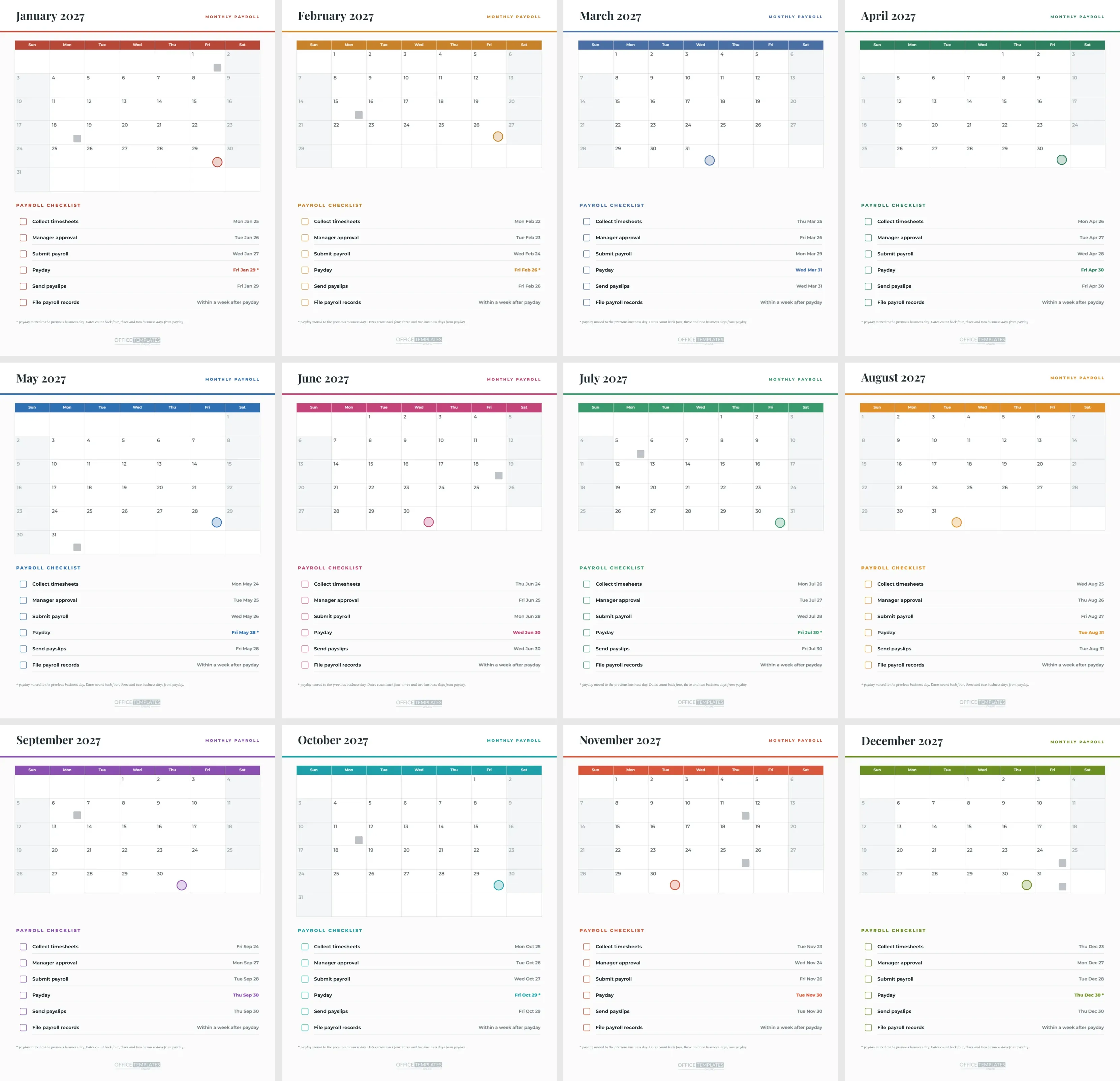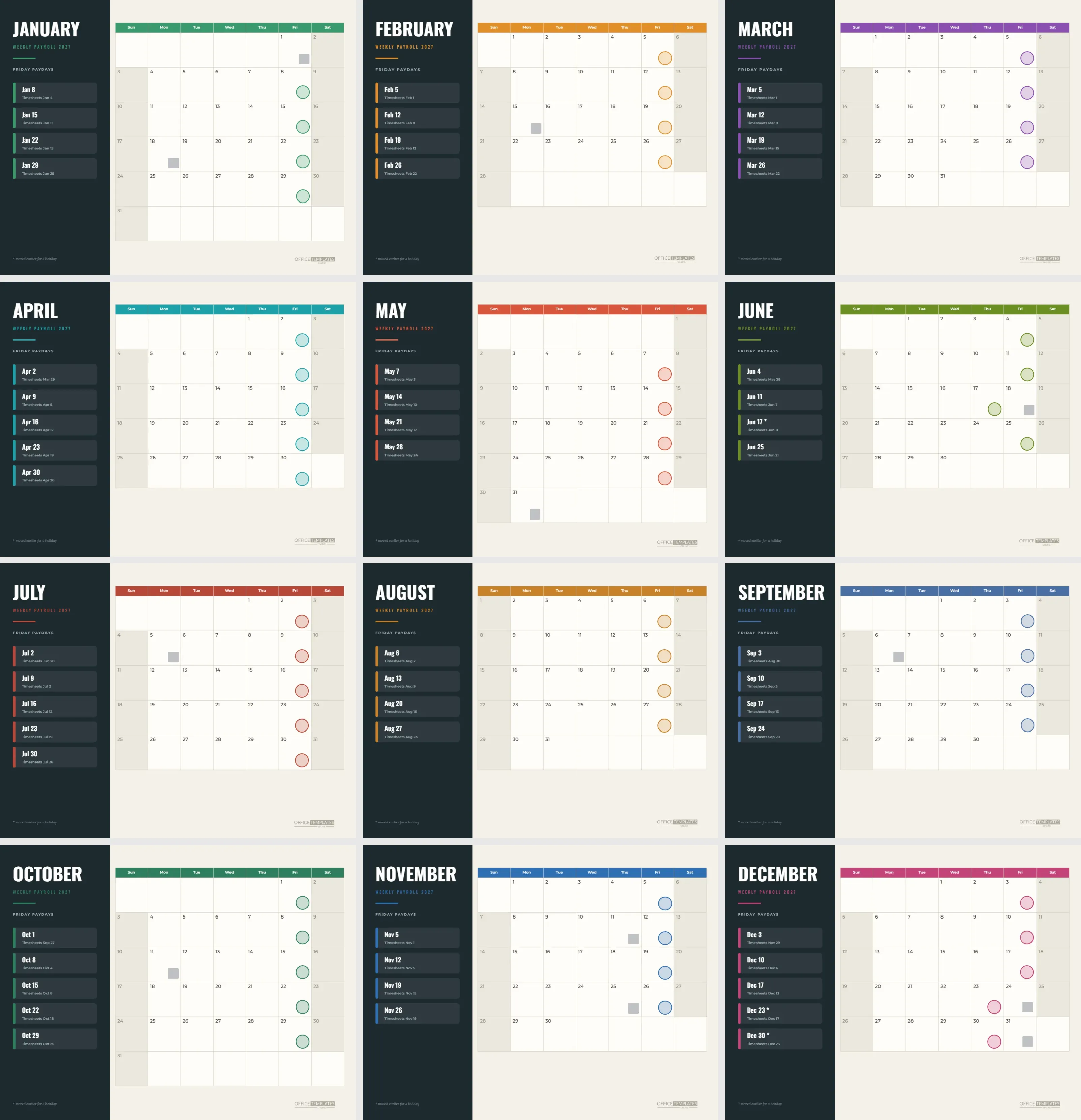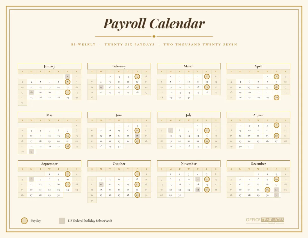
There is a place for payroll calendars that look like they belong on a wall in a law firm or a boutique hotel. This elegant version for 2027 sets the bi-weekly schedule on warm cream paper inside a double gold border. An italic serif headline, a small diamond divider, and a spaced caption introduce a calm four-column year. It is a calendar you could frame.
The Double Border
Two thin gold rectangles, one slightly inside the other, frame the page. The outer line is heavier, and the inner line is a hairline. This simple detail gives the page the feeling of a certificate or a printed menu, and it holds the composition together without any other decoration.
The Italic Headline
Payroll Calendar is set in Playfair Display Bold Italic, in a deep brown. The letterforms have strong contrast and graceful curves, which suits a formal subject. The heading is centred in the upper third of the page, with space around it so it can breathe, and the brown is softer than black on cream.
The Diamond Divider
Beneath the title, a thin gold line is split by a small diamond. The divider is built from two rectangles and a four-point polygon, so it can be moved, scaled, or recoloured. It sits between the heading and the caption, and it adds the sense of a printed invitation without clutter.
The Spaced Caption
The caption reads BI-WEEKLY, TWENTY SIX PAYDAYS, TWO THOUSAND TWENTY SEVEN in widely spaced Cormorant Garamond capitals, in gold. Spelling out the numbers is a deliberate touch borrowed from formal stationery. If it feels too much, replace the words with digits, and the design will still hold.
The Four Column Calendar
Twelve months sit in four columns and three rows, set in Cormorant Garamond. Month names are brown on cream with a thin gold outline; the day name row is pale gold and weekends are a light parchment tone. Numbers are small but crisp, and the gold hairline borders keep the grid delicate.
Gold Rings and Parchment Squares
Paydays carry a gold ring with a faint gold tint. Holidays carry a parchment grey square. The ring is thicker than the grid lines, so it is easy to find without shouting. The legend at the foot uses Cormorant at a slightly larger size, in brown, for a refined finish.
The Twenty Six Paydays
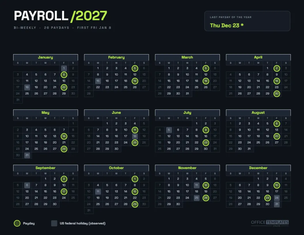
Paydays fall every second Friday from January 8: Jan 8, 22; Feb 5, 19; Mar 5, 19; Apr 2, 16, 30; May 14, 28; Jun 11, 25; Jul 9, 23; Aug 6, 20; Sep 3, 17; Oct 1, 15, 29; Nov 12, 26; Dec 10, and Thursday, Dec 23. The last moves earlier for the observed Christmas holiday.
Framing the Printout
The page is Letter landscape, which fits a standard 11 by 8.5 inch frame, or a larger frame with a mat. Print on cream or ivory stock around 120 gsm for a handsome result. Because the page already has a border, a simple black or walnut frame is enough.
Where It Looks Right
Law firms, wealth managers, boutique hotels, private clinics, architecture practices, galleries and family offices. In such places, a payroll page may be seen by clients or visitors, and an elegant calendar looks more considered than a spreadsheet printout stuck to a cabinet.
Editing the Text
All text is editable. Change the headline to your firm’s name, shorten the caption, or add a line with a second language. If you change the fonts, keep the same pairing logic: a high-contrast serif for the headline and a lighter serif for the caption and the calendar.
Editing the Gold Framed Calendar
The grid is the editor’s Full Year Calendar object. Use Calendar Options for the year, week start, and colours. The rings and squares are grouped shapes over the grid, so after a change you will need to move them. The border and divider are separate shapes and do not follow.
Changing the Gold
Gold is a mood rather than a metal here, a warm ochre that prints well. For silver, replace the fill with a cool grey and the cream with a pale blue grey. For copper, shift toward orange. Make the change on the border, divider, caption, month outlines, and rings together, so the page stays unified.
Printing Gold Cleanly
A colour laser or good inkjet handles ochre well. Choose actual size, background graphics on, and a heavier paper to avoid showing through. If your printer leaves a margin, the double border will be cropped slightly. Check a draft, and use a print shop for a framed copy.
Pairing the Gold Page With Quiet Table Companions
For a quieter companion, use the bi-weekly pay period schedule and the processing deadlines sheet, which carry the same dates in table form. The elegant page is for display, and the tables are for work. All three agree because they come from one computed list.
Honest Limits
An elegant page does not make a date more certain. The dates follow a previous business day rule and a US federal holiday list. Confirm them with your payroll provider, and adjust the squares for your own holidays, particularly if you work outside the United States.
The Gold Page in Brief
Cream paper, double gold border, italic serif headline. Twenty-six paydays, one moved. Four-column year. Letter landscape. Editable text, border, divider and calendar.
A Note for Hospitality and Clinics
Staff rooms in hotels and clinics often have a notice board that guests never see. An elegant page still lifts the standard of the space, and it tells shift workers that pay is handled with care. Print a copy in the staff area and keep a second in the manager’s office for reference during queries.
Gifting the Calendar to a Retiring Colleague
A framed gold and cream calendar makes a thoughtful keepsake for a payroll clerk about to retire. Add a line under the caption, such as With thanks for every payday, and the year in which they served. It costs little and acknowledges a job that rarely gets thanked.
How the Border Survives Different Printers
Home printers often leave a quarter-inch margin that trims a thin border. If yours does, scale the page to ninety-five percent so the border stays inside the printable area. A print shop can print to the edge and trim, which keeps the frame at full size and looks the most polished.
Adding a Second Language Below the Gold Caption
For multilingual workplaces, add a line in a second language under the caption, set in the same Cormorant Garamond at a slightly smaller size. A bilingual heading looks natural in an elegant layout, and it extends the courtesy of the page to every member of staff.