Rule One: Use Only Black
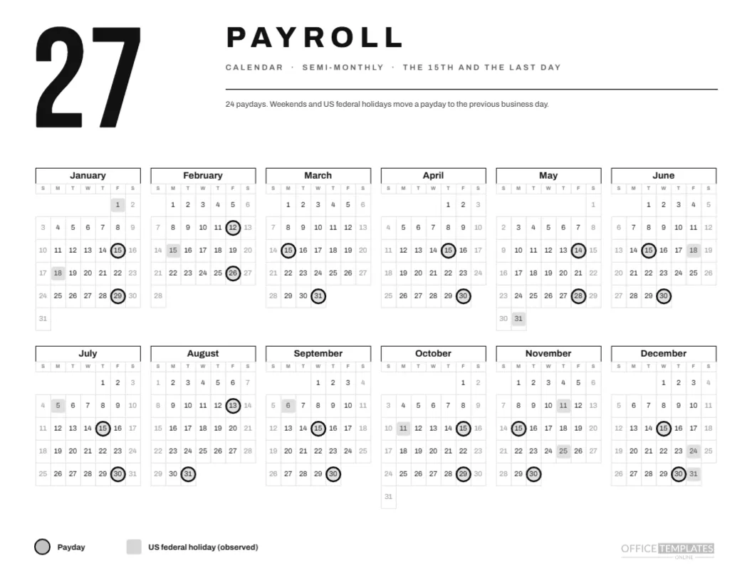
This page is built to survive a cheap printer. Everything is black, white, or a light grey, so it prints cleanly on an office laser, a photocopier, or a fax scan of an old inkjet. A huge 27 in condensed capitals stands at the top left, the word PAYROLL sits beside it in heavy Archivo capitals, and a single hairline separates the header from the calendar.
Rule Two: Show Only What Matters
The page carries one calendar, one legend, and one sentence: 24 paydays, with weekends and US federal holidays moving a payday to the previous business day. It has no logo band, no tiles, no illustration. That restraint is not an absence of design but the design itself.
Rule Three: Six Columns Wide
The year uses six columns and two rows, which makes a wide, low calendar that reads like a timeline. January to June sit above July to December. Month names are bold black, set in a box with a black bottom border, and day letters are small grey capitals. Weekend cells are a faint grey.
Rule Four: A Ring Is a Payday
Paydays carry a thick black ring with a faint grey fill, and holidays carry a pale grey square. The two shapes differ in weight and form, so they remain distinct in any greyscale copy. The legend at the foot shows both, in the same bold sans, with no decoration.
The Twenty-Four Paydays
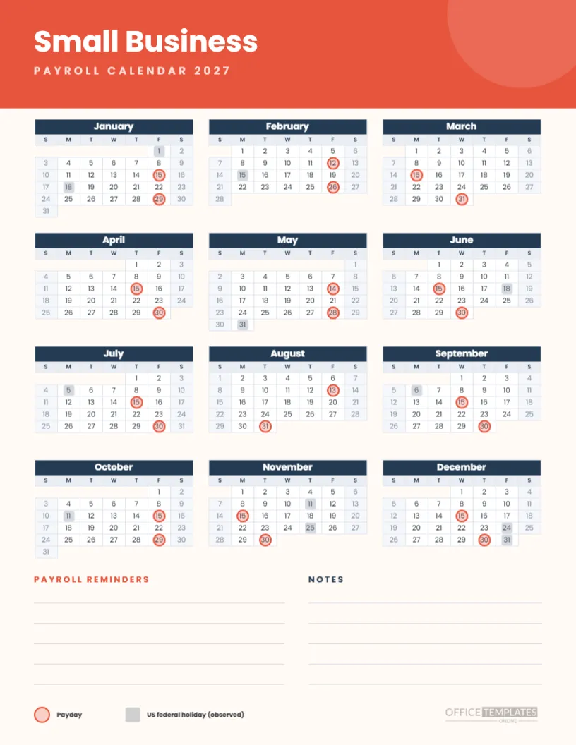
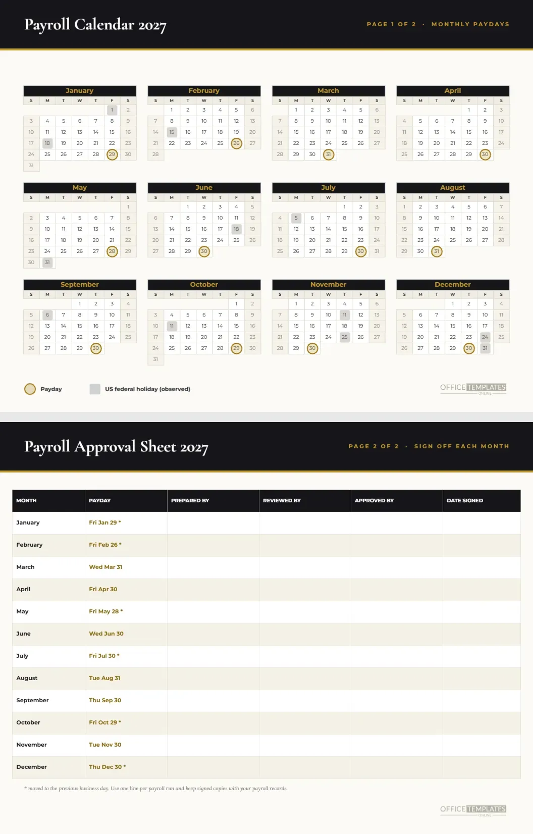
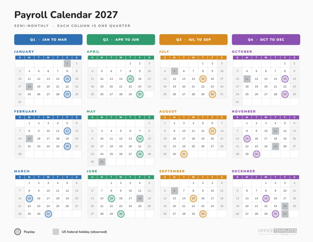
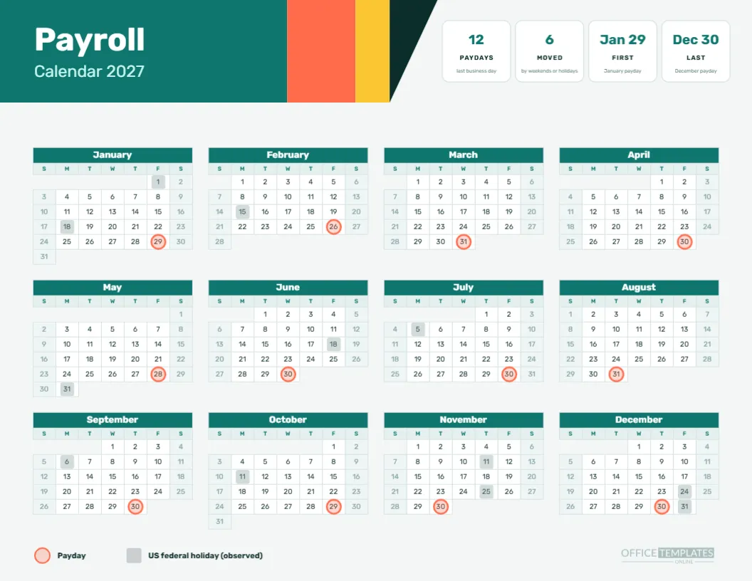
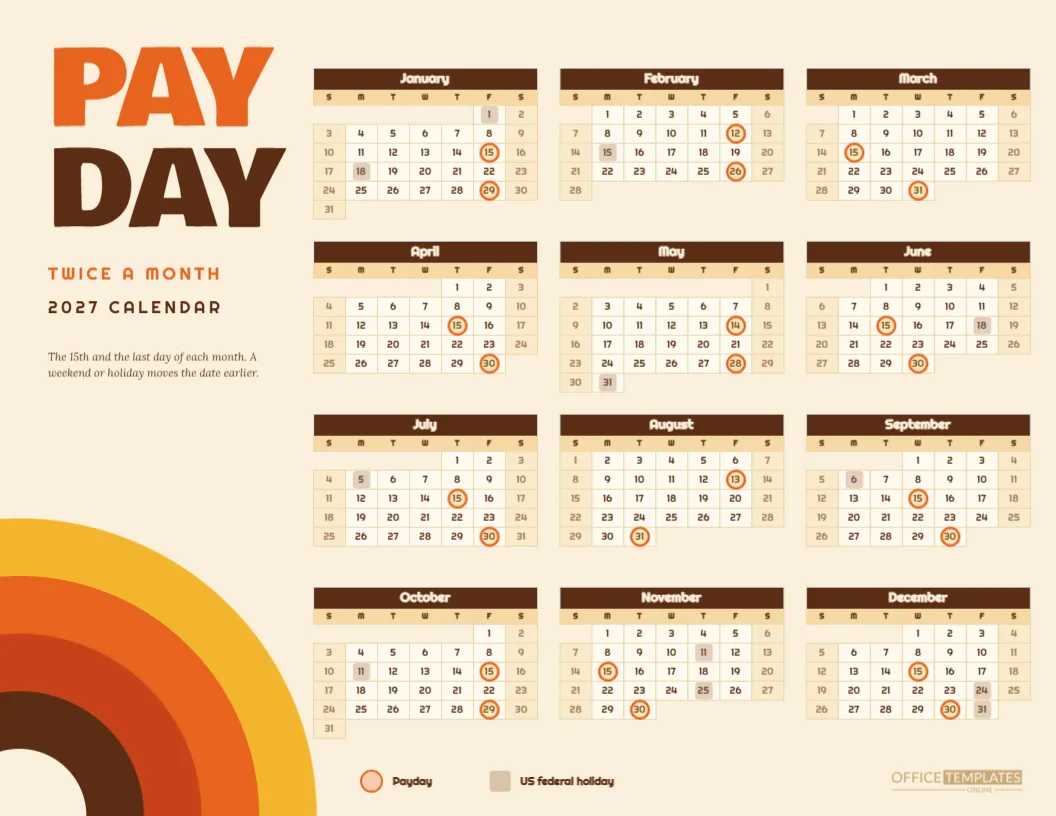
Mid-month paydays fall on the 15th unless the day is a weekend or holiday: January 15, February 12, March 15, April 15, May 14, June 15, July 15, August 13, September 15, October 15, November 15, December 15. Month-end paydays fall on January 29, February 26, March 31, April 30, May 28, June 30, July 30, August 31, September 30, October 29, November 30, and December 30.
Reading the Moved Dates
Nine rings sit on dates other than the 15th or the last day. They are the January, February, May, July, August, October and December ones, with February and May moving twice. A reader who knows the rule can find each on the grid in seconds, because moved paydays always sit on Fridays or Thursdays before a weekend or holiday.
Why a Huge 27
The big numeral does three things. It names the year at a glance, it fills the top left of the page so the calendar can sit comfortably beneath, and it makes the page look like a poster rather than a form. Change it to another year, or replace it with a pay frequency such as 24, if you prefer.
Typography
The numeral is Bebas Neue. The title and the calendar use Archivo, which has a sturdy grotesque feel in its heavier weights and stays legible at the tiny size of the day numbers. Using only two typefaces keeps the page coherent, and both are free Google Fonts that embed cleanly in the export.
Print Economy
Because the page has no large solid areas apart from the numeral, it uses little toner. It photocopies well, scans well, and still looks sharp when printed several to a sheet and then trimmed into pocket cards. Photocopy it onto coloured paper if you want a pop of colour without changing the file.
Customising the Minimal Page Without Losing Its Calm
Every item is editable. Change the sentence, swap the numeral, recolour the rings to a brand colour if you want one accent, or move the legend. If you do add a colour, restrict it to the rings so the minimal feel stays intact. Fewer colours mean more consistent prints.
Calendar Options
The calendar is the editor’s Full Year Calendar object. Open Calendar Options to change the year, choose Monday as the week start, or adjust the border colour. The rings are separate grouped shapes laid over the grid, so check them whenever you change something in the calendar.
Changing the Pay Pattern
For bi-weekly, weekly, or monthly pay, start from the matching page in this collection and apply the same minimal styling, or replace the rings here with your own. The page layout is simple enough that a rebuild takes minutes, and the minimal look does not depend on semi-monthly dates.
Studios and Offices That Suit Black and White
Design studios, law offices, architecture firms, and any workplace with a taste for restraint. It is also useful where a page is posted in a shared space that already has plenty of colour, because a black and white page stands out by being calm.
Accessibility
High-contrast black on white is among the most readable combinations for people with low vision, and the shape-based markers do not depend on colour. Print at actual size, or larger, and keep the page uncluttered. The two typefaces are clear at the small sizes used.
Pairing the Minimal Page With Semi-Monthly Detail Sheets
For a deeper view of semi-monthly pay, use the semi-monthly pay schedule and cut-off cards in this collection. They share the 24 dates. This minimal page is the overview you put on the wall.
Honest Limits of the Minimal Calendar
The calendar uses a previous business day rule and a US federal holiday list. Banks, providers, and laws vary. Check dates before you promise them to employees, and adjust the rings for your own holiday list if you work outside the United States.
Summary Rules of Use
Print black and white. Keep the rings. Move them if you change the year. Check the dates. Replace the page every January.
Cutting the Page Into Pocket Cards
Because the page prints cleanly in black, it also works as a source for pocket-sized cards. Print two copies, trim along the grid blocks and fold the pieces so that January to June appears on one side and July to December on the other. A card in a wallet is a good way for a busy manager to check the next payday on the move.
Why Hairlines Matter
The single hairline under the title is the only rule on the page. It separates the heading from the data and gives the layout its spine. A heavier line would compete with the numeral, and no line at all would leave the heading floating. Resist the temptation to add more rules, since each new one reduces the calm.
A Few Black and White Variations
Try inverting the page for an evening shift office: a black background with white type and white rings. The calendar’s colours can be reversed in Calendar Options and on the shapes. Print a test, because dark pages show every scuff and use a lot of toner, but the dramatic version is striking on a break room wall.
Keeping the Page Fresh Year After Year
A minimal page ages well because it carries no trends. Save the design, change the numeral and the year, then rebuild the rings with the new paydays. A yearly refresh takes about fifteen minutes and gives you a consistent look that staff recognises from one January to the next.