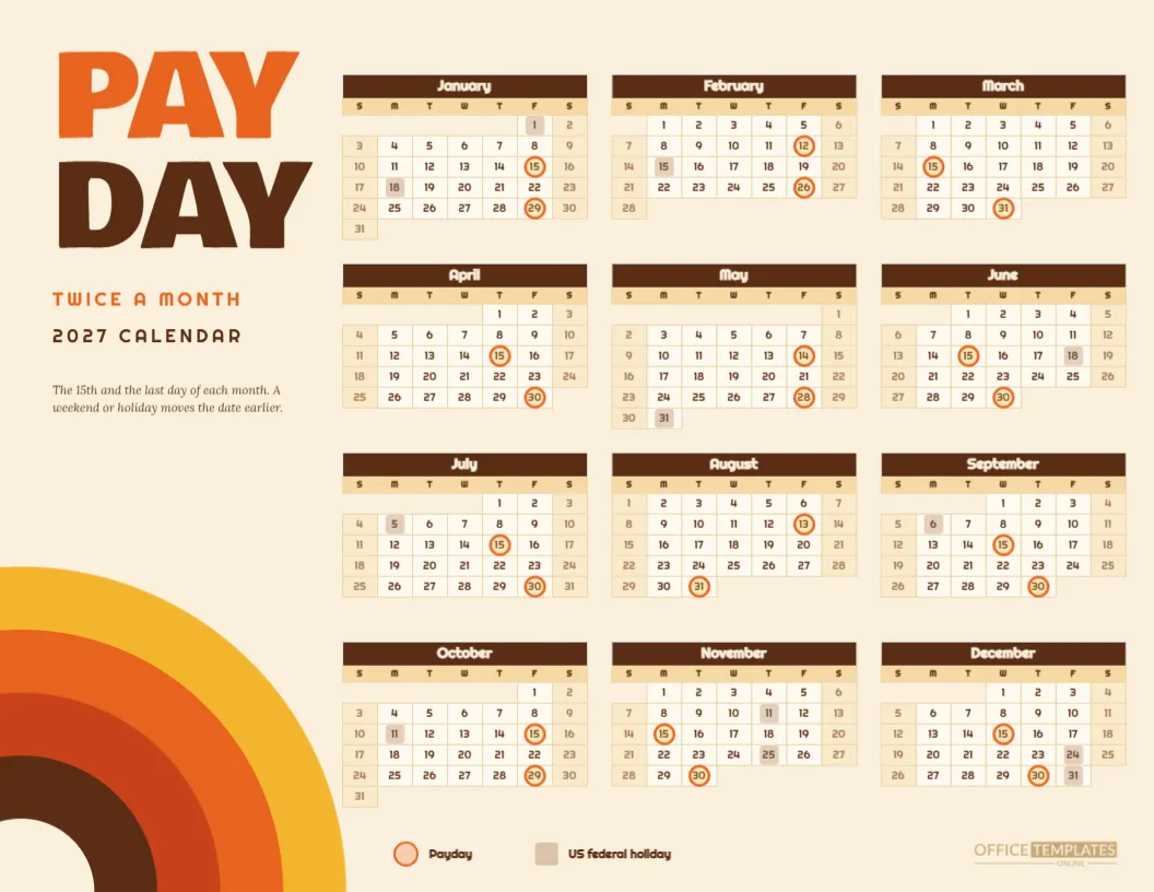
Payday should feel like a celebration, and nothing says celebration like orange and brown and a rainbow of arcs from 1974. This Retro Payroll Calendar for 2027 shows the semi-monthly pay schedule on a cream page with a giant PAY DAY headline, a stack of concentric arcs in the corner, and a three-column year on the right. It is friendly, loud, and slightly silly, in the best way.
First Impression: The Headline
The words PAY and DAY are stacked in Bowlby One, a heavy rounded display face. PAY is bright orange and DAY is deep brown. Beneath them, TWICE A MONTH in orange and 2027 CALENDAR in brown are set in Righteous, a soft geometric type with a seventies swing. A short italic line explains the rule.
The Sunburst Arcs
In the bottom left corner, four quarter circles nest inside each other: yellow, orange, rust and dark brown, with a cream hole in the middle. They look like a rainbow or a record sleeve. They are built from simple circles, so they are easy to recolour, resize or delete if you want a cleaner page.
The Three Column Year
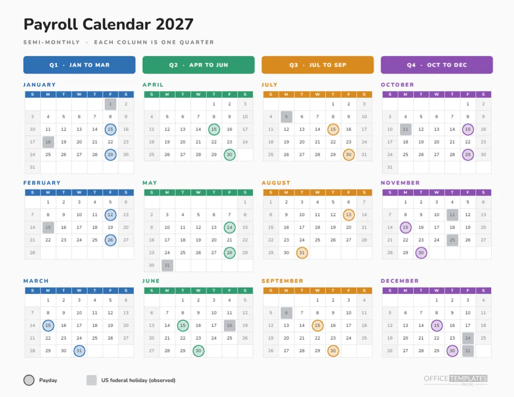
On the right, twelve mini months sit in three columns. Month headers are dark brown with cream text, day names sit on a sand tint, and weekends have a warm beige fill. Every number is set in Righteous. Orange rings with a yellow fill mark the paydays, and sand coloured squares mark observed holidays.
Twenty-Four Paydays, Twice a Month
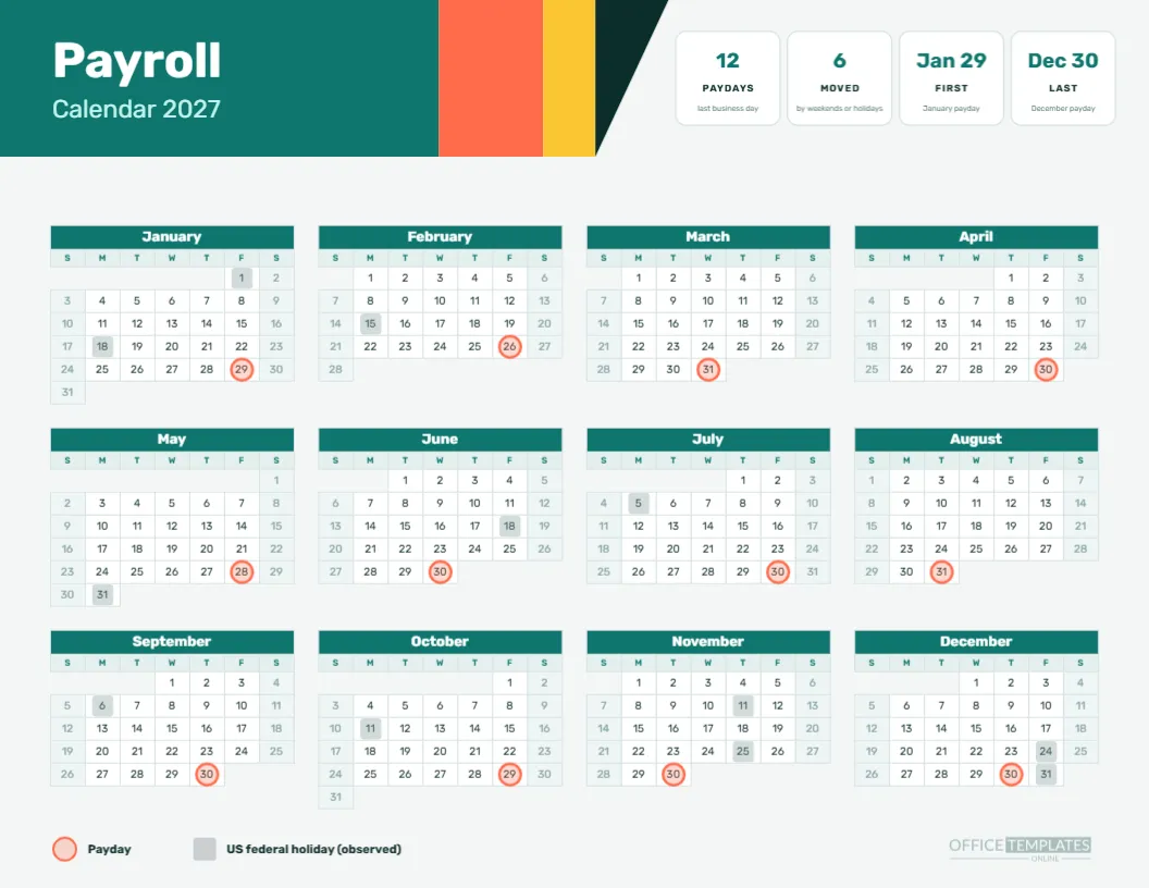
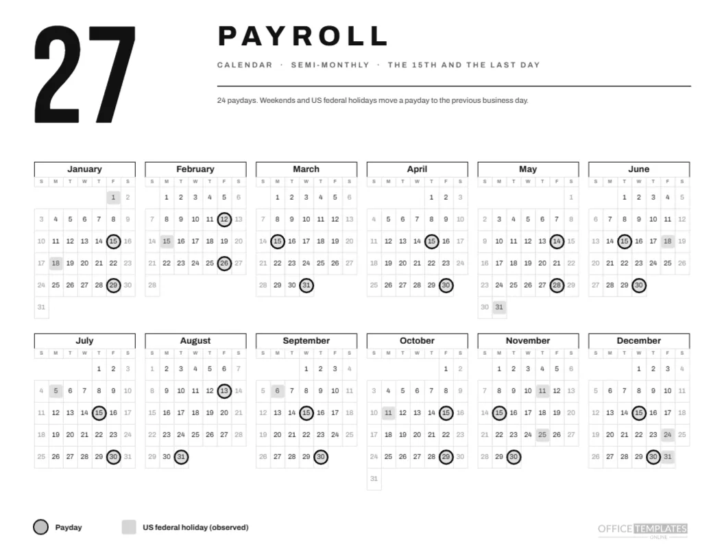
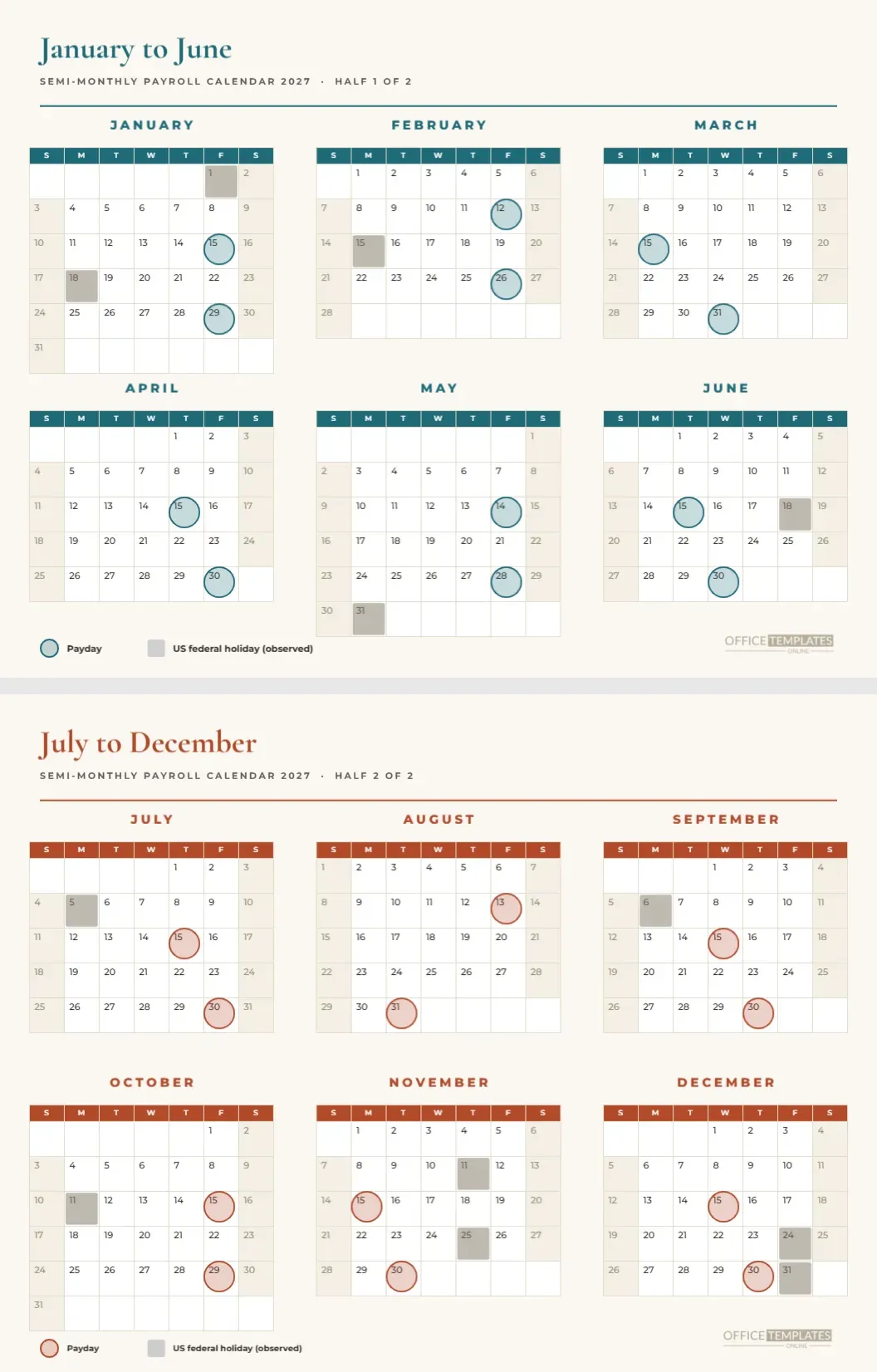
Pay arrives on the 15th and the last day, moved earlier when needed. Nine dates move: January 29, February 12, February 26, May 14, May 28, July 30, August 13, October 29 and December 30. The remaining fifteen stay on the 15th or the last day. The rings make that obvious, since a moved ring sits visibly away from the middle of the month.
The Rule in the Sentence
The italic line under the headline says: the 15th and the last day of each month, and a weekend or holiday moves the date earlier. It is only twenty words, but it explains the rule to anyone who reads it. If you pay on different dates, rewrite the sentence and move the rings.
Playful, Not Silly
A retro look can be funny, but the information on the page is accurate and clear. The numbers are legible, the rings are consistent, and the legend is plain. Style supports the message, and it makes a duty feel like a treat. That is a useful trick in any office.
Bakeries and Record Shops Where the Retro Page Fits
Restaurants, record shops, bakeries, bike shops and creative agencies with a sense of humour. It is also a cheerful choice for a staff room, where it will be seen daily. A serious bank might prefer a calmer page, and the collection has plenty of those.
Editing the Arcs
The arcs are five circles stacked in size order, with a cream circle on top for the hole. Change the colours to match your brand, or move the group to another corner. You can enlarge them to bleed off the page, which looks bold, or shrink them for a small accent.
Editing the Headline
The words PAY and DAY are text boxes. Change them to PAYDAY, or to the name of your company’s payday, such as FRIDAY FUNDS. Keep the heavy font so the stack stays punchy. Test a few colour combinations before settling, since heavy fonts look different in each.
Editing the Retro Year Grid
The year grid is a Full Year Calendar object. Use Calendar Options to change the year, week start, or colours. The rings and squares are grouped shapes laid on top, so adjust them after any change. The legend uses the same shapes, so check it matches.
Swapping the Orange Palette for Another Decade
The page uses orange, yellow, rust, brown and cream. For a different era, try teal, mustard and cream, or pink, red and cream. Replace fills in groups so the page stays coherent. Keep the dark colour for the month headers, since the cream type needs a strong background.
Printing the Retro Page
Print landscape on Letter at actual size with background graphics on. Cream paper makes the colours feel warmer, though a white sheet prints nicely too. The arcs use a fair amount of ink, so a laser printer or a print shop will give the best result for a wall display.
Pairing With Other Semi-Monthly Pages
For timesheet dates, see the semi-monthly pay schedule and the cut-off cards in this collection. They cover the same 24 paydays in tabular and card form. This retro page is the poster, and those are the working sheets.
A Gentle Warning About Dates
The dates follow a previous business day rule and a US federal holiday list. They may differ from your payroll provider’s schedule or from local rules, so check them before promising anything to staff. A fun design does not make a date more certain.
The Orange Page in Brief
Cream page, orange and brown, sunburst arcs. Twenty-four paydays, nine moved. Three-column year. Letter landscape. Editable text, shapes and calendar.
Making the Page Feel Like a Poster
Enlarge the page to tabloid at a print shop and mount it on foam board for a staff room. The big headline and arcs hold up at poster size, and the calendar becomes comfortable to read from across a room. A single colourful poster does more for payday awareness than a dozen emails.
Cheerful Wording for the Footer
Add a small line at the bottom such as the 15th is money day, or have a great payday. Keep it in the same typeface as the rest of the page, and in brown so it does not fight the headline. Humour works best when the facts above it are clear and correct, as they are here.
Combining the Retro Look With Your Own Logo
A logo can sit in the cream hole of the arcs, scaled to fit the circle. A round or square mark works best. If your logo is long and thin, place it under the italic sentence instead, and keep the arcs as pure decoration. Either way, check the logo against the cream and orange so it stays legible.
Handling Two Pay Groups on One Retro Page
Some small employers pay salaried staff semi-monthly and hourly staff weekly. Print the page for the salaried group and add a second set of rings in a different colour for the weekly group, with a small legend line. Do not overdo it: two marker types are the limit before the grid becomes busy.