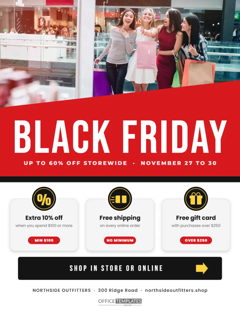
A good photograph sells faster than any headline. If you have a strong image of your store, your newest collection, or a happy customer, this flyer lets it lead. The top half of the page is one wide photo slot. A slanted red panel cuts across its lower edge and carries the words BLACK FRIDAY in tall white capitals. Below, three round badges explain why it is worth shopping with you, and a black bar tells people where to go next.
Why a Photo First Black Friday Flyer Works
People look at faces, products and places before they read words. A flyer that opens with a large photograph earns a second glance before the reader has decided whether they care about Black Friday at all. It also makes your business recognisable. A picture of your own shop front, staff or products is more persuasive than any generic sale graphic, because it shows exactly where the deal is.
Choosing the Right Photograph
Pick a landscape photo with the main subject in the upper two-thirds, because the red panel covers the bottom part of the slot. Bright, well-lit images look best against the red. A lifestyle shot, such as a person wearing your jacket in the snow, often works better than a plain product on white. Replace the image with the Replace Image button; the slot keeps its size and position.
The Slanted Red Title Panel
The panel rises from left to right, which gives the page a sense of movement. BLACK FRIDAY is set in Bebas Neue, a tall, narrow typeface that fills the width without feeling heavy. A second line in spaced capitals reads UP TO 60% OFF STOREWIDE and the dates, November 27 to 30. A thin black strip under the panel separates it from the white lower half.
Three Round Benefit Badges
| Badge | Benefit | Condition in the sample |
|---|---|---|
| % | Extra 10% off | when you spend $100 or more |
| FREE | Free shipping | on every online order |
| GIFT | Gift card | with purchases over $250 |
Each badge is a black circle with a thin yellow ring and short text inside, followed by a bold title and a one-line condition in grey.
Benefits Versus Discounts
Most flyers only talk about price. Benefits, such as free shipping, a gift card, or an extra discount above a spend level, answer the other questions shoppers have: will it cost more to get it home, and is there a reason to spend a little more? Listing them clearly can lift the average basket without lowering prices further.
Writing Conditions Customers Can Trust
Every benefit has a short condition underneath. Keep these honest and simple. If the gift card only applies to certain departments, say so. Unclear conditions lead to disappointed customers at the till, which is the last thing you want on the busiest day of the year.
The Black Call to Action Bar
Near the bottom, a black rounded bar reads SHOP IN STORE OR ONLINE with a yellow arrow pointing to the right. It tells the reader what to do next. Change the words to suit your business, for example, BOOK YOUR APPOINTMENT, ORDER BY PHONE, or VISIT US THIS WEEKEND.
Customising the Photo Banner Flyer
- Replace the photo with your own landscape image.
- Edit the discount and dates in the red panel.
- Rewrite the three benefits and their conditions.
- Change the call to action to the action you want.
- Update the store name and address line, then download.
Changing the Badge Symbols
The badges contain short words and a percent sign rather than icons, which keeps them sharp at any size. You can use other short words, such as WRAP, PICKUP, or 24H. Keep them to four letters or fewer so they fit inside the circle without shrinking the font too much.
Colour Choices Beyond Red
Red is the classic Black Friday colour, but the panel can be any strong colour from your brand. Deep blue, emerald, or black with a coloured stripe all work. Keep the title white and make sure the panel is dark enough for good contrast. The yellow accents in the badges and arrow can change to match.
Printing the Photo Flyer
Photographs print best on coated or glossy paper. Use the highest quality setting on your printer and turn on background graphics. If you are printing many copies, send the PDF to a print shop and ask for a proof first, because photos can look darker in print than on screen.
Using the Flyer as a Social Media Graphic
Download a PNG and post it as is, or crop the top half with the photo and red panel for a striking banner. The benefits section makes a good second slide in a carousel. Because the photo is your own, the post will look different from generic sale graphics.
Placing the Flyer in the Shop Window
Print a copy at a larger size, such as tabloid, and tape it inside the window facing out. The photo and the red panel read from across the street. Add a second copy near the till so customers see the benefits again before they pay.
Telling a Story With the Lead Photograph
A photo that shows the product in use tells a small story: a family on a new sofa, a runner in fresh trainers, a cook with a shiny pan. Stories help shoppers imagine owning the item. Choose an image where the main subject faces into the page rather than off the edge, so the eye moves toward the title and the benefits below.
Photo Banner Benefits Flyer Questions
What size should my photo be?
At least 2,000 pixels wide gives a sharp print. Smaller images can look soft on paper.
Can I move the red panel?
Yes. It is an editable shape. Keep it covering the bottom edge of the photo so the two connect.
Can I add a fourth benefit?
Yes. Reduce the spacing between badges and duplicate one. Three badges make the page easier to scan.