Some audiences respond to nostalgia more than to percentages. Gamers, music fans, vintage collectors, and anyone who grew up with arcade cabinets recognise the glowing grid and the striped sunset at once. This neon flyer borrows that 1980s synthwave look to make Black Friday feel like an event rather than a chore. It is ideal for electronics stores, game shops, record stores, bars and arcades.
The Synthwave Style in a Nutshell
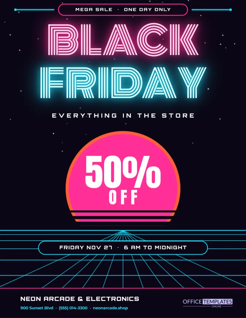
Synthwave art usually has a night sky, a huge sun striped by horizontal bands, a glowing grid floor that disappears to a point on the horizon, and lettering that looks like neon tubes. The flyer uses every one of these ideas, drawn from editable shapes, so the colours and positions can be changed in the editor.
Neon Letters in Pink and Cyan
BLACK is set in pink and FRIDAY in cyan, both in Monoton, a font made of parallel lines that looks like bent glass tubing. Each word is drawn twice, once with a wide soft glow and once with a tighter core, which gives the impression of light bleeding into the dark. Below them, EVERYTHING IN THE STORE is spaced out in Orbitron.
The Striped Sunset Behind the Offer
A pink disc with an orange rim sits in the middle of the page. Dark horizontal bars cut across its lower half, getting thicker toward the horizon. The offer, 50% OFF, sits on the sun in heavy white letters with a deep shadow. It is the brightest point on the page, so the discount is the first thing people read after the title.
The Perspective Grid Floor
Below the horizon, cyan lines run toward a vanishing point while horizontal lines get closer together near the horizon. A rounded pill sits on the grid with the date and hours: FRIDAY NOV 27, 6 AM TO MIDNIGHT. Because the grid is made of separate lines, you can delete some for a lighter look or recolour them to match your brand.
What the Neon Flyer Contains
| Element | Sample content | Font or colour |
|---|---|---|
| Title | BLACK FRIDAY | Monoton in pink and cyan |
| Subtitle | EVERYTHING IN THE STORE | Orbitron in white |
| Offer | 50% OFF | Anton in white on the sun |
| Date pill | FRIDAY NOV 27, 6 AM TO MIDNIGHT | Orbitron in white |
| Footer | NEON ARCADE & ELECTRONICS | Orbitron with cyan details |
Shops That Suit a Neon Black Friday Flyer
The style fits places with a playful, evening or entertainment feel: video game stores, electronics outlets, vinyl shops, vape lounges, cinemas, bowling alleys and bars running late deals. It also works for online stores aimed at younger customers. For a formal brand, the editorial or Swiss flyers in this collection are a better fit.
Editing the Neon Flyer
- Retype BLACK and FRIDAY only if you need another language; otherwise keep them.
- Change 50% OFF to your real headline discount.
- Edit the date pill with your opening hours.
- Replace the store name and contact line in the footer.
- Download as PDF for print or PNG for social media.
Keeping the Glow Readable
Glows look best on dark backgrounds. If you lighten the page, the neon effect will disappear, and the text will look blurred. Keep the background near black, keep text short, and avoid adding long paragraphs. The power of this flyer comes from a few glowing words, not from detail.
Printing a Dark Neon Flyer
Dark backgrounds use a lot of toner and can show banding on cheap printers. For a handful of copies, a good inkjet on glossy paper gives the deepest blacks and brightest pinks. For larger runs, ask a print shop for a rich black. Printed glows look softer than on screen, so check one proof before printing many.
Posting the Neon Flyer on Social Media
This design looks its best on phones, where the screen itself glows. Export it as a PNG and post it on the evening before the sale. The dark background makes it stand out in a feed full of white product photos. Crop it to a square for a grid post if you want, keeping the sun and the title in frame.
Pairing the Flyer With an In-Store Atmosphere
If you have neon signs, LED strips, or a playlist of synth music, use them on the day. When the store matches the flyer, the event feels thought through, and customers are more likely to share photos. Even a single pink and cyan light near the entrance makes the connection.
Adding a Second Offer Without Breaking the Mood
If you need to mention another deal, such as a free game with every console, add it as a second pill on the grid below the date. Keep the same rounded shape and cyan outline so it looks like part of the scene. Avoid boxes with white backgrounds, which would break the nighttime atmosphere.
Using the Synthwave Flyer for Late Night Events
The night sky and glowing grid make this layout a natural fit for evening events, such as a midnight launch or a late opening on Thanksgiving night. Change the date pill to the evening hours and mention music, snacks, or a countdown. The flyer then promotes an experience as well as a discount.
Making the Neon Flyer Accessible
Glowing letters are dramatic, but some readers find them harder to read. Keep the most important facts- the date, the discount, and the address- in plain white text with good contrast, as the template does. Use the neon style for the title only.
Checking the Neon Flyer at Small Sizes
Social feeds often show images at thumbnail size. Before you post, shrink the flyer on your screen and check that BLACK FRIDAY, the discount, and the date are still readable. If the date pill becomes too small, enlarge it slightly or shorten the text, so the key facts survive the trip into a busy feed.
Neon Synthwave Flyer Questions
Can I change the neon colours?
Yes. Change the text colour and the glow colour together so the light matches the letters.
Is Monoton easy to read?
At large sizes, yes. Keep it for the title only and use a simpler font for details.
Can I add product photos?
The layout has none by design. Use the doorbuster or tech deals flyers if you need product pictures.