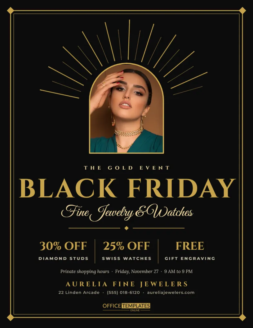
Jewelers, watch shops, and luxury boutiques face a dilemma every November. They want to join Black Friday, but bright red sale graphics can make fine products look cheap. This Art Deco flyer solves that. It borrows the glamour of the 1920s, with gold sunbursts, fine double frames, and classical lettering, so a discount feels like an invitation to a private event instead of a clearance.
The Art Deco Look Explained
Art Deco design loves symmetry, geometry, and metallic accents. Typical motifs include radiating sunbursts, stepped frames, arches, and tall capital letters. This flyer uses all of them in a restrained way: a gold frame around the page, small diamond corners, rays fanning out from behind an arched window, and a title in Cinzel, a typeface based on Roman inscriptions.
The Gold Sunburst and Arched Photo
At the top of the page, thin gold rays fan out in two lengths, alternating long and short, like the light from a stage. In the centre sits an arched photo slot with a gold outline. Place a close-up of a ring, a necklace on a velvet stand, or a watch face here. The arch shape frames a single object beautifully and reinforces the vintage feel.
Cinzel Title and Script Subtitle
THE GOLD EVENT appears in small-spaced capitals, then BLACK FRIDAY in large gold Cinzel. Beneath it, Fine Jewelry and Watches is written in Great Vibes, an elegant script. The contrast between engraved capitals and flowing handwriting is a classic jewelry store pairing, and it works equally well for perfume, leather goods, or champagne.
Three Offer Columns
| Offer | Category |
|---|---|
| 30% OFF | Diamond studs |
| 25% OFF | Swiss watches |
| FREE | Gift engraving |
The columns are separated by thin gold rules. Each has a large gold figure and a small spaced label underneath. A free service, like engraving, sits comfortably alongside discounts and adds value without cutting prices.
Private Shopping Hours
A line of italic text under the offers reads Private shopping hours, Friday, November 27, 9 AM to 9 PM. Calling the event private shopping, even when the doors are open to everyone, makes customers feel welcome rather than rushed. You might also offer appointments, champagne, or a personal stylist, and mention it here.
Why Restraint Sells Luxury
Luxury customers are often wary of deep discounts because they worry the product is not genuine or not current. Modest, clearly stated reductions on specific categories feel more credible than a giant percentage. The flyer keeps the numbers small and the presentation rich, which protects the perceived value of your brand.
Editing the Deco Flyer
- Replace the arched photo with a close-up of your hero piece.
- Change the three offers and their categories.
- Edit the date and hours line.
- Retype the store name, address, and website.
- Keep the gold colour consistent if you adjust it.
Choosing the Right Gold
The template uses a warm antique gold, not a bright yellow. On screen, flat colours stand in for metallic ink, so choose a muted tone that suggests gold without looking mustard. If you print with a professional shop, ask about metallic gold ink or foil for the frame and title; it turns a flyer into a keepsake.
Photographing Jewelry for the Arch
Jewelry photographs best on dark velvet or black acrylic with a single soft light. Shoot slightly from above so the piece fills the arch, and leave a little dark space around it so it does not touch the gold outline. Reflections are part of the charm, but avoid harsh glare on stones.
Printing Black and Gold Flyers
A black background needs a rich black for depth, which a print shop can provide. At home, a photo inkjet on matte card gives the most elegant result. Thin gold lines can disappear on low-resolution printers, so check a proof and thicken the frame slightly if needed.
Using the Flyer as an Invitation
Because it looks like a formal invitation, this design works well posted or handed to existing clients. Add a short handwritten note on the back, such as We would love to see you on Friday, and it becomes a personal invitation to a sale. Loyal clients appreciate being asked first.
Matching the Flyer to Your Store Display
Echo the look in store with a simple black and gold sign at the entrance and gold ribbon on gift boxes. Customers who arrive with the flyer will see the same elegance in your window, which keeps the experience consistent from the first glance to the moment they leave.
Other Shops That Suit the Deco Style
Besides jewelry, the Art Deco look suits bars, hotels, perfume counters, bridal shops, cinemas, and anyone selling the feeling of an occasion. Swap the script line for your category and replace the photo. The sunburst and arch remain a striking frame for almost any single product.
Writing Offers That Respect the Brand
Luxury customers respond to precise, quiet language. Instead of HUGE SAVINGS, write 25% off selected Swiss watches or complimentary engraving on every gift. Mention the brands or materials if they matter to your clients. Short, exact phrases suit the Cinzel capitals and keep the elegant tone of the page intact.
Adding an Appointment Line to the Deco Flyer
Many jewelry clients prefer to shop with a consultant. A short line such as appointments available on request or reserve a private viewing invites them to book ahead. It also spreads visits across the day, so each client receives proper attention during the busiest weekend of the year.
Keeping Deco Details Crisp in Print
Fine gold lines and small capitals can soften on cheap paper. Print a proof, check the rays and the frame, and thicken any line that looks faint. Crisp details are what make Art Deco feel expensive, so it is worth a test sheet before a full print run.
Art Deco Jewelry Flyer Questions
Can I use a lighter background?
Yes. Try deep green or navy. Keep it dark so the gold still glows.
Can I replace the arch with a circle?
Yes, but the arch is part of the Deco style. A circle feels more modern.
Is the gold printed as metallic?
No. It is a flat colour. Metallic ink or foil is a print shop option.