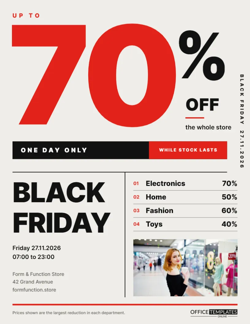
Swiss design, also called the International Typographic Style, is built on grids, clean sans serif type, and bold contrast. It has been used for decades by museums, airlines, and design brands because it is clear and confident. This Black Friday flyer applies those rules to a sale. A giant red 70 runs off the left edge of the page, a black percent sign sits beside it, and everything else follows a strict grid. The result is modern, calm, and impossible to ignore.
Principles of Swiss Typographic Design
Swiss design uses a visible structure: columns, rules, and alignments that the eye can follow. It prefers neutral typefaces, plenty of white space, and large type used as a graphic element. Decoration is kept to a minimum. In this flyer, the only illustration is the number itself, and every block of text lines up with a column.
The Giant 70 as the Main Graphic
The number 70 is set in Inter at an enormous size and cropped by the left edge. Cropping makes the number feel even bigger than the page, as if it could not be contained. A black percent sign completes it on the right. Next to it, small text reads UP TO and off the whole store, so the number is explained in a few words.
The Vertical Date Line
Along the right edge, BLACK FRIDAY 27.11.2026 runs vertically in small spaced capitals. Rotated text is a common Swiss detail. It adds information without taking space from the main grid, and it gives the page a sense of rhythm. Change the date format to the one your customers use, such as 11.27.2026 or November 27.
The Strict Grid Below
A horizontal black rule divides the page in two. In the lower half, a vertical rule splits the space into two columns. The left column carries BLACK FRIDAY in heavy stacked letters, then the date and opening hours, then the store name and website. The right column has a numbered list and a photo.
The Numbered Department List
| Number | Department | Largest reduction |
|---|---|---|
| 01 | Electronics | 70% |
| 02 | Home | 50% |
| 03 | Fashion | 60% |
| 04 | Toys | 40% |
Numbers are in red, department names in heavy black, and percentages aligned to the right edge, with thin rules between rows. A note at the bottom of the page explains that each figure is the largest reduction in that department.
Why Clarity Converts
A cluttered flyer forces readers to search for the important facts. A Swiss layout puts them in a predictable order: the discount, the event, the date, the place, the details. Readers understand the offer in a few seconds, which is exactly what a flyer pinned on a busy noticeboard needs.
Editing the Swiss Flyer
- Change the big number to your headline discount.
- Update the vertical date line.
- Retype the four departments and percentages.
- Replace the photo in the lower right.
- Edit the hours, store name, and website.
Changing the Big Number
Two-digit numbers fill the space best. If your maximum discount is a single digit or you prefer a phrase like BOGO, reduce the size and keep the crop on the left edge. The number is ordinary text, so it stays editable; select it and type a new value.
Colour Discipline
The palette is limited to warm grey paper, black and one red. Swiss design often uses a single accent colour, and that restraint makes the red feel powerful. If you change the red to your brand colour, keep it as the only accent, and resist adding more colours.
Choosing a Photo for a Minimal Layout
The square photo in the lower right should be simple: a single product on a plain background, or an architectural detail of your shop. Busy photos fight the grid. Black and white images also look excellent here and reinforce the graphic style.
Printing the Swiss Flyer
The design uses large areas of light background, which makes it economical to print at home. The big red number needs a printer that handles solid colour well. Print at actual size on US Letter, and consider a heavier matte stock for a gallery poster feel.
Using the Layout as a Poster
Because it relies on large type, this flyer scales up beautifully. Print it at tabloid or poster size for your window. The giant 70 is readable from the street, and the grid keeps the details organised even at a large size.
Brands That Suit the Swiss Look
Design stores, architecture practices, furniture shops, galleries, bike shops and modern fashion labels all fit this style. It suggests quality, precision and good taste. It is less suited to playful or traditional businesses, which might prefer the toy store or newspaper flyers in this collection.
Using White Space as a Design Element
The empty area between the big number and the grid is deliberate. White space gives the 70 room to breathe and makes the page feel calm and premium. Resist the urge to fill it with extra offers or decoration. If you need more information, add it to the department list, where it belongs in the grid.
Choosing a Single Accent Colour for the Swiss Flyer
Red is used for the number, the list numbers and the bottom rule, and nowhere else. If your brand colour is blue or green, apply it to the same three places. Keeping one accent colour is what gives Swiss layouts their clarity, so avoid adding a second highlight colour.
Translating the Swiss Flyer for Other Markets
The layout depends on short words and numbers, so it translates easily. Replace BLACK FRIDAY with the local name of the event if you need to, and adjust the date format in the vertical line. Because the grid holds everything in place, the page keeps its structure in any language.
Swiss Typographic Flyer Questions
Can I remove the photo?
Yes. Extend the department list or leave the space empty; white space is part of the style.
Which fonts work for this style?
Neutral sans serifs such as Inter, Helvetica-style fonts, or Work Sans.
Can the number go off the right edge instead?
Yes. Move the number and the percent sign, keeping the crop on one edge only.