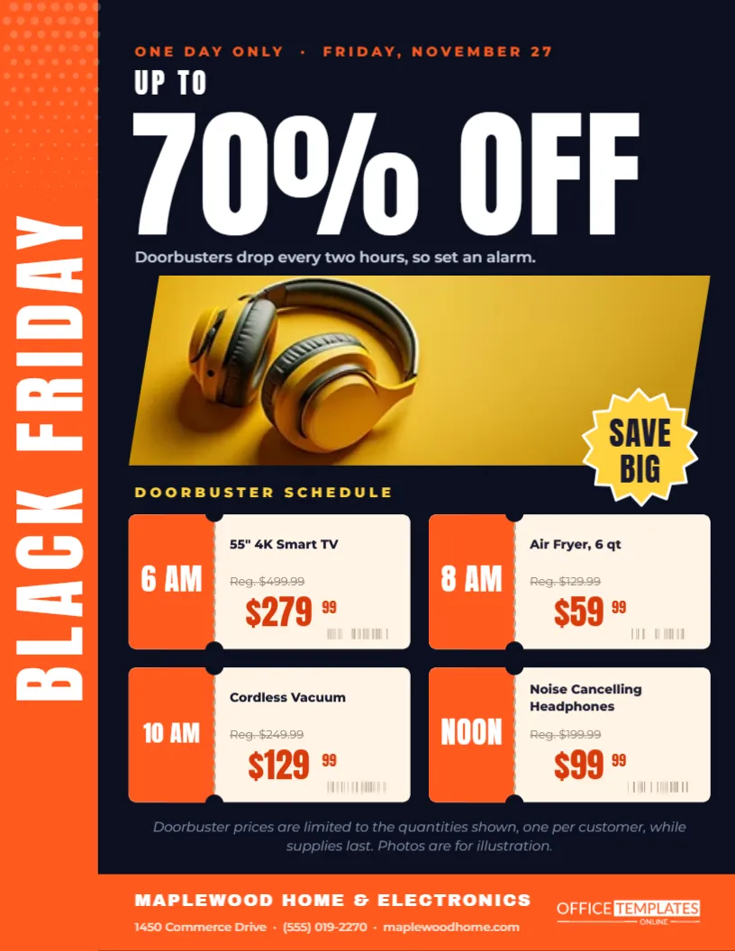
Not every Black Friday sale wants neon and exploding stars. A homeware boutique, an interiors shop, or a gift store often sells calm, considered things, and a loud flyer can feel out of place. This editorial flyer takes the quieter route. It looks like a page from a home magazine: warm paper, double rules, a large serif title and four neat product cards. The message is still a sale, but it is delivered with the same taste as the shop itself.
The Magazine Look of the Editorial Flyer
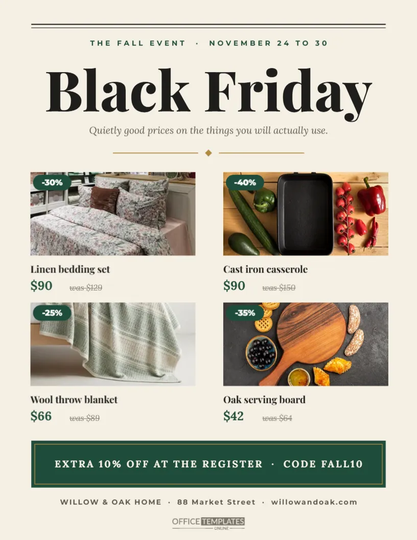
The background is a warm off-white, like uncoated paper. Two thin rules run across the top, followed by a spaced green line that reads THE FALL EVENT and the dates. The title Black Friday is set in Playfair Display at a large size, and a soft italic line in Lora sits beneath it: quietly good prices on the things you will actually use. A brass divider with a small diamond separates the header from the products.
Forest Green and Brass for a Considered Sale
Forest green feels natural and steady, and brass adds a little warmth without becoming flashy. Together they suit linen, wood, ceramics, candles and kitchenware. If your shop has its own colours, change the green of the pills and code band, and keep the paper background light so the photographs stand out.
Four Product Cards With Discount Pills
| Product | Discount | Sale price | Was |
|---|---|---|---|
| Linen bedding set | 30% | $90 | $129 |
| Cast iron casserole | 40% | $90 | $150 |
| Wool throw blanket | 25% | $66 | $89 |
| Oak serving board | 35% | $42 | $64 |
Each card has a landscape photo, a green pill with the percentage in the corner, the product name in Playfair Display, the sale price in green, and the old price struck through in italics.
Photographing Products for the Editorial Cards
Use photographs with soft natural light and a simple background, ideally from the same session so the four cards feel like a set. Shoot from the same angle for every product. A cluttered photo will undo the calm effect of the layout. Each slot is a real image shape, so Replace Image swaps the picture without changing the frame.
The Register Code Band
A deep green band near the bottom carries an extra offer: EXTRA 10% OFF AT THE REGISTER, CODE FALL10. A thin brass frame inside the band makes it feel like a printed card. Change the code to anything your till system recognises, or replace it with a different message such as gift wrapping or a loyalty bonus.
Writing Copy in an Editorial Voice
The tone of this flyer is conversational and modest. Instead of MEGA DEALS, the subtitle talks about things people will actually use. Keep that voice if you edit the text. Short, specific phrases such as hand-finished, small batch, or made to last suit the layout better than capital letters and exclamation marks.
Customising the Editorial Flyer Step by Step
- Change the event line and dates at the top.
- Retype the four product names, prices, and percentages.
- Replace each photo with your own product shot.
- Edit the code band with your real offer.
- Update the store line and download a PDF.
Showing Fewer or More Products
Four products give the page breathing room. If you only want to feature two, delete the lower cards and enlarge the upper ones. If you want six, duplicate a card and reduce the photo height. Keep the margins equal on both sides; a small amount of space is part of the editorial style.
Printing on Uncoated Paper
This design looks particularly good on uncoated or matte paper, which matches the off-white background. Print at actual size on US Letter. If you place copies in shopping bags, fold them once horizontally between the second row of products and the code band.
Using the Editorial Flyer Online
Save the page as an image for your newsletter or social posts. The calm layout works well in email, where readers are flooded with loud sale banners. Linking each product card to its page on your site turns the flyer into a simple shop window.
Matching the Editorial Flyer to In-Store Signs
Use the same green and brass on shelf tags and window signs, and repeat the Playfair Display title. When the flyer, the window, and the tags share a look, customers who arrive with the flyer in hand feel they have found the right place, and the sale feels deliberate rather than rushed.
Choosing Four Products That Tell One Story
The editorial layout works best when the four products feel related, as if they came from one room or one gift guide. Bedding, a throw, a casserole and a serving board together suggest a cosy winter home. Avoid mixing very different categories, such as a phone charger next to a linen set, because the page will lose its calm, curated feeling.
Adding a Gift Wrapping or Delivery Note
Many homeware purchases on Black Friday are gifts. A short line under the code band, such as complimentary gift wrapping on request or free local delivery over $100, answers a question people already have. Keep it in the same quiet tone as the rest of the page, and keep it short enough to fit on one line.
Keeping the Editorial Flyer Readable at a Glance
Even a calm design must be scanned in seconds. The large title, the four photographs, and the green prices are what the eye catches first. If you add text, keep it smaller than the product names, and never place copy over the photographs, so the page keeps its clear hierarchy.
Editorial Home Sale Flyer Questions
Is this design only for homeware?
No. It suits any shop with a refined style, such as bookshops, stationers or fashion boutiques.
Can I change the fonts?
Yes. Any serif with strong contrast keeps the editorial feel. Keep the body font simple.
Are the discount pills calculated?
No. They are typed text, so update the percentage when you change a price.