A Sales Card Has One Job: Get the Call Back
Sales representatives hand out more cards than almost anyone. They go to trade shows, meet buyers in lobbies and leave cards with receptionists who pass them on. A good sales card is easy to read in a second, easy to find in a pile and easy to act on. The phone number and email must be obvious, the name must be memorable, and the company must be clear. This design organises those items in a clean grid, with blue circles that look modern and trustworthy.
Circles, a Ringed Photo and a Tag
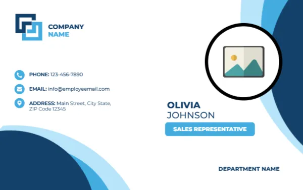
The card is 3.375 x 2.125 inches in landscape. The background is white. Large navy and light blue circles overlap along the right edge and the bottom left corner, like ripples in water. At the top left, a blue square logo with COMPANY NAME sits above a column of three small blue circular icons: a phone, an envelope and a map pin, each with a line of text in navy. On the right, a big round photo placeholder with a thick black ring sits at the top, and below it the name OLIVIA JOHNSON is set in navy capitals, with a light blue tag reading SALES REPRESENTATIVE. At the bottom right, DEPARTMENT NAME appears in bold navy.
The Order of Information a Buyer Needs
- Name, so they can remember who you are.
- Role, so they know who to ask for.
- Phone and email, so they can reach you.
- Company, so they can find you again.
This card puts the logo and contact lines together on the left and the person on the right, which makes it easy to scan from either side. If your territory is regional, add a line such as Northwest Region under the title.
A Direct Number Beats a Switchboard
For sales roles, always print a direct line or a mobile number, not just the main switchboard. Buyers call when they are ready, and an extra step may lose the sale. If you work with several time zones, add a second line with available hours, such as Mon to Fri, 8 to 5 Eastern. Replace the sample address with your office or leave it out if you travel for most of the week.
Add a Next Step on the Back
A card with only contact details does less than a card with a prompt. Duplicate the page in the editor and use the back for a short line: “Book a 15 minute demo,” with a QR code that links to your calendar. Another option is to print your most popular product or service in three bullet points. A buyer who flips the card over gets a reason to call.
Photo and Ring
The photo sits inside a thick black ring, which makes it stand out. Click the placeholder and choose Replace Image. A friendly, professional portrait with a smile suits sales, and a plain background makes it easy to see. If your company discourages photos on cards, delete the placeholder and move the name to the top.
Branding the Blue
The blue circles are part of the background art. If your company uses another colour, change the text colours to match and replace the logo block. Blue is a safe choice for finance, technology and professional services, where trust matters.
Printing for the Trade Show
Before a show, order more cards than you expect to need. Use 300 to 350 gsm stock with a matte finish, so that notes written on the back are legible. A letter sheet takes eight of them. Carry them in a slim case to keep the corners crisp.
For other cards in this style, see the remote worker name card and the executive name card. More are in ID cards.