Two Colour Bands for a Paper That Weighs Two Things
A compare and contrast paper looks at two subjects side by side. The two toned navy and teal bands on this cover echo that idea, and the heading COMPARE & CONTRAST announces the paper type at once. It suits essays and research papers on two theories, two products, two periods or two policies.
Navy and Teal Slanted Bands
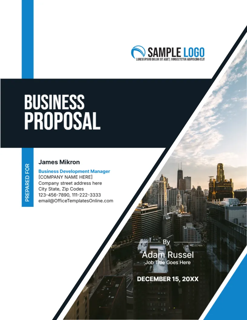
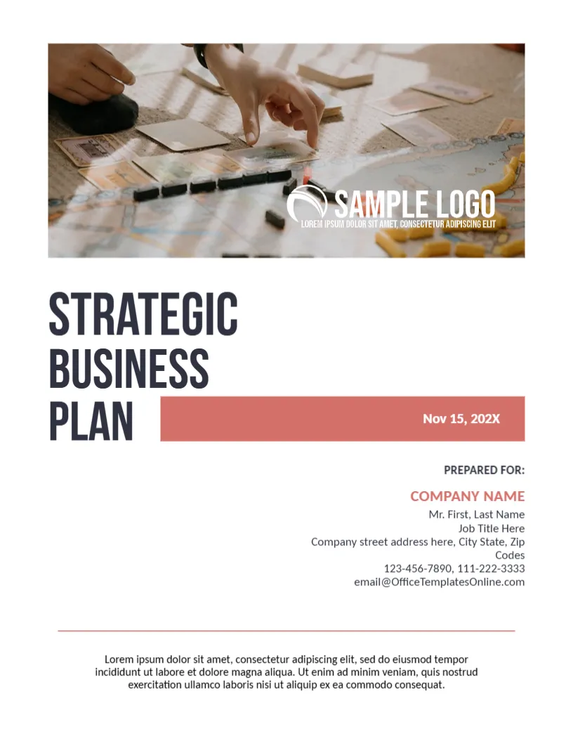
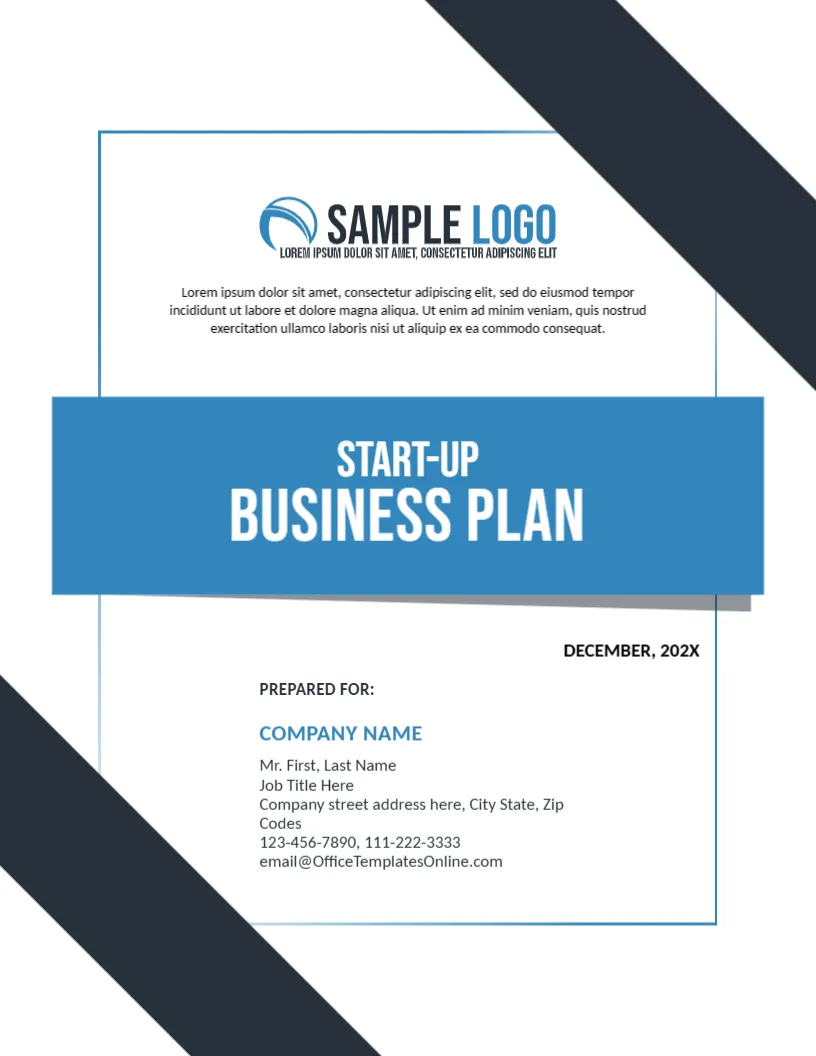
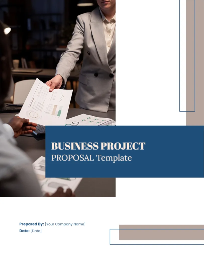
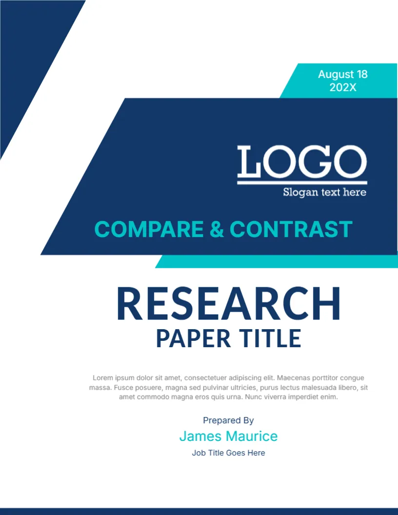
The page is 8.5 x 11 inches, portrait, one page. A slanted navy band holds the logo and the label, and a teal band edges it from below. A teal tab at the upper right carries the date, August 18 202X. A navy triangle in the upper left corner and a dark line at the foot frame the page. The bands are graphics.
Title Block and Author Line
The band reads COMPARE & CONTRAST in teal. Below it, RESEARCH is in large navy capitals and PAPER TITLE in a smaller size. A paragraph follows, then Prepared By, James Maurice in teal and Job Title Goes Here. A white LOGO with Slogan text here sits in the band. Replace the label with your two subjects if you prefer, for example Tea vs Coffee.
Ways to Organise a Compare and Contrast Paper
- Block method: all about A, then all about B.
- Point by point: compare A and B on each criterion.
- Choose three to five criteria.
- State a clear thesis about the main difference or similarity.
- End with what the comparison shows.
Choosing Fair Criteria
Compare the two subjects on the same points, such as cost, quality, history and effect. If you choose points that favour one subject, readers will notice. A fair comparison makes the final judgement more persuasive.
Using a Table Early
A small table of the main criteria with a short entry for each subject helps readers see the comparison at once. Put it near the start, then explain each point in the text.
Editing and Printing the Compare and Contrast Cover
The fonts are Inter and Carlito. Text edits freely. Print on 100 gsm paper in colour, or submit a PDF. The date tab is narrow, so keep the date short.
Finishing With a Judgement
A comparison is most useful when it ends with a conclusion. Say which subject is better for a particular purpose, or what the main difference teaches us. Readers should leave knowing more than the list of points.
Step by Step Editing of the Compare And Contrast Research Cover
- On the compare and contrast research cover, click the main title and type your own words, keeping the same style of capitals.
- Retype every name and contact line on the compare and contrast research cover, checking each spelling against an official source.
- Change the year or date on the compare and contrast research cover, then search the page for XX and for the word Lorem so that no placeholder remains.
- Click the logo or the photo on the compare and contrast research cover, choose Replace Image and resize the new picture until it fills its space.
- Zoom the compare and contrast research cover to full screen and read each line aloud, because spoken reading catches slips that silent reading misses.
- Keep a clean master of the compare and contrast research cover without your private details, so that later versions begin from a tidy copy.
Consider the analytical research paper cover. Similar designs include the definition research paper cover. Set it beside the research paper cover page. Every compare and contrast research style alternative sits in business and report cover pages.