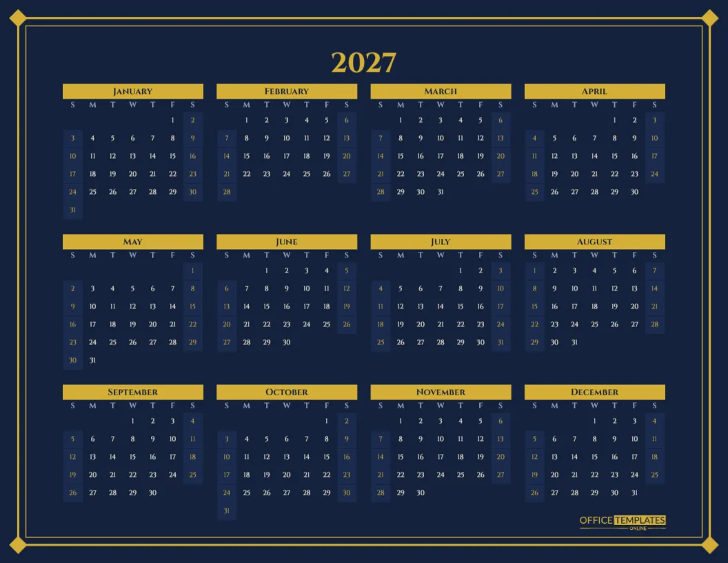
Picture a law office in early January. The new year planner goes up behind the reception desk, and instead of a cheap promotional poster, it is deep navy with gold detailing, framed like a piece of art. Clients notice it. Staff actually use it. That is the idea behind this calendar: a year planner elegant enough for a boardroom, a hotel lobby, or a smart home study, that still shows every date of 2027 at a glance.
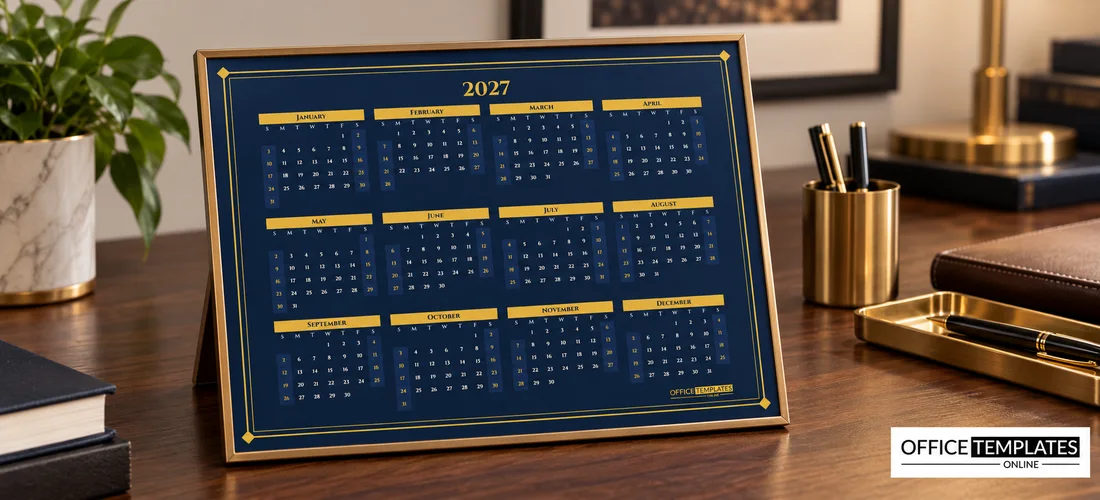
Where This Calendar Belongs
Not every space suits a bright, playful calendar. Some rooms call for something quieter and more refined. This design was made for them:
- Reception areas of law firms, clinics, agencies and consultancies.
- Executive offices and meeting rooms.
- Hotel front desks and guest lounges.
- Home studies with dark wood, leather or navy walls.
- Gift shops and stationers selling premium calendars.
Navy, Gold and Classical Lettering
The calendar is US Letter landscape, 11 x 8.5 inches. The whole page is a deep midnight navy. A double gold frame runs around the edge, a heavier line with a fine line just inside it, and small gold diamonds sit in all four corners. The title, 2027, is set in Cinzel, a classical Roman capital font with an engraved, monumental feel, in gold.
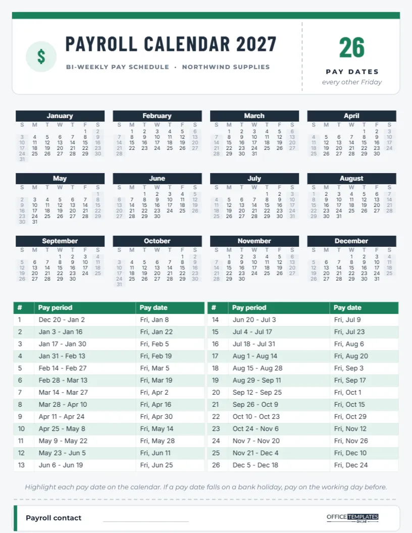
Below the title, the twelve months are laid out four across and three down. Each month has a solid gold bar with the month name in navy capitals, a row of weekday initials in soft blue-grey, and the cream dates. Weekends are set on a slightly lighter navy with gold numbers, which gives the grid a subtle rhythm without breaking the dark, calm look. The OTO logo sits in gold at the bottom centre.
The Year Behind the Gold
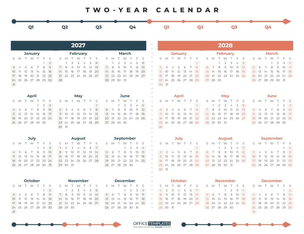
All twelve months are one Calendar object in the editor’s Full Year style. The dates are calculated, so they are always correct. Open Calendar Options to change the year, and every month rebuilds with the right dates while the 2027 title updates automatically. In the same panel, you can start the week on Monday, which many offices prefer, change the font, or adjust the colours of the month bars, weekends, and title.
Making It a Business Gift
A well-designed year calendar is one of the few corporate gifts people keep all year. To turn this design into a client gift:
- Add your company name or logo below the title in gold.
- Add your phone number and website in small cream type at the bottom.
- Print on heavy matte card, ideally with gold foil on the frame and title at a print shop.
- Pack each calendar in a navy envelope with a short handwritten note.
Because the design is understated, the branding feels like a courtesy rather than an advert, which is exactly why people hang it up.
Alternative Colour Pairings
| Background | Accent | Mood |
|---|---|---|
| Midnight navy | Gold | Classic, executive (as designed) |
| Charcoal black | Champagne | Modern luxury |
| Forest green | Brass | Heritage, library |
| Burgundy | Rose gold | Warm, hospitable |
| Ivory | Navy | Light and formal |
To switch, select the background and frame and recolour them, then change the month bar, title and weekend colours in Calendar Options.
Marking Dates Without Spoiling the Design
Dark calendars need a different marking style. Ordinary ballpoint pens disappear on navy. Instead, use a gold or silver metallic paint pen, or white gel pen, to circle dates. Small round metallic stickers make tidy markers for events and holidays. If several people share the calendar, use a gold dot for company events and a silver dot for team holidays, and add a tiny key in the corner.
Framing for the Wall
This calendar looks its best framed. A simple black or gold frame with a cream mat turns it into a piece of decor. Frame it behind glass and mark dates on the glass with a fine dry-erase pen, so you can update plans without touching the print. At the end of the year, replace the print with next year’s version, using the same frame.
Printing Dark Designs Well
Large areas of navy need a good printer. Download the PDF and, for the best result, print at a print shop on heavy matte or silk card. Ask for a test print first, as dark blues can shift slightly between printers. On a home inkjet printer, choose a high-quality setting and let the page dry fully before handling. If you want to save ink for an office print run, switch the background to ivory and the month bars to navy for a light version of the same design.
A Planning Ritual for Busy Teams
An elegant calendar on the wall invites a better planning habit. Many small firms hold a short year-ahead meeting in the first week of January, standing in front of the calendar. Partners mark court dates, audits or busy seasons; staff mark their main holiday weeks; the office manager marks closures and training days. Everyone leaves with the same picture of the year, and the calendar becomes the reference point for every scheduling question that follows. Because the design is so calm, the coloured dots and metallic marks people add stand out clearly without making the wall look messy.
Pairing It with Monthly Pages
A year-at-a-glance calendar is perfect for the big picture, but daily appointments need more space. Many offices pair this framed year calendar with a simple monthly calendar on each desk. Use the same navy and gold colours on the monthly pages so the stationery feels like a set. The year calendar holds holidays and milestones; the monthly pages hold meetings and deadlines.
Year Calendar Notes from the Office
Can we add our logo?
Yes. Add your logo image in the editor and place it under the title or in a corner.
Will the gold print as real gold?
On a standard printer, it prints as a warm gold colour. For metallic gold, ask a print shop for gold foil.
Can the calendar start on Monday?
Yes. Set the week start in Calendar Options.
Can we make it bigger?
The design scales cleanly to tabloid (11 x 17 inches) or poster sizes at a print shop.
Print it on good card, frame it, and let 2027 hang in gold.