In a season of flashing banners and shouting headlines, the quietest poster in the street can be the one people remember. Minimalism suits brands built on calm, good design: Scandinavian homeware, independent fashion, ceramic studios, specialty coffee, and architecture-minded shops. This 12 x 18 inch poster says Black Friday with one black circle, one number, and plenty of space.
The Minimalist Poster Composition
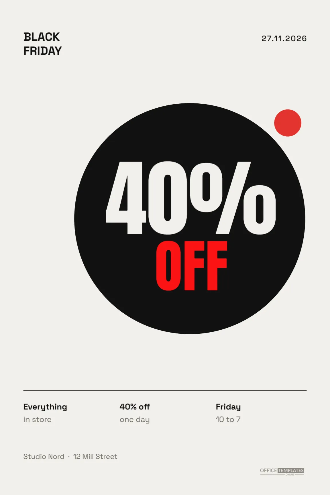
The poster is 12 x 18 inches, portrait, on a warm off-white background that feels like quality paper. In the top left corner, BLACK and FRIDAY are stacked in small bold Space Grotesk, a modern geometric font. In the top right, the date appears as 27.11.2026, in the day-month-year order used across much of Europe.
The centre of the poster is a large solid black circle, slightly offset to the right. Inside it, -40% is written in a light, thin weight of Space Grotesk, in the same off-white as the paper. A small red dot sits outside the circle at the upper right, the only colour on the page, like a full stop or a sticker on a gallery label.
Near the bottom, a hairline rule runs across the page, with three neat columns below it: Everything, in store,40% off, one day and Friday, 10 to 7. The shop name, Studio Nord in the sample, sits beneath in grey, and the brand mark is in the bottom right.
Principles Behind Minimal Sale Design
- One focal point. The black circle and the number are all the eye needs.
- Space as a material. The empty paper is what makes the circle feel strong.
- Restraint in colour. A single red dot is more noticeable than a page of red.
- Small, precise type. Details are tiny but perfectly aligned, which signals care.
Editing the Minimalist Black Friday Text
Click -40% to change the discount. A thin font weight keeps the minimal feel; avoid switching to a heavy weight. Edit the date in the top right to match your format; US shops may prefer 11.27.2026. Update the three footer columns with what is included, the discount, and the hours, keeping each to two short lines.
Choosing a Shape for Your Brand
The circle is simple and friendly, but other shapes carry different meanings:
| Shape | Feeling | Suits |
|---|---|---|
| Circle | Calm, complete | Homeware, ceramics, cafes |
| Square | Solid, architectural | Furniture, design studios |
| Tall rectangle | Elegant, upright | Fashion, perfume |
| Half circle | Sunrise, new beginning | Wellness, beauty |
Replace the circle with another shape from the Elements panel, keep it black and centre the number inside.
The Role of the Red Dot
In galleries, a small red dot next to an artwork means it has been sold. Here it adds a touch of wit and a single point of colour. You can move it, recolour it to your brand colour, or turn it into a tiny label, but keep it small. Its power comes from being the only colour on the page.
Printing a Minimal Poster Well
Minimal designs show every flaw, so print quality matters. Use an uncoated, slightly textured paper for a natural feel, and ask for a rich black for the circle. Check that the thin lines and small text print crisply. Hang the poster in a simple wooden or aluminium frame, with space around it on the wall.
Minimalism and Honest Discounts
A minimal poster suits a minimal offer: one clear discount on everything, with no complicated conditions. If your offer has several tiers or exclusions, explain them at the till or on your website rather than adding them to the poster. Customers who are drawn in by the calm design will appreciate straightforward pricing too.
A Matching Minimal Social Post
The design adapts beautifully to Instagram. Change the canvas to 1080 x 1350 pixels, keep the circle and number, and move the stacked title and date to the top corners. A series of minimal posts, one each day of the weekend with a different shape, makes an elegant campaign.
Changing the Background Tone
The off-white background is warm, like natural paper. You can try pale grey for a cooler feel, light sand for an earthy brand, or even black with a white circle for a dramatic reverse. If you invert the colours, change the number to black and keep the red dot.
Minimal Window Display Ideas
Pair the poster with an equally minimal window: one product on a plinth, a single plant or a stack of your best-selling items. Avoid filling the window with sale signs. The contrast with busier shops nearby will make passers-by stop and look.
Black Friday Without the Noise
Some brands choose to opt out of Black Friday discounts entirely, offering instead a donation to charity or a repair service. The poster works for those campaigns too: replace -40% with a short word such as Repair or Give, and use the footer columns to explain the idea.
Aligning Everything on the Minimal Poster
Minimal design depends on precise alignment, because there is nothing to hide small errors. The stacked title and the footer columns share the same left margin, and the date lines up with the right margin. When you edit, use the editor’s alignment guides to keep these edges exact. Check spacing too: the gaps between the footer columns should be equal. These details are invisible when they are right and obvious when they are wrong, which is why careful alignment makes a simple poster look expensive.
Minimalist Poster Questions
Can I use my brand font?
If your brand font is a Google Font, yes. Clean geometric sans serifs suit the design best.
Is 12 x 18 inches a standard frame size?
Yes. Frames in this size are easy to find, and the poster also scales to 18 x 24 inches.
Can I add a product photo?
Place a photo inside the circle instead of the number for a gallery-style poster, and move the discount to the footer.
Sometimes the strongest message is the simplest. Set your number, choose your shape, and let this poster bring a moment of calm to Black Friday.