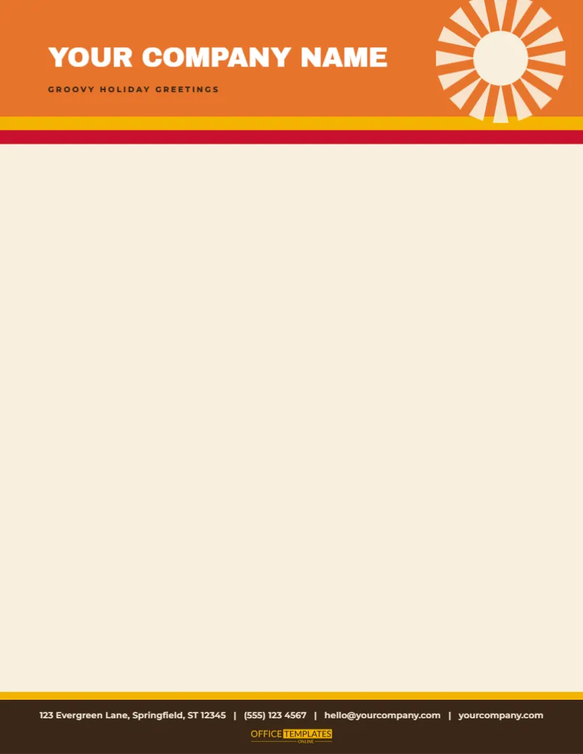
The mid-century Christmas was bright, optimistic and a little space-age, and this letterhead brings it back in bold colour. An orange block spans the top of a warm cream sheet, with a mustard stripe and a red stripe along its lower edge, and a starburst of sixteen cream rays at the upper right. YOUR COMPANY NAME stands in bold white capitals with GROOVY HOLIDAY GREETINGS in dark brown. At the foot, a mustard stripe tops a dark brown band that carries the contact line in cream, with the small OTO mark in mustard.
Stripes as a Frame
Mid-century graphic design loved bands of flat colour, and here three bands act as a frame for the entire page. They are each about a seventh of an inch deep, so they are slim and elegant rather than heavy. The top set runs orange, mustard, teal from the edge inward, and the bottom set runs teal, mustard, orange, which mirrors the pattern. The result is a balanced, cheerful page that leaves lots of room for your text.
The Atomic Starburst
The starburst is a group of twelve short orange lines radiating from a centre, at thirty-degree intervals, with a four-pointed teal sparkle in the middle. It is typical of the mid-century taste for stars, boomerangs and atoms. Because it is made of simple lines and one polygon, it prints crisply, and you can scale, recolour, or rotate it. A larger burst makes a bolder header, and a smaller one leaves more room for a long name.
| Part | Colour | Position |
|---|---|---|
| Top stripes | Orange, mustard, teal | Upper edge, 0.14 inch each |
| Starburst | Orange rays, teal centre | Top left, 1 inch across |
| Company name | Teal Pacifico script | Beside the burst, 26 point |
| Bottom stripes | Teal, mustard, orange | Lower edge, mirrored |
Script Lettering With a Retro Flair
The name is set in heavy white capitals on the orange block, with a short dark brown line of text beneath it. The stripes and the starburst echo the colours of the mid-century. Keep both lines short, and avoid setting a long phrase in the header. If your name is long, reduce the size to twenty points or move it to two lines. The warm cream page makes the colours glow.
Printing Bold Flat Colours
Orange and teal are strong colours that can print unevenly on some inkjets. Use the best quality setting and a smooth matte paper, and let the sheet dry flat. If your printer leaves a white edge at the bottom, the lower stripes may need to move up a quarter inch. A laser printer or a print shop will handle the full-width bands neatly.
Laying Out the Retro Letter
- Begin the text roughly two inches below the top stripes.
- Use a clean sans serif font in dark brown or black ink.
- Leave one inch above the contact line.
- Choose a friendly, upbeat tone to match the design.
- Sign with a brush pen in teal for a stylish touch.
Who Might Pick the Retro Sheet
- Vintage shops, record stores, and retro diners.
- Design studios, architects and furniture makers.
- Cocktail bars and event hosts planning a mid-century party.
- Schools and clubs with a lively, creative character.
- Anyone who finds traditional red and green too predictable.
Questions About the Retro Letterhead
Can I change the colours to pink and aqua?
Yes. Select the stripes and the starburst and choose new fills.
Which fonts are used?
On the retro starburst stripe letterhead sheet, Archivo Black sets the company name, and Montserrat sets the tagline and the contact line.
Can I remove the lower stripes?
Yes. Select them and press Delete, keeping only the top set.
Does it suit A4?
Yes. Resize the page and stretch the stripes to the width.
A Mid Century Mailing Set
The retro mid-century starburst gift tags and the retro atomic starbursts wrapping paper in this collection use the same stars and colours. Send a letter on this sheet with a parcel wrapped in the paper and tagged with a starburst, and your customer receives a set that looks like it came from a 1958 catalogue.
Using the Sheet for Party Invitations
A retro-themed party calls for a retro invitation. Print the letterhead, write the party details in the body, and send it in a cream envelope with a teal seal. The starburst and the stripes announce the theme before the invitation is read. It is a quick way to make a themed event feel planned.
Writing in an Upbeat Voice
A retro design invites a lively tone. Write in the same spirit as a mid-century advertisement: friendly, direct, and a little bit playful. Greet the reader by name, give them the news in a sentence or two, and end with an invitation. Avoid heavy jargon. A touch of humour suits the design, but make sure the key facts, such as dates and prices, are crystal clear.
A Letterhead for Vintage and Antique Sellers
Dealers in vintage furniture, records, clothing and kitchenware can use this sheet for catalogues, auction notices and customer letters. The starburst and stripes echo the pieces they sell. Add a list of items in a table with columns for a description, a date, and a price. The sheet turns a simple price list into a charming mid-century brochure.
Pairing the Stripes With Real Props
For a party or a shop window, print a few spare sheets and cut the stripes into bunting flags or table runners. Add a few real atomic stars cut from card. The retro look is easy to extend into a whole display, and the letterhead becomes a design brief for the room.
Choosing Paper for Bold Stripes
Heavier paper of about thirty pounds keeps the stripes flat, and stops show through on double-sided prints. A matte-coated stock gives the most vivid orange and teal. If you want a vintage feel, a lightly toned cream paper makes the colours look softer. Always test a single sheet before you commit to a large run.