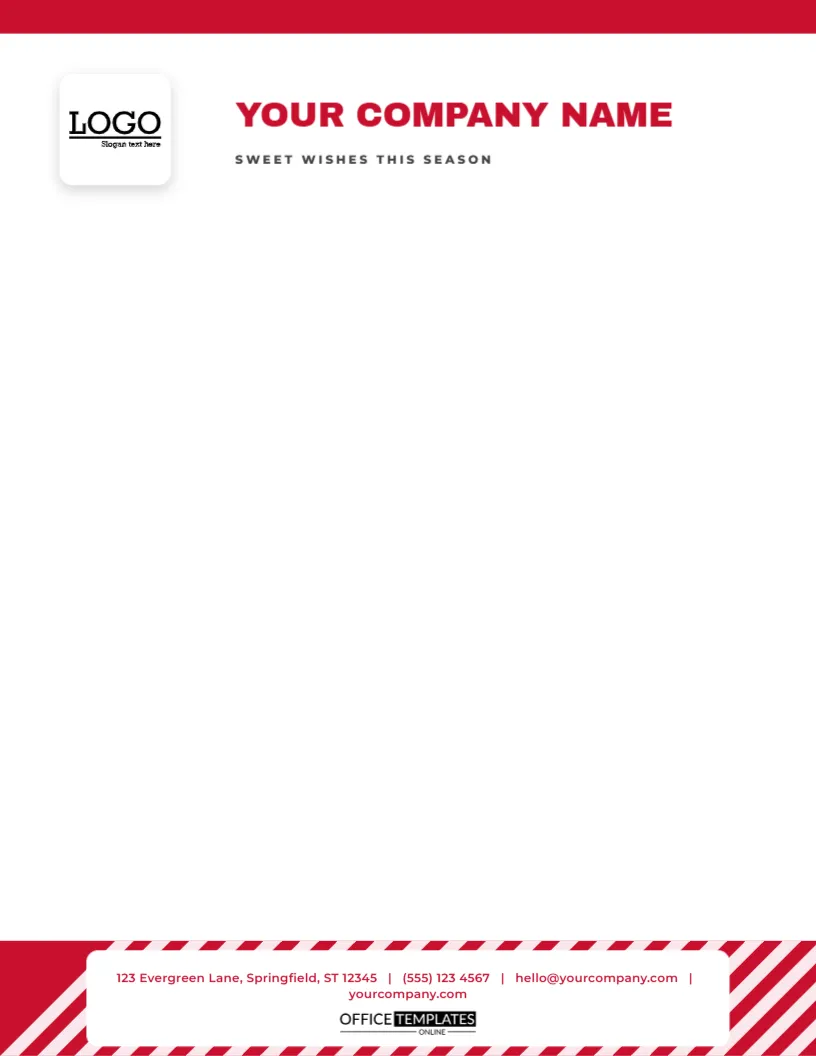
Some letterheads begin with a flourish at the top. This one saves its boldest move for the end. The upper part of the page is simple: a thin red strip, a white logo tile on the left and YOUR COMPANY NAME in bold red capitals beside it, with SWEET WISHES THIS SEASON in small tracked capitals beneath. Along the bottom runs a thick band of diagonal red and white stripes like a peppermint ribbon, with a white panel across it that holds the contact line, and the small OTO mark below. It is cheerful and uncluttered.
A Stripe at the Foot
A striped band at the bottom of a page acts like a frame for the whole letter. It also keeps the top of the page clean, so the first thing a reader sees is the company name and the opening line. The stripes are red parallelograms on a white ground, at a steep angle, about a third of an inch wide. They are grouped into one object, so you can recolour, resize, or move the whole band, or change the stripes to green for a different seasonal feel.
The Top Right Logo Slot
At the left of the header, a square logo tile holds a sample logo. Click it and choose Replace Image to swap in your own. The frame keeps its size, and your image is centred in it. A square logo works best. For a wide logo, widen the slot and move the name a little to the right. Because the slot is a pattern-filled shape and not a flat picture, it stays selectable and editable.
| Part | Position | Notes |
|---|---|---|
| Company name | Top left, red brush script, 28-point | Type your own name |
| Tagline | Under the name, small capitals | Replace with a slogan |
| Logo slot | Top right, 0.9-inch square | Replace Image keeps the frame |
| Stripe band | Bottom edge, 0.7 inch deep | Recolour or resize |
Contact Details Above the Band
The contact line sits just above the stripes, in small brown sans type, with address, telephone, email and website separated by bars. Retype each part with your own information. If your details are long, reduce the type by half a point or split them over two lines. The small OTO mark sits on the white band between the stripes, so it stays legible.
Typing a Cheerful Letter
- Open with a short, friendly sentence, since the design suggests a light tone.
- Keep the main message in two or three paragraphs.
- Use a clear sans or serif body font at ten or eleven points.
- Close with a thank you and a warm sign-off.
- Leave an inch of space above the contact line.
Who Might Use a Candy Cane Letterhead
Bakeries, sweet shops, ice cream parlours, dentists with a sense of humour, nurseries, children’s entertainers and cafes all suit a peppermint stripe. It also suits schools and clubs that send lively letters to families. The design is playful but tidy, so it works for a professional message as well.
Printing a Striped Band
Diagonal stripes need a good print to avoid jagged edges. Use the best quality and a smooth paper, and check the first sheet at arm’s length. If your printer cannot print to the bottom edge, move the band up by a quarter inch or accept a thin white margin below it. A laser printer or a print shop will give the sharpest stripes.
Questions About the Stripe Letterhead
Can I change the stripes to green?
Yes. Select the stripe group and choose a new colour.
Which fonts are used?
On the candy cane stripe footer letterhead sheet, Archivo Black sets the company name, and Montserrat sets the tagline and the contact line.
Can I move the band to the top?
Yes. Select it and drag it to the top, then move the name below it.
Does the template include a body area?
The body is blank, from just under the tagline to just above the contact line, so you can type or print on it.
Pairing With Peppermint Items
The candy cane stripe pennant gift tags, the candy cane stripe wrapping paper and the candy cane stripe treat cone in this collection share the same peppermint pattern. A letter on this sheet, a cone of sweets and a striped tag make a sweet set for a customer or a neighbour.
Reusing the Sheet After the Holidays
Remove the tagline and change the stripes to a brand colour, and the letterhead becomes a general-purpose sheet for the rest of the year. A striped foot is a friendly feature that suits many businesses, and the same layout serves a spring promotion with a few edits.
A Friendly Letter for Customers and Families
The peppermint band suggests a friendly voice, so write the way you would speak to a neighbour. Say thank you, share a piece of news, and give a clear next step. Add a small incentive, such as a seasonal discount, in a single sentence near the end. Keep it short enough to fit comfortably between the header and the stripes, with space to breathe.
Choosing Stripe Colours for Your Brand
Red and white is the classic combination, but you can match your own colours. A shop with a navy brand might use navy and white; a florist might use pink and white. Select the stripe group and choose a new colour, then check that the contact line above it still reads clearly. A branded stripe turns the letterhead into a year-round design.
A Letterhead for Bakeries and Sweet Shops
A bakery or a sweet shop can use the peppermint foot as a trademark. Use the sheet for order confirmations, price lists, and seasonal offers, and print a short list of festive products in a table. The stripes suggest candy at once, so the customer connects the letter with the shop before reading it. Add a hand-signed note at the foot of important letters.
Printing on Coloured or Cream Paper
On cream paper, the white stripes will print as the paper colour. This gives a softer, vintage look. Try a test sheet on your chosen stock. If you prefer crisp white, use bright white paper, and the red stripes will look more vivid. The choice is a matter of mood, and either works well.