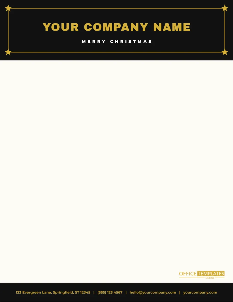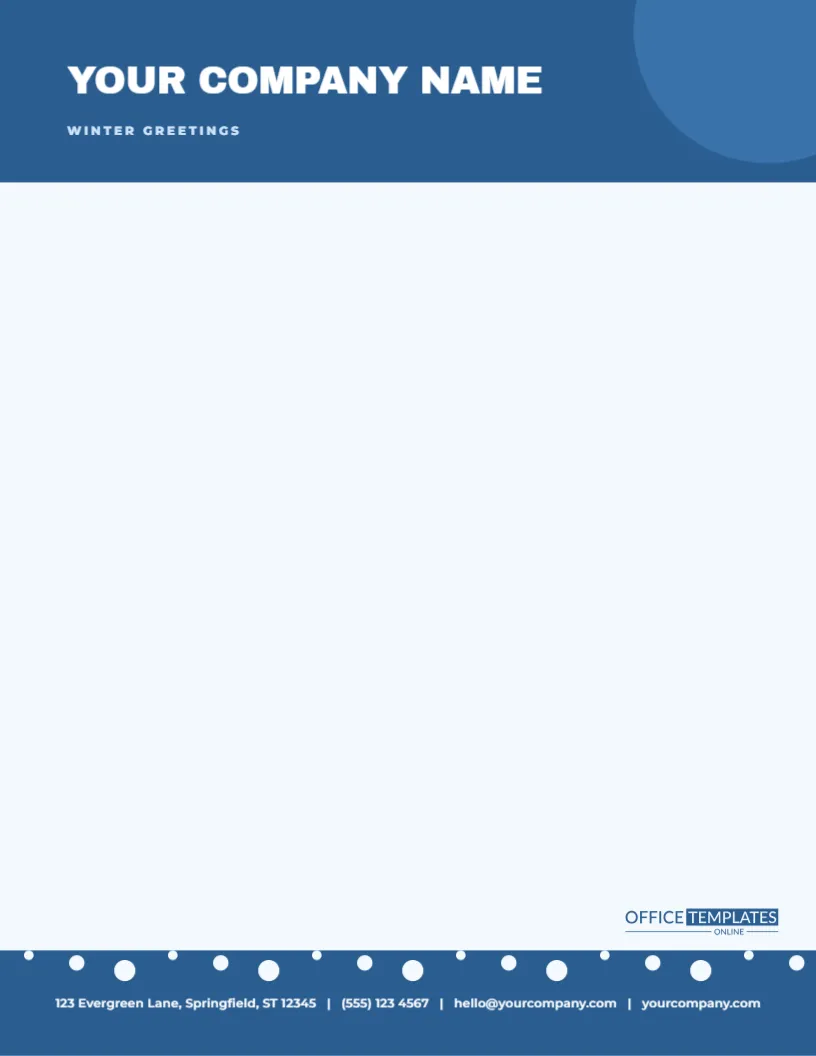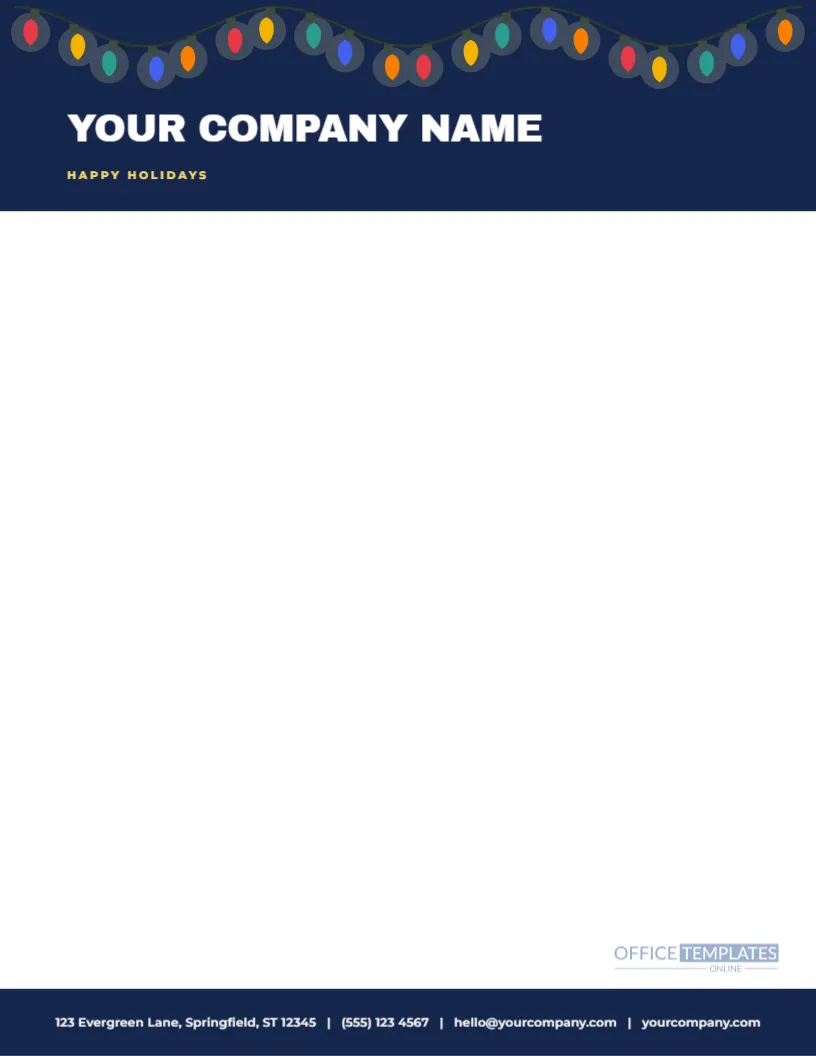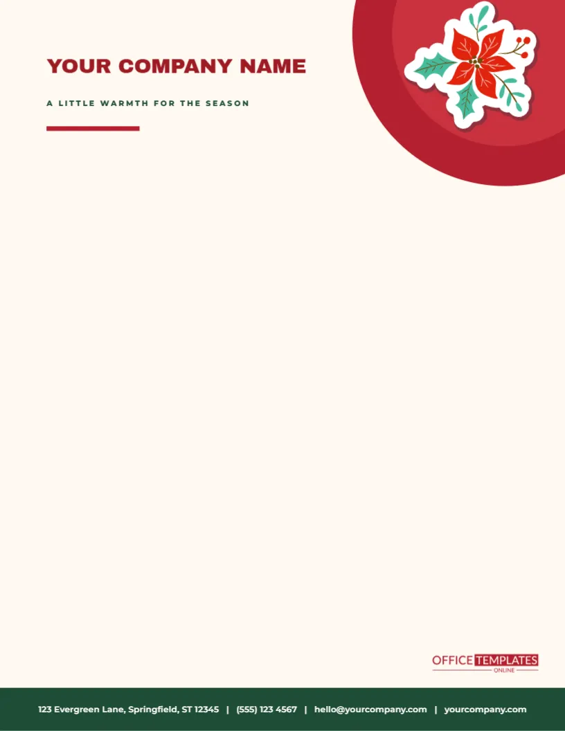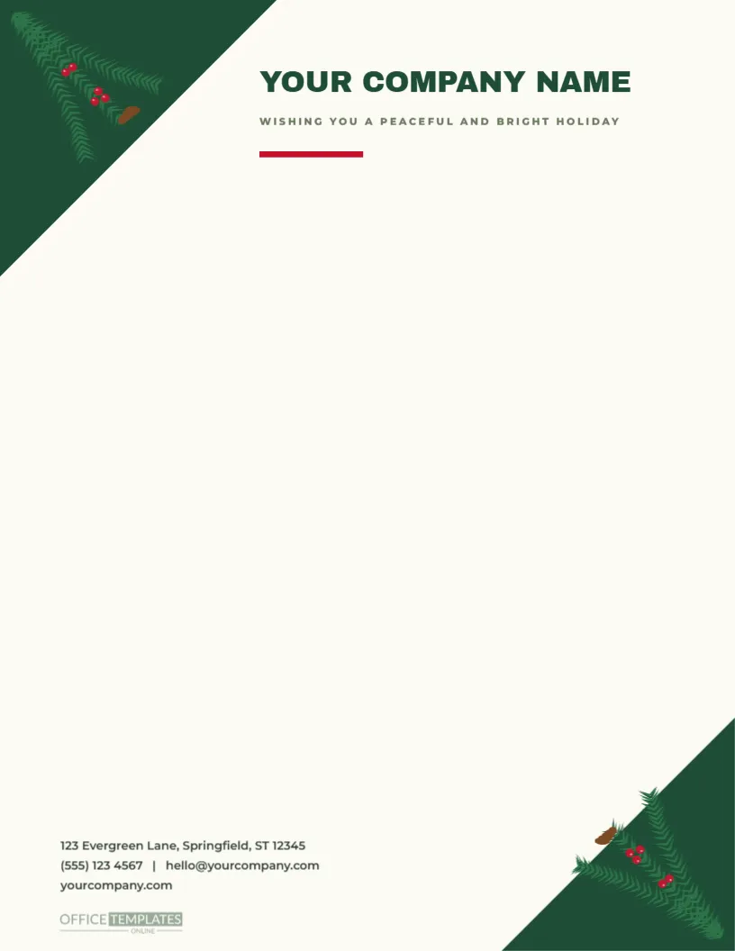
Two corners of fir give this letterhead its frame. A deep green triangle fills the top left corner, with a branch of needles and red berries laid across it, and a second triangle and branch fill the bottom right, so the sheet reads as a diagonal. Between them, YOUR COMPANY NAME sits in bold forest green capitals with WISHING YOU A PEACEFUL AND BRIGHT HOLIDAY in small tracked capitals and a short red bar beneath it. The contact block sits at the lower left on a pale cream page, and the body of the sheet is left clear.
A Diagonal Frame
Placing decoration at opposite corners creates a diagonal line across the page, which the eye follows from the top left to the bottom right. This keeps the centre of the sheet open for your letter while still giving the page a sense of being framed. The branches are about two inches across, so they take little space, and the contact block sits to the left of the lower branch, balancing it at the bottom of the page.
The Fir Branch Artwork
Each branch is a vector illustration with three sprigs of needles fanning from the corner, a small cluster of red berries, and a brown pine cone. The bottom right branch is the same artwork rotated by a hundred and eighty degrees. Because it is vector, you can recolour the greens, scale the branch, or ungroup it to remove the cone. If your brand uses a different colour, recolour the needles to a blue-green or a grey-green for a frosted effect.
| Part | Position | Notes |
|---|---|---|
| Top left branch | Upper corner, about 1.9 inches | Fans toward the centre |
| Bottom right branch | Lower corner, rotated 180 degrees | Mirrors the first |
| Company name | Starts 2.3 inches from the left | 24-point Cormorant serif |
| Contact block | Bottom left, three lines | 9-point sans |
The Name and the Seasonal Line
The name is set in a heavy display face in capitals, which reads clearly even at a distance. The tagline beneath is a small tracked line, and a short red bar sits under both. You can change them: replace the seasonal line with a tagline, a short slogan, or the name of a department. A short line works best, since the space to the right of the top triangle is limited. If your name is long, reduce its size or move it a little lower.
How to Set Up Your Letter
- Start the date about two and a quarter inches from the top.
- Keep the left margin at one inch, since the branch only occupies the corner.
- Stop the text about one and a half inches above the contact block.
- Avoid placing the signature block close to the lower branch.
Printing Fir Green Without Muddiness
Dark greens can print too blue or too grey on some printers. Test one sheet and compare it with the screen. If the greens look flat, boost the saturation by a few points. A laser printer reproduces the fine needles cleanly, and an inkjet will do well on a smooth matte paper. Because the branches are small, ink consumption is low.
Where This Letterhead Fits
It suits landscapers, garden centres, tree farms, woodworkers, eco-friendly shops, outdoor clubs and anyone connected to nature. It also suits solicitors and accountants who want a restrained seasonal letter, since the design is quiet and refined. Churches and community groups can use it for newsletters and event letters. The green palette feels fresh without being loud.
Questions About the Branch Letterhead
Can I use only one branch?
Yes. Select the second branch and delete it.
Which fonts are used?
On the evergreen corner branches letterhead sheet, Archivo Black sets the company name, and Montserrat sets the tagline and the contact line.
Can I add my logo?
Yes. Place an image beside the name or in the free corner next to the contact block.
Can I print it on recycled paper?
Yes. Recycled cream paper suits the natural theme.
Pairing With the Pine Collection
The watercolor pine sprig gift tags, the fresh pine sprig wrapping paper, and the evergreen wreath tags in this collection share the same botanical mood. A parcel wrapped in pine paper, tagged with a sprig and accompanied by a letter on this letterhead looks like a single, thoughtful package.
Sustainable Stationery Tips
Print only as many sheets as you need, use both sides for drafts, and recycle any misprints. Choose paper from certified sources, and avoid heavy ink coverage. A letterhead that is mostly white with two small branches is already economical, and it sends a message of care for the environment that suits the design.
Writing a Letter in a Natural Voice
The fir branches suggest a quiet, natural tone, so write simply. Use short sentences and plain words, and avoid jargon. Begin with the reader’s name and a thank you, state your news in the second paragraph, and end with a warm wish for the season. Read it back, and cut anything that sounds like marketing language. A natural voice matches a natural design.
Printing Green Branches on a Budget
The two branches use little ink, so a hundred copies cost very little. If you print at home, use the standard quality setting on recycled cream paper. The branch colours stay rich on a lightly textured sheet. A short test page will show you whether the greens look natural. Keep a box of sheets ready for orders and replies throughout December.
Using the Letterhead for Garden and Landscape Quotes
A landscaper or a gardener can use the sheet to send quotations for winter tidying, tree work and spring planting. The branches introduce the trade without a word, and the blank body leaves room for a table of prices. A tidy quotation on a seasonal sheet looks more professional than a plain printout, and it encourages the customer to say yes. Keep spare sheets flat in a folder, because the diagonal branches look best on a page that has not been folded. Add a line of your own to the lower left block if you need a second address.