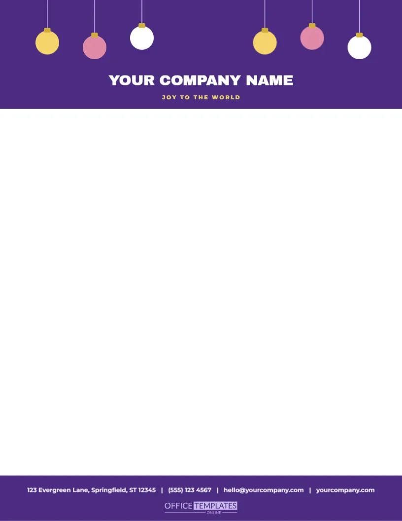
A row of baubles hanging from the top edge turns the top of the page into the top of a tree. A deep purple night block, two and a third inches tall, spans the top of a white sheet, and six glass ornaments in gold, pink, and white hang at different heights from fine threads, each with a small gold cap. Below them, YOUR COMPANY NAME sits centred in bold white capitals with JOY TO THE WORLD in gold. A purple band at the foot carries the contact line in white with the small OTO mark beneath.
Movement in a Static Header
Because the baubles hang at different lengths, the header has a sense of movement. The eye moves from one to the next, as if the ornaments were swinging gently. The effect is much livelier than a straight border, and it shows that a header can have rhythm. The strings are fine lines drawn behind the baubles, which give a realistic look.
Six Baubles, Four Colours
Each ornament is a circle in a single colour with a cap and a highlight. The colours are cranberry red, warm gold, pine green, navy blue, a second red and a second gold, arranged so that no neighbours match. The sizes vary slightly, from eight tenths to just over an inch. All the shapes are light vectors, which means you can recolour them to match your brand, shift their heights, or delete a few for a simpler header.
| Bauble | Colour | Position |
|---|---|---|
| First | Cranberry red | Far left, medium height |
| Second | Warm gold | Left, lowest |
| Third | Pine green | Left centre, highest |
| Fourth | Navy blue | Right centre, medium |
| Fifth | Cranberry red | Right, high |
| Sixth | Warm gold | Far right, lowest |
A Centred Name Below the Baubles
The company name is set in heavy white capitals at twenty-two points, centred below the lowest bauble. The gold tagline beneath it is a small tracked line that you can replace. If your name is long, reduce the size slightly. If you prefer a logo, delete the name and place it in the same position, on the purple block.
How to Set Out the Letter
- Begin the date about two and a half inches from the top.
- Use a centred or left-aligned address block, whichever you prefer.
- Choose a serif font for the body to match the name.
- Leave a clear inch above the contact line.
- Print in black or dark brown ink.
Who Might Choose This Letterhead
- Gift shops, department stores and florists.
- Event companies that supply decorations and lighting.
- Nurseries and primary schools writing to families.
- Hotels and restaurants announcing festive menus.
- Community groups organising seasonal fairs.
Printing Round Shapes Cleanly
Circles show any misalignment, so use the best print quality and a smooth paper. If the highlights look uneven, increase their opacity slightly. The strings are very thin lines and may be faint on some printers, so check them at arm’s length. A laser printer gives crisp lines. The baubles print vividly on bright white paper, and warmly on cream.
Questions About the Baubles Letterhead
Can I change the bauble colours to my brand?
Yes. Select each bauble and choose a new fill.
Which fonts are used?
On the hanging ornaments header letterhead sheet, Archivo Black sets the company name, and Montserrat sets the tagline and the contact line.
Can I add more baubles?
Yes. Duplicate any bauble and its string, and place it in the row.
Does the header fit A4?
Yes. Resize the page and spread the baubles across the new width.
Matching Bauble Items
The round ornament gift tags, the glass ornament wrapping paper, and the giant ornaments wrapping paper in this collection use the same baubles. A letter with a row of ornaments, a parcel in bauble paper, and a round tag make a cohesive package. A real glass bauble tied to the parcel makes the match complete.
Using the Header on Greeting Cards
Scale the page to a card size and print the header on the front of a fold-over card. The hanging baubles look just as good on a card as on a letter. Write a short message inside, and send it with the letter to a valued customer.
Writing a Letter Below the Baubles
The baubles occupy the top two inches, so begin the letter below them. A centred address block looks good under a centred name. Keep the opening cheerful, the middle clear and the close warm. If you list prices or dates, use a small table, which keeps the page tidy and gives the baubles their moment of attention without competing with dense text.
Printing Glossy Highlights
The soft white highlights on the baubles give them a glass look. They are semi-transparent, so they show best on a light, smooth paper. If they print too faint, raise their opacity in the editor, or add a second small highlight. A laser printer reproduces them cleanly, and a photo-quality inkjet setting will make them glow.
A Letterhead for Gift Shops and Decorators
Shops that sell decorations can print this sheet for price lists, order forms, and thank you notes. The baubles advertise the product, and customers keep the sheets near the tree. Add a short list of best sellers beneath the header, and the letter becomes a mini catalogue. It is a simple, effective way to keep your shop in mind through the season.
Spacing Baubles for a Natural Look
If you add more baubles, keep the gaps uneven and vary the heights, so the row looks hung by hand. Use only two or three colours in a small group to avoid a busy header. Move the strings so they stay vertical, and check that no bauble overlaps the company name. A little irregularity is the secret of a natural tree. Finally, check the finished letter in the envelope window if your mailing uses window envelopes, because a bauble can drift behind the glass. Keep the strings thin and grey so they stay delicate. Check the threads at arm’s length after printing, because fine lines can look faint on some printers.