Questions and Answers About the Snowy Night Village Envelope
What is the design?
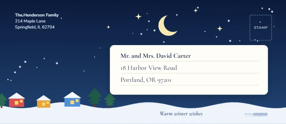
It is a winter night scene drawn across the full face of a #10 envelope, 9.5 by 4.125 inches. The sky is a gradient from very dark navy at the top to a lighter blue near the horizon. A pale yellow crescent moon hangs near the centre, four small stars sparkle around it and dozens of tiny snowflakes drift down the page. A rolling snow covered hill runs along the bottom edge, with three little houses in red, orange and blue, each with a snowy roof and glowing yellow windows. Two green pines stand to the right of the houses and a third peeks in from the left edge.
Where does the address go?
The recipient sits on a white rounded label in the centre right, so the text stays crisp against the dark sky. The sample reads Mr. and Mrs. David Carter with a street and city beneath it, each line on its own thin grey rule. The return address sits top left in white Nunito Sans type, and a dashed stamp box sits in the top right corner. Below the label, an italic line in dark blue reads Warm winter wishes, set on the pale snow in Cormorant Garamond.
Why a night scene for an envelope?
A dark envelope makes a strong first impression on a doormat. Most of the mail that arrives in December is white, cream or brown, and a deep blue envelope with a glowing village stands out. It also works well for people who send invitations to a winter party or a Christmas Eve gathering, since the colours suggest the evening itself.
How are the houses and snow built?
Every shape is a separate editable object. The houses are rectangles with triangle roofs and square windows, the hill is a single wavy polygon, and the snowflakes are tiny circles grouped together so they move as a single object. You can recolour a house, delete one or copy it to build a longer street. The pines are stacked triangles with a small trunk.
Can the colours change?
Yes. For a purple dusk, change the sky fill to a plum gradient and the house colours to warm pinks. For a daytime scene, swap the navy for a pale blue and replace the crescent moon with a sun. The white label stays readable in either case.
How do I edit the address text?
Click any line in the return address or the recipient label and type. If an address is long, reduce the font size of that single line, or widen the label by dragging its handles and moving the lines to match. The rules under each line are separate shapes, so move them with their line.
The Design in Numbers: A Short Spec Sheet
| Item | Value |
|---|---|
| Envelope size | #10, 9.5 by 4.125 inches, landscape |
| Sky colours | Dark navy to lighter blue gradient |
| Moon and stars | Pale yellow crescent, four pointed stars |
| Houses | Three, in red, orange and blue |
| Address label | White rounded rectangle with soft shadow |
| Recipient font | Cormorant Garamond, 16 point, bold first line |
| Return font | Nunito Sans, 10 point, white |
Designer’s Notes on Keeping Snow Away From the Address
A common mistake with snowy designs is letting the flakes land on top of the writing. In this envelope the snowfall is placed in the sky and around the label, but the label itself is a solid white card that sits above it. The snowflakes are also scattered in a way that avoids the return address, so the white type stays clean. When you add more snow, keep the flakes small, between a pixel and three pixels across, and leave the white panel untouched.
Printing a Dark Envelope Properly
Dark backgrounds are demanding. Cheap paper can show streaks in a solid blue, and a home inkjet will use a good amount of ink. For a small batch of ten or fifteen, print on a quality matte paper, let the sheets dry fully and fold or cut carefully. For a larger run, a print shop will give a rich, even blue and can print on pre made envelopes. A pale paper edge may show where trimming leaves a thin white line, so ask for a small bleed or print slightly larger than the envelope and trim.
Matching Cards and Extras
The village works well with a card that repeats the moon and the stars, and with a navy gift tag that shows the same houses. A simple option is a plain cream card with a handwritten note, which lets the envelope do the decorating. Add a gold sticker seal on the back flap to complete the look.
Mailing Tips for a Dark Envelope
Dark envelopes need a clear address area, and this design provides one with its white label. Keep the label’s text dark and avoid any glitter or foil near it. Postal machines read the bottom strip, so keep the small logo and any extra decoration out of it, and check the guidance from your post office for large batches.
Writing Addresses on a Dark Sky Envelope Without Smudges
If you hand write on a printed envelope instead of typing, the dark navy sky will not take ink. That is exactly why the address sits on a white label. Use a fine tipped black or dark blue pen, write slowly and let the ink dry before you stack the envelopes. A gel pen glides well on a coated label but can smear on very glossy stock, so test one first. When you type the address instead, keep the recipient font between 15 and 17 points, since the label is generous and a larger size reads better in a poorly lit hallway.
Building a Longer Street of Houses for a Larger Mailing
Some people like to send a series, with a different house lit each week of Advent. The three houses are separate objects, so copy one, change its colour and drop it into the line. Slide the pines apart to make room and keep the house roofs on the same baseline so the street looks tidy. If you add more than five houses, shrink them slightly so the row does not run into the address label, and keep the snowy hill under every foundation. A small trick is to light only one window per house and leave the others dark, which makes the scene feel like a real winter evening.