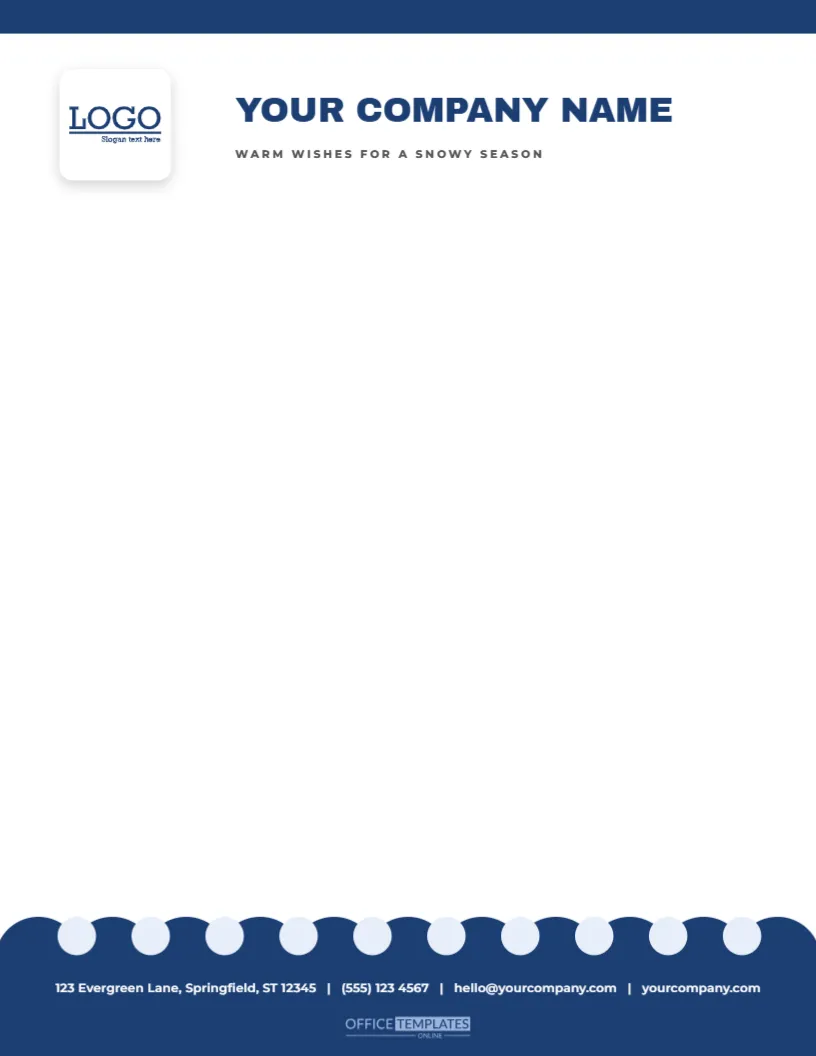
The first snowfall softens every outline, and this letterhead does the same for the bottom of the page. The upper part is bright white with a navy strip along the top edge, a white logo tile on the left and YOUR COMPANY NAME in bold navy capitals, with WARM WISHES FOR A SNOWY SEASON in small tracked capitals beneath it. At the foot, a deep blue band is scalloped along its top edge like snowdrifts, with a row of pale snow dots above, and carries the contact line in white with the small OTO mark below.
Snow Drifts at the Foot of the Page
The waves are drawn as two overlapping polygons with sine curve edges, one in white and one in a very pale blue, set against a light blue band. They stretch across the full width and look like rolling snow. Because they sit at the foot, the header stays clean and corporate, and the seasonal note appears only at the base. This makes the design suitable for businesses that want a winter feel without a strongly Christmas look.
The Logo Slot
At the top left, a square slot holds a sample logo. Click it and choose Replace Image to upload yours. The image keeps the size of the slot, and the frame remains selectable and editable. A square logo fits well. If your logo is wide or tall, adjust the slot size in the editor, and nudge the company name to keep a comfortable gap.
| Part | Position | Details |
|---|---|---|
| Company name | Top left, 26-point navy serif | Type your name |
| Seasonal line | Under the name, soft blue italic | Replace with a tagline |
| Logo slot | Top right | Replace Image keeps the frame |
| Snow waves | Bottom, 1.45 inches deep | Recolour or flatten |
The Contact Line Above the Waves
The contact line sits in navy sans type at the top of the wave area, so it is easy to read against the pale blue. Retype each part with your details, or add a second line if you have more to say. Because the waves start below the line, the type will not overlap any drawing. If you move the line, check that it stays clear of the crests.
Typing Your Letter
- Begin about one and three-quarters inches from the top.
- Use a classic serif or a clean sans at ten and a half points.
- Print the body in dark navy for harmony with the header.
- Stop at about nine inches, above the contact line.
Printing Soft Blue and White
The waves are pale and use little ink, but the exact tint depends on the printer. Test a sheet and compare it with your envelope. If the blue looks grey, shift it a little towards cyan. Print on bright white paper so the white wave is truly white. A laser printer or a print shop will handle the long, smooth curves without banding.
Who Uses a Snowy Hills Letterhead
Banks, insurers, solicitors, estate agents and consultants often want a seasonal sheet that does not feel too festive. This design fits them well. It also suits ski lodges, winter sports shops, schools and councils sending winter notices. The calm blue palette is neutral enough to carry from December through to February.
Questions About the Hills Letterhead
Can I change the blue to my brand colour?
Yes. Select the band and the waves and choose new fills.
Which fonts are used?
On the snowy hills footer letterhead sheet, Archivo Black sets the company name, and Montserrat sets the tagline and the contact line.
Can I remove the waves?
Yes. Select each wave and delete it, leaving the band.
Does it fit A4?
Yes. Resize and stretch the waves to the new width.
Winter Items That Share the Hills Palette
The icy blue snowflake scalloped gift tags, the winter snowflake footer letterhead and the snowman bags in this collection share the same blue and white palette. A set of winter items in one palette helps a small organisation look consistent through the season. Use them together for a mailing, a window display and a customer gift.
Using the Footer as a Newsletter Base
Copy the page and use the waves and the contact line as the footer of a one-page winter newsletter. Place a heading, two columns, and a small table above them. The soft waves close the page gracefully, and the newsletter looks designed with very little effort.
Writing in a Calm Corporate Voice
A snowy foot suggests quiet reliability, so choose a calm voice. Open with a thank you, state the matter clearly, and offer your help. Avoid hype. If you must give bad news, such as a price rise, do it plainly in the second paragraph, with a reason and a date. A letter on a calm sheet gets a calm reading, and clear writing earns trust.
Printing Smooth Waves Without Banding
Long smooth gradients and shapes can show faint bands on some inkjet printers. Use a high-quality setting, bright white paper, and clean print heads. If banding appears, switch to a laser printer, or ask a print shop to run the sheets. A test print will show whether the waves look soft or streaky, and a small adjustment of tint usually cures it.
Adding a Second Page Style
For continuation pages, copy the sheet, delete the logo slot and the seasonal line, and keep the waves. A plain page with a snowy foot looks consistent with the first page and costs almost nothing in ink. Number the pages in the footer and your multi-page letters will look professional.
Using the Slot for a Seasonal Logo Variation
Many brands create a winter version of their logo with a small snowflake or a Santa hat. Place that version in the slot for December, and the whole page feels coordinated. Save the original logo for the rest of the year. A seasonal logo is a charming small touch that costs a few minutes of design. Swap the snow dots for a plain rule if you want to save ink on a long run.