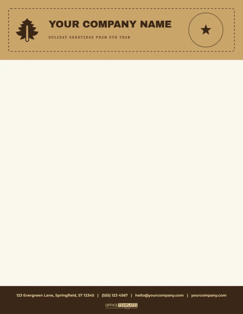
There is a place in every town for a business that looks like it was built by hand, and this letterhead is for that business. A block of kraft brown, two inches deep, spans the top of a pale paper sheet, edged inside with a dashed line like a perforated stamp. A dark pine tree stands on the left, YOUR COMPANY NAME runs beside it in bold dark capitals, a typewriter line reads HOLIDAY GREETINGS FROM OUR TEAM, and a round postmark with a star sits on the right. A dark brown band at the foot carries the contact line.
A Post Office Look
The design borrows from old parcel labels: brown paper, a rubber-stamped tree, a circular cancellation and a typewritten line. The dashed border looks like a stamp edge, and the whole band feels like it might have been stuck on a parcel at a village post office. It is the right style for makers, bakers, farm shops and any business that wants to look honest and handmade.
The Header Band in Detail
The band is a plain brown rectangle with a dashed dark brown outline inset by a quarter of an inch. The pine is a one-colour vector illustration in the same dark brown, so it prints crisply. The postmark is two concentric circles with a small star, at about sixty percent opacity, which gives it the faded look of a real cancellation. Every part can be recoloured, moved, or deleted.
| Part | Style | Notes |
|---|---|---|
| Brown band | Kraft tone, 1.55 inches deep | Recolour to match your packaging |
| Dashed border | Dark brown, inset | Delete for a plainer band |
| Pine stamp | Dark brown vector | Swap for your own icon |
| Postmark | Concentric circles and a star | Change the star to initials |
Typewriter Type for the Words
The name and the footer use a typewriter face with a slightly uneven look. Typewriter lettering suits notes, receipts, and personal letters, and it is easy to read at small sizes. The uneven baseline gives each line a hand-set charm. You can switch to another Google font in the editor, but keep a monospaced or typewriter style to preserve the character of the design.
Setting Up the Body
- Start the date about two inches below the top edge.
- Use a typewriter or a simple serif font in the body for consistency.
- Print in a dark brown or black ink.
- Keep an inch free above the footer rule.
Printing the Brown Band
A full-width band of brown uses a moderate amount of ink. Use a medium-weight paper, standard quality, and let the sheet dry before you feed it back. Brown can print greenish on some printers, so test one sheet. If the colour is off, adjust the hue slightly in the editor. A cream paper under the band makes it look warmer and gives a natural feel.
Who Might Choose a Kraft Letterhead
Craft makers, farm shops, bakeries, candle makers, woodworkers, small publishers and Christmas market stalls all fit this design. It also suits any business that sells parcels, because the stamp and postmark suggest delivery. Use it for order confirmations, thank you notes and price lists, and print a stack on recycled paper to match.
Questions About the Kraft Letterhead
Can I use my own icon in place of the pine?
Yes. Delete the tree and insert any icon, tinted brown.
Which fonts are used?
On the Kraft stamp header letterhead sheet, Archivo Black sets the company name, and Montserrat sets the tagline and the contact line.
Can I change HOLIDAY GREETINGS?
Yes. Click the line and type any short phrase, such as your tagline.
Is it suitable for A4?
Yes. Resize the page and stretch the band.
A Matching Parcel Set
The kraft stamped gift tags, the kraft stamp address labels, the kraft pine tree stamp paper gift bag, and the kraft brown with white pine trees wrapping paper all share the same look. Send an order in a kraft parcel with a stamped tag and a letter on this sheet, and the customer receives a package that tells a single story from the label to the note.
Using the Letterhead as a Packing Slip
Print the sheet and add a table of items between the header and the footer. The stamped look suits a packing slip, and the brown band makes it feel like part of the parcel. Add a line at the foot for returns. A well-designed packing slip is a small piece of branding that customers remember.
Keeping the Handmade Feel in Digital Form
For emailed letters, export the sheet as a PDF. The typewriter type and the brown band stay crisp on screen. Add a short hand-signed line scanned from your own writing, and the digital letter keeps its personal tone.
Choosing Paper That Suits the Stamp Look
A pale cream or oatmeal paper makes the brown band look warm, and the stamp look authentic. Recycled stock with a few flecks adds to the handmade feel. Avoid very glossy paper, which makes the design look too polished. A sheet of about twenty-eight-pound weight feels like good stationery and handles the ink well.
Writing Notes That Go in Parcels
Many small businesses slip a note into every order. Print this sheet at half size and write a short thank you with a pen, mentioning the customer’s name and the item they bought. A handwritten line on a stamped sheet feels like a letter from a person, not a machine, and customers often keep the note with the product.
Customising the Postmark With Your Town
Replace the star in the postmark with your town’s initials, or type the year around the ring. A custom postmark makes the sheet unique to your business and adds a layer of authenticity. Keep the text short and in the same typewriter font, and the stamp will look as if it came from your own local post office. A last tip is to print a few sheets on kraft coloured stock, where the brown band disappears into the paper, and only the stamp lines show.