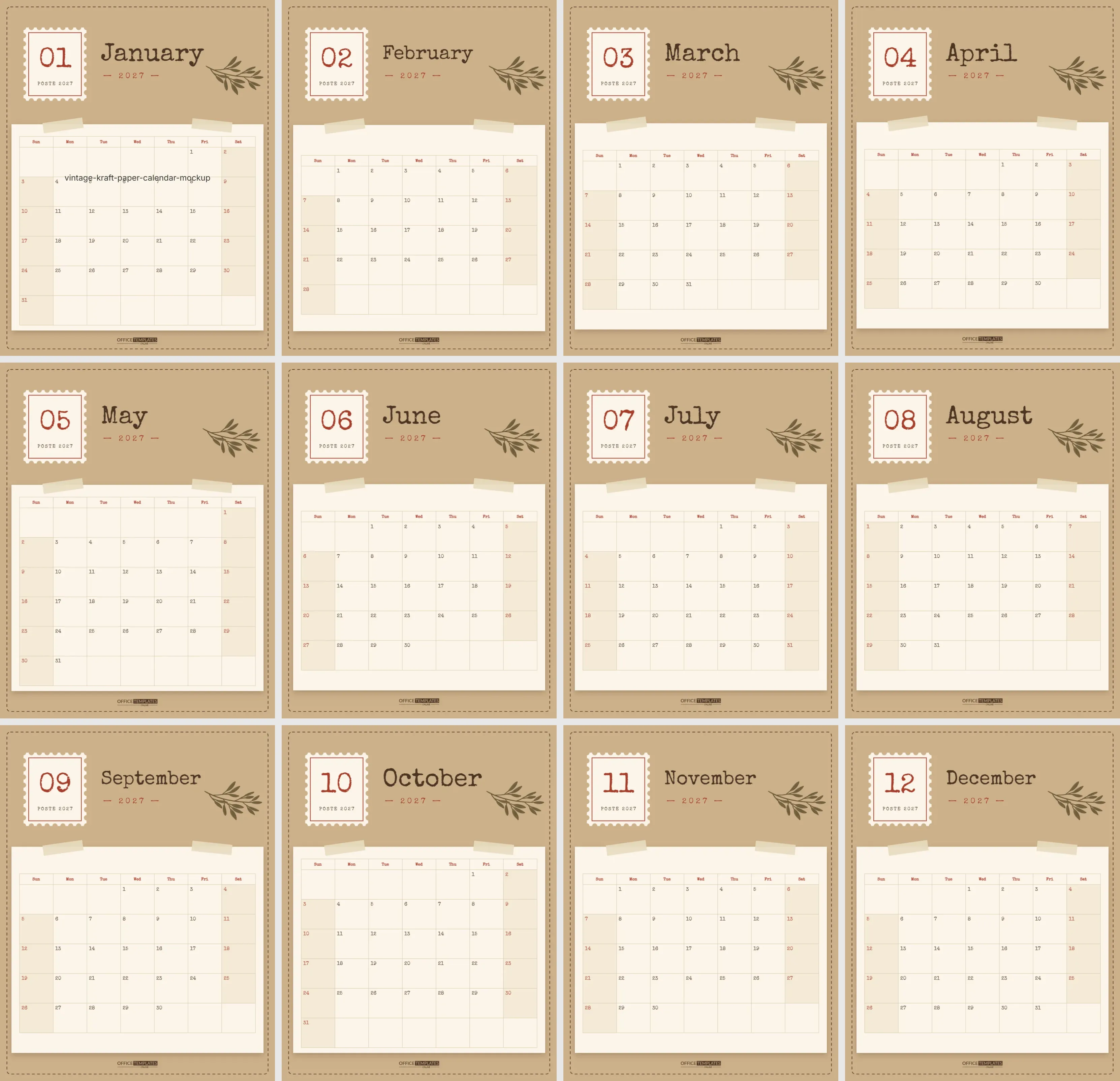
There is something comforting about things that look old and well loved: brown paper parcels, typewritten letters, postage stamps and pressed leaves. This vintage calendar brings that feeling to every month of 2027. It suits farmhouse kitchens, cosy studies, bookshops, cafés and anyone who prefers rustic charm to glossy modern design.
Five Ways a Vintage Calendar Goes Wrong
- Printing kraft on kraft: If you print the brown background onto brown paper, the page turns muddy. Set the background to white before printing on real kraft card.
- Glossy paper: A shiny finish fights the handmade look. Matte or uncoated card keeps it authentic.
- Too many colours of ink: Rainbow highlighters clash with browns and reds. Stick to brown, black, and one red.
- Cramming the stamp: The stamp is a focal point; keep notes inside the grid, not on the header.
- Forgetting the week start: If your household thinks in Monday-to-Sunday weeks, change it in Calendar Options before you print all twelve pages.
What Gets It Right
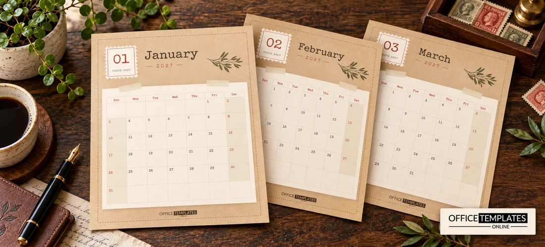
The calendar has twelve US Letter pages (8.5 x 11 inches, portrait). Each page has a warm kraft-brown background with a dashed stitched border running all the way around, like the edge of a handmade notebook. In the top-left corner, a postage stamp with a scalloped perforated edge holds the month number in red typewriter digits, with POSTE 2027 printed small underneath.
Beside the stamp, the month name is set in Special Elite, a Google font that looks like an old typewriter, in dark brown, with — 2027 — in red. A pressed olive sprig in muted brown sits in the top-right corner. The calendar grid is printed on a cream paper card with a soft shadow, held to the page by two strips of pale masking tape. The grid uses the same typewriter font, with red weekday names, shaded weekends, and red weekend numbers. The OTO logo sits in brown at the bottom.
Postage Stamp Details
The stamp is built from a cream rectangle and a ring of small kraft-coloured circles that form the perforated edge, plus a fine red inner frame. It is grouped, so you can move it as one piece. The month number and the POSTE 2027 line are separate text on top, so you can change them easily. Some people like to replace the number with a tiny illustration or a monogram for a personal touch.
Printing on Kraft or White
- Download the PDF.
- For the look shown, print in colour on white matte card; the kraft background is part of the design.
- For real kraft paper, set the background to white first, so only the stamp, text, sprig, and card print.
- Use 200 gsm card for a sturdy hanging calendar.
Reliable Dates in a Vintage Look
Even though the design looks old-fashioned, the calendar grids are fully modern. Each one is the editor’s built-in Calendar object, set to the right month of 2027. Open Calendar Options to change the year, start the week on Monday, or adjust the colours and font. Everything lines up automatically. For a 2028 calendar, change the year on each page, update 2027 in the header and the stamp, and print again.
A Rustic Calendar for Every Space
| Where | Why it fits |
|---|---|
| Farmhouse kitchen | Warm browns match wood, linen, and open shelves |
| Home study or library | Typewriter type feels literary and calm |
| Café or bakery counter | Kraft paper matches takeaway bags and menus |
| Craft or sewing room | Stitched border and tape feel handmade |
| Small shop or studio | A gift for customers with the shop name added |
Making It Feel Even More Handmade
- Print on real kraft card instead of white paper, and recolour the background to white so the paper shows through.
- Tie the pages together with jute twine through two punched holes.
- Clip the calendar to a vintage clipboard or a wooden hanger.
- Add a real pressed flower or leaf to the January page with a dab of glue.
- Stamp important dates with a small rubber stamp in red ink.
Swapping Kraft Brown for Sage or Dusty Blue
The kraft brown background, the cream card, and the tape strips are all simple shapes you can recolour. Try sage green with cream for a botanical look, or dusty blue with ivory for a coastal cottage feel. The sprig is an editable vector illustration; recolour it from its swatches or swap it for another plant. If you prefer a cleaner font for the dates, choose any Google font in Calendar Options while keeping the typewriter month names.
Writing on the Cream Grid
The cream card is designed for writing. Brown, black, or dark red pens look right at home, and a fountain pen or fine felt tip suits the vintage style. If you like hand lettering, write birthdays and holidays in small caps for a typewriter-like finish.
Keeping a Year of Small Records
The vintage style suits record-keeping as well as planning. Use the squares to note the books you finish, the first frost, the day the swallows return, or the jam you made. These small entries turn the calendar into a nature diary or a household log that is lovely to read back. At the end of the year, bind the twelve pages with twine and keep them on a shelf next to previous years; the kraft pages age well and the stamp numbers make each month easy to find.
Small Print
Can I change the motto or add one?
There is space under the month name for a short line, such as a quote or a family motto, in the same typewriter font.
Does the tape look real when printed?
The tape strips are semi-transparent shapes in a pale cream, so they read as masking tape on the printed page.
Is the kraft texture an image?
No. It is a solid kraft colour, so it prints evenly and you can change it.
Can I use the calendar for a business gift?
Yes. Add your business name and contact details under the grid.
Does it come in other sizes?
It is US Letter, but you can print it scaled to A4 or A5.
Can the week start on Monday?
Yes. Change it in Calendar Options on each page.
A Thoughtful Gift for Letter Writers
For friends who still send letters and postcards, this calendar makes a fitting gift. Pair it with a set of real stamps, a nice pen, and some writing paper, and mark the birthdays of people they write to. Small shops, bookshops, and stationers can also print the calendar with their name for customers, which feels personal rather than promotional.
Print the stamps, tie the twine, and hang it up. A year of 2027 that feels like a letter from an old friend.