Calm, Quiet, Almost Silver
Some families choose a sympathy card with a clear aim: nothing loud, nothing heavy. This design delivers that. The colours are soft grey green and silver, the leaves look as if they were painted with a thin brush, and the portrait sits in a delicate frame of green scrolls. It is a card for sharing quietly, in a family group or on a memorial page, where the person’s face and a few kind words are enough.
Describing the Card
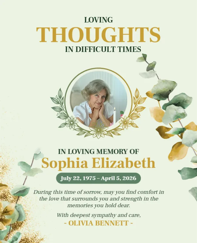
The card is 650 x 800 pixels in portrait. The background is a pale grey to white gradient, with silvery leaves in sage and soft grey drooping from the top left and the top right, and a few more in the lower left. In the upper half, a round portrait of a woman with wavy brown hair, in a dark top, holding flowers, sits inside a green scroll shaped frame that looks like a wrought iron mirror.
Under the portrait, IN LOVING MEMORY OF is in dark capitals, with EMILY GRACE in large sage green capitals, and the dates in a green bar with dark type: (May 9, 1972 to April 1, 2026) in the sample. The message reads: With deepest sorrow, we remember and honor a life so beautifully lived. May cherished memories bring comfort, and may love surround you during this difficult time. It ends With heartfelt sympathy, and Jessica Williams in bold. The font is Tinos, a classic serif.
Short Edits for a Personal Card
- Replace the portrait by clicking it and choosing Replace Image.
- Retype the name and the dates.
- Edit the message if you want to mention a relationship, such as “your mother.”
- Change the sign off to your own name or your group.
When a Name Is Long
The name is set in large capitals and spans most of the width. A long name such as “Elizabeth Marguerite Thompson” will not fit on one line. Reduce the font size a little, or split the name over two lines. If the family uses a middle name, ask whether to include it, since it affects the length and the style.
Messages for Different Senders
| Sender | Message idea |
|---|---|
| A friend | I am thinking of you and holding Emily close in my memories |
| A neighbour | Emily was a bright part of our street and we will miss her |
| A colleague | With sympathy from all of us who worked beside her |
Why Light Cards Suit Some Families
Dark cards can feel very intense. Light cards, such as this one, allow more space for the photograph to be seen and for the viewer to rest. They suit many cultures and religions, because they avoid strong symbols. If you are not sure what the family prefers, a light and simple card is often the safest choice.
Digital Use and Printing
The card works well as a PNG or JPG shared by message or email. The soft colours also print nicely at a small size on matte paper. Print it with a white border and slip it into a card as an insert, together with a handwritten line.
For a similar light design with a heavier frame, see the sharing your grief and support card. For a bold, dark design, see the eternal peace and loving memory card in blush. More are in condolence templates.