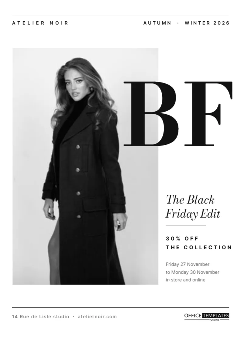
High-end fashion brands approach Black Friday carefully. They want to reward loyal clients without looking like a discount store. A monochrome editorial layout is the answer. This A4 flyer looks like a page from a fashion magazine: white space, hairline rules, a tall photograph, and a large Bodoni monogram that overlaps the image. The offer is stated quietly in a narrow column.
A Fashion Magazine Layout
The page is almost entirely white with black type. Thin rules run across the top and bottom, holding the brand name ATELIER NOIR on the left and AUTUMN WINTER 2026 on the right. A tall photo slot fills most of the left side. The layout follows the classic structure of fashion editorials, where the image dominates, and the text supports it.
The Bodoni BF Monogram
Large letters B and F in Bodoni Moda overlap the right edge of the photo. Bodoni is a high-contrast serif closely associated with fashion magazines. The overlap creates depth and drama, like a magazine cover where the title sits behind or over the model.
The Tall Photo Slot
The photo slot is tall and narrow, perfect for a full-length fashion image. Use a strong editorial photograph: a model in a coat, a detail of tailoring, or an accessory on a plain background. Black and white photos look especially elegant in this layout.
The Narrow Notes Column
| Text | Style |
|---|---|
| The Black Friday Edit | Bodoni Moda italic |
| 30% OFF THE COLLECTION | Spaced Inter capitals |
| Friday 27 November to Monday 30 November, in store and online | Inter in grey |
The column sits to the right of the photo, beneath the monogram, with a short rule separating the title from the offer.
Why Minimal Design Suits Luxury
Luxury brands rely on restraint. A clean, quiet page signals confidence and quality, and it protects the brand image even during a sale. Customers understand that a 30% discount from a respected label is significant, without needing it shouted.
Writing for a Fashion Audience
Use short, confident phrases. The Black Friday Edit sounds curated, like a selection made by a stylist. Avoid exclamation marks and sales jargon. Dates are written in a European style, day then month, which suits an international fashion brand.
Customising the Monochrome Flyer
- Replace the brand name and season at the top.
- Insert your editorial photo.
- Change the monogram letters if you like.
- Edit the offer and dates in the column.
- Update the studio address and website at the bottom.
Changing the Monogram
BF stands for Black Friday, but you can use your brand initials instead. Keep the letters large and in Bodoni or another high-contrast serif. Position them so they overlap the photo edge slightly; the overlap is what gives the layout its magazine feel.
Choosing a Photograph
A single strong image is better than a collage. Choose a photograph with clean lines and a clear subject, ideally shot against a plain wall or in a simple location. If the photo is busy, the monogram and text will compete with it.
Printing on Premium Paper
The flyer is A4. Print on heavy, bright white paper with a matte or silk finish for a premium feel. The black type and thin rules need a sharp printer; a print shop gives the best results for a luxury brand.
Using the Flyer as a Lookbook Page
The layout works beautifully as part of a digital lookbook or email campaign. Create several versions with different photographs and pieces, and send them as a series. Each page can feature one hero item from the Black Friday edit.
Boutiques, Jewelers and Design Studios
The monochrome style suits boutiques, jewelers, furniture designers, architects, and galleries. Replace the photo and the monogram, and adjust the copy. The same discipline of white space and fine type works for any refined brand.
Inviting Clients to a Private Preview
Luxury brands often give loyal clients early access. Add a line such as: Private preview for clients on Thursday evening. An exclusive invitation makes the sale feel like a reward and encourages clients to visit before the general public.
Keeping the Page Balanced
When editing, resist filling the white space. Keep the column narrow and the text short. If you add anything, align it with existing edges. Balance and restraint are what make the page feel expensive.
Choosing the Collection for the Edit
A curated edit should feel intentional. Select a limited number of pieces, perhaps outerwear, knitwear, and accessories, rather than discounting everything. Customers understand that the edit is a selection, which keeps the rest of your collection at full value.
Styling the Photo for the Monogram
When shooting the image, leave some quiet space on the right side where the BF monogram overlaps. A plain wall or a soft shadow behind the model works well. If the photo is busy in that area, the letters will be harder to read.
Using the Flyer in Store Displays
Print the flyer at a larger size and frame it near the entrance or the fitting rooms. A framed editorial page feels like part of the store design rather than a sale sign, which suits a luxury boutique.
Sending the Edit to Loyal Clients
Email the flyer to your client list a day before the public announcement, with a personal note from the designer or store manager. Early access rewards loyalty and often leads to the best pieces selling to your most valued customers.
Keeping the Same Look Across Every Channel
Use the same Bodoni monogram, white space, and photography style in your emails, social posts, and window. A consistent editorial look across every channel makes the Black Friday edit feel like a deliberate part of the brand.
Monochrome Fashion Flyer Questions
Can I add colour?
Yes, but a single accent colour is best, such as a deep red for the offer.
Can I use a horizontal photo?
The slot is tall. A horizontal photo will be cropped; choose a portrait image.
Is the monogram editable text?
Yes. Retype the letters and resize them.