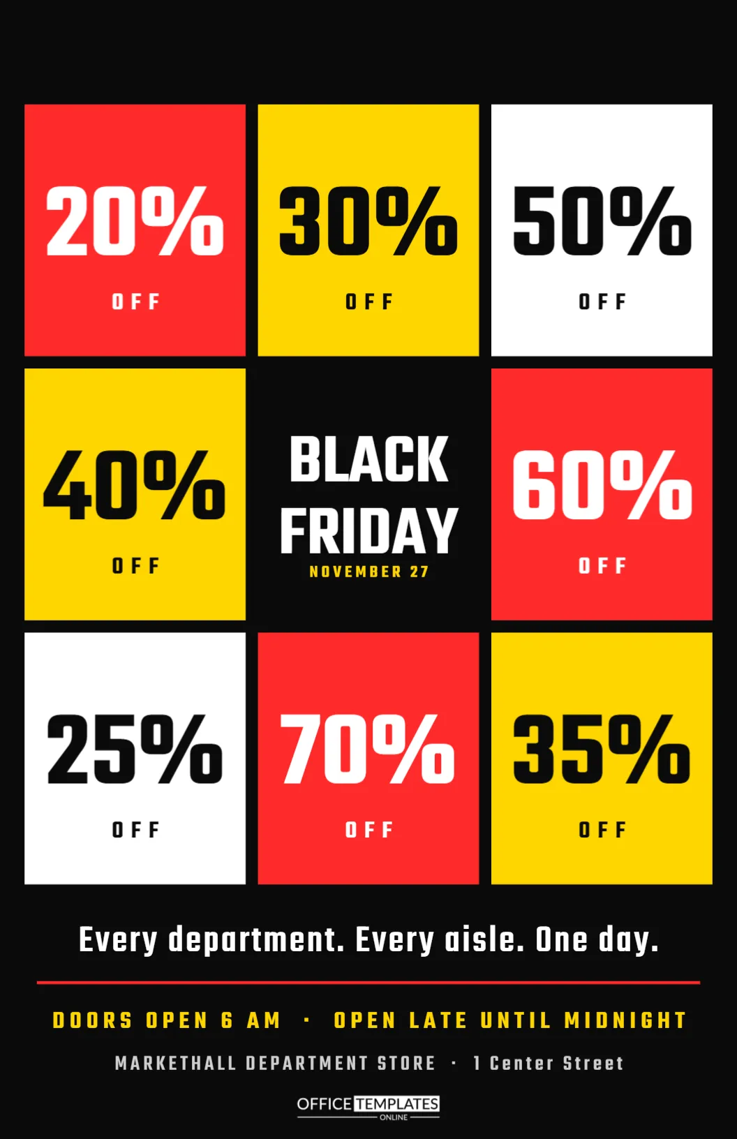
A shop window is the most valuable advertising space a store has, and on Black Friday it needs to be seen from across the street. This tabloid flyer, 11 by 17 inches, is designed for the glass. A mosaic of eight bold percentage tiles in red, yellow, and white surrounds a central BLACK FRIDAY block, so passersby understand at a glance that the whole store is on sale, with discounts everywhere.
Designed to Be Read From the Street
Window posters are seen from a distance and in passing, often by people walking or driving. Large, high-contrast shapes and numbers work best. This flyer uses a black background with brightly coloured tiles and huge Teko numerals, which remain readable from several metres away.
The Percent Tile Mosaic
| Position | Tile | Colour |
|---|---|---|
| Top row | 20%, 30%, 50% | Red, yellow, white |
| Middle row | 40%, BLACK FRIDAY, 60% | Yellow, black, red |
| Bottom row | 25%, 70%, 35% | White, red, yellow |
Each tile carries a large percentage and the word OFF beneath it. The central black space holds BLACK FRIDAY and the date.
Why a Mosaic Works
A single big number tells customers the maximum discount. A mosaic tells them the discounts are everywhere, in every department. It suggests variety and abundance, which encourages people to come in and explore rather than look for one item.
The Central Block
In the middle of the grid, BLACK FRIDAY is stacked in white Teko, with NOVEMBER 27 in yellow below. The black square makes the title feel like the heart of the mosaic. Change the date if your sale runs over several days.
The Message Under the Mosaic
Below the tiles, a line reads: Every department. Every aisle. One day. Short, rhythmic sentences like this are easy to read on the move and memorable. A red rule separates it from the opening hours: DOORS OPEN 6 AM, OPEN LATE UNTIL MIDNIGHT.
Customising the Window Flyer
- Change the percentages on the tiles to your real discounts.
- Edit the date in the central block.
- Rewrite the message line if you like.
- Update the hours and store details.
- Print at tabloid size for the window.
Honest Percentages on the Tiles
Each tile should reflect a real discount available in the store. If 70% only applies to a few items, make sure customers can find them. Shoppers who see 70% in the window and cannot find anything at that price may feel misled. You can label tiles with departments if you prefer, such as 30% OFF SHOES.
Printing at Tabloid Size
Tabloid is 11 by 17 inches, also called ledger. Many office printers and all print shops can print it. The black background uses a lot of ink, so a print shop gives the most even result. For outdoor-facing windows, consider a weather-resistant or laminated print.
Placing the Flyer in the Window
Hang the flyer at eye level, facing out, in a spot without glare from lights inside the store. Two or three copies spaced across a large window create a strong pattern. Use clear tape or suction hooks so the glass stays clean.
Using the Flyer Inside the Store
The same poster works on walls, at the end of aisles and near the entrance. Inside, it reminds customers that discounts are everywhere and encourages them to explore further. Smaller prints can be used near the tills.
Changing the Tile Colours
The red, yellow and white palette is classic and bold. You can switch to your brand colours, but keep at least three contrasting colours so the mosaic feels lively. Avoid very similar tones, which turn the grid into a single block.
Department Stores and Outlets
The mosaic suits department stores, outlets, malls, and large retailers with many categories. Smaller shops can use it too, with tiles for their main product groups. Restaurants can adapt it with dishes and prices instead of percentages.
Sharing the Window Design Online
The square mosaic crops beautifully into a social media post. Export the flyer and crop the grid for a square image. The bright tiles stand out in a feed and match what customers will see in your window.
Keeping the Window Uncluttered
Too many posters in one window cancel each other out. Use this flyer as the main sign and remove older promotions. A clean window with one strong message is far more effective than a collage of signs.
Choosing Tile Colours for Visibility
Red, yellow and white on black are among the most visible colour combinations from a distance. If you change them, test the poster outside on the street before printing many copies. Colours that look strong on screen can disappear behind window reflections.
Labelling Tiles With Departments
For larger stores, add a small department name under each percentage, such as SHOES or KITCHEN. Shoppers can then see which area offers which discount and plan their visit. Keep the department names short so they do not crowd the bold numbers.
Lighting the Window Flyer at Night
Many people pass shops after dark in late November. A small light directed at the poster, or a lit window display behind it, keeps the message visible in the evening. Nighttime visibility can bring in customers who plan to return the next morning.
Replacing the Poster as the Sale Changes
If your discounts change over the weekend, print updated versions and swap them in the window. A fresh poster on Saturday with new percentages gives passersby a reason to look again and tells customers the sale is still going strong.
Checking the Window Poster From Across the Street
After taping the poster up, walk across the road and look back. If the percentages are hard to read through reflections, move the poster to a shadier part of the glass.
Store Window Flyer Questions
Can I print it on US Letter?
Yes. It will scale down, but the tabloid size reads better from the street.
Can I replace a tile with a photo?
Yes. Delete a tile and add a photo slot of the same size.
Are the tiles separate objects?
Yes. Each tile and its text can be edited on its own.