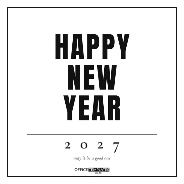
This card does everything with type. A white square page carries a thin black frame and three heavy condensed lines, HAPPY, NEW and YEAR, stacked like a poster, with a rule, a widely spaced 2027 and a small italic line, may it be a good one. Nothing else is needed. The result is bold, modern, and quick to print at home in black ink. It suits designers, studios, offices, students, and anyone who likes a clean, graphic greeting that works in any size.
The Power of Pure Typography
Large letters and plenty of white space make a message instantly clear. The card needs no photograph or illustration, so there is nothing to date it. It will look current for years, and it reproduces well on any printer, even in a photocopy.
Heavy Condensed Lines in Black
The three lines use Anton, a tall condensed face with thick strokes. They fill the width of the frame and create a strong block. If you change the words, keep each line short, about five letters, so that the block stays even.
The Thin Frame and Generous Margins
A single black line surrounds the design with a wide margin of white. It acts like a border on a gallery print. Make the line thicker for a bolder look, or remove it for a borderless card.
Editing the Stacked Words for the Typographic Card
You can swap the words for any short message of three lines, such as MAKE IT COUNT or HELLO NEW YEAR. Keep them in capitals and preserve the equal line spacing. The stacked format is easy to repurpose for other occasions.
The Spaced 2027 Line and Italic Wish
Below the stack, a thin rule separates the headline from the year, which is set in a light serif with generous spacing. The italic line in grey adds a gentle human note to the strong headline.
| Element | Typeface style | Size role |
|---|---|---|
| Stacked lines | Heavy condensed sans | Headline |
| 2027 | Light serif, wide spacing | Date marker |
| Wish | Italic serif, grey | Human touch |
Cards for Designers and Studios
Creative professionals often prefer typography-led cards. Add your studio name in place of the logo and send the card to clients. The simple design shows confidence and good taste without needing a big budget.
Cards for Offices and Remote Teams for the Typographic Card
Because the card is black and white, it prints on any office printer. Teams can pass it around for signatures, or send it as a PDF. Add a short note thanking colleagues for their work.
Cards for Students and Classrooms
Teachers can use the card as a poster on a classroom door or as a handout for students to colour. The clean outlines work well for colouring and for adding handwritten goals in the margins.
Printing in Black and White Without Wasting Ink for the Typographic Card
A mostly white page uses very little ink. Choose a smooth paper with a slight tooth for crisp edges. If you print many copies, a laser printer gives sharper black type than an inkjet.
Printing in Colour Variations for the Typographic Card
You can change the black to navy, deep green, or burgundy for a subtle variation. Keep the background white, and check that the thin lines stay visible. Use a single colour to keep the typography strong.
Screen Printing and Stamping Ideas
Because the design uses solid shapes, it converts easily to a stamp or screen print. Make a few hand-printed cards on kraft paper for a rustic look. The bold letters survive uneven pressure.
Using the Square Format on Social Media
The square shape fits most feeds. Post it on January 1 with a caption about your goals. The high-contrast type is readable at small sizes, so it stands out among photographs.
Adding a Handwritten Note to a Printed Card
Use a fine pen to write a short message in the lower margin or on the back. The contrast between printed type and handwriting makes the card feel personal. Keep the handwriting small and neat.
Making a Typographic Series
Create a series of cards in the same style for other occasions, such as thank you, birthday, or congratulations. The recognisable layout becomes a brand for your stationery.
Final Check Before Printing for the Typographic Card
Confirm the year, the spelling of every word, and the spacing of the lines. Print a test sheet to check the frame margins, then run the full batch.
Why Simple Cards Are Easy to Translate
With only a few words, the design can be translated into any language without changing the layout. Replace the stacked lines with Feliz, Año and Nuevo, or Bonne, Année and Heureuse. The bold shapes remain strong, and international friends will smile when they receive a greeting in their own language.
Embossing, Letterpress and Other Print Finishes
Because the type is large and solid, it takes embossing and letterpress beautifully. A print shop can give the black letters a tactile edge. Even a small batch of fifty cards will feel luxurious when you can touch the lettering.
Placing the Card on a Desk or Shelf as a Mini Poster
Fold the base of the printed card to make a stand, or tape it to a small frame. The graphic block of letters reads well from a distance and makes a handsome desk decoration through January.
Matching Wrapping Paper and Labels in Black and White
Print the stacked words on tissue paper or a sticker sheet to make matching packaging. Black and white wrapping with a red string looks sharp, and it extends the design from a single card to a whole gift.
Choosing the Right Weight for the Frame Line
A one-point frame feels delicate, while a three-point line feels like a poster. Adjust the stroke to match the print size and viewing distance. Test the frame on a proof, because very thin lines can disappear on rough paper.
Sharing the Typographic Card as a Printable Download
Because the card is black and white, you can share it as a printable PDF for friends and customers. Ask them to print it at home and add their own colour with markers. People enjoy sharing a design they helped to finish.