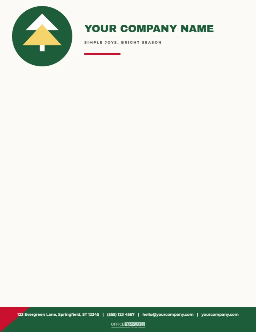
When a business does not want to look loud, it can still look seasonal. This letterhead is the most graphic in the collection. A deep green circle at the top left holds a simple tree made of two triangles, one white and one gold, with a small trunk. Beside it, YOUR COMPANY NAME stands in bold green capitals with SIMPLE JOYS, BRIGHT SEASON in small tracked capitals and a short red bar beneath. A green band at the foot with a small red corner triangle carries the contact line in white.
Less Is Seasonal
A small symbol can carry a season without any further decoration. The triangle tree is about three-quarters of an inch tall, which is enough to read as Christmas at a glance but small enough to look like a logo mark. For businesses with a strong brand identity, a tiny icon is an easy way to acknowledge the season without disturbing the existing look.
Triangles and Light Type
The tree is built from two overlapping triangles and a small rectangle for the trunk, one white and one gold, on a deep green circle. The name is set in a heavy display face in green capitals, with a small tracked tagline and a short red bar beneath. Both are easy to edit. Replace the tree with a star, a snowflake, or a small version of your own logo.
| Part | Style | Easy change |
|---|---|---|
| Tree | Two triangles and a trunk, sage | Recolour to your brand |
| Company name | Lowercase thin sans, spaced | Type your own |
| Short rule | One inch, sage | Lengthen or delete |
| Contact line | Centred, grey green | Retype your details |
Plenty of Room for the Letter
With only a thin header and a single contact line, the page offers more writing room than any other design in the set. The body can begin about two and a quarter inches from the top and run to nine and a half inches. That makes this a good choice for long letters, reports, and legal documents, where space is at a premium.
Typing and Printing
- Use a clean sans serif body at ten points to match the header.
- Keep the margins at one inch on all sides.
- Print in dark grey for a soft modern look.
- Use a smooth white or warm white paper.
- Save a PDF for emailing.
Who This Letterhead Fits
Architects, designers, consultants, therapists, estate agents, accountants, and creative studios often choose minimal stationery. This design lets them add a seasonal touch without a decorative header. It also suits any business that sends letters to a mixed audience and wants to avoid religious or overly festive imagery. A simple tree is gentle enough for nearly everyone.
Print Economy
The page uses almost no ink, so it is the cheapest letterhead to print in the collection. A few triangles, one line of lowercase text, and a rule hardly register. That makes it suitable for large mailings and for offices where printing costs matter. If your printer shows a tint on a white page, change the background to pure white.
Questions About the Minimal Letterhead
Can I use my own logo instead of the tree?
Yes. Delete the tree and place your logo in its position.
Which fonts are used?
On the minimal geometric tree letterhead sheet, Archivo Black sets the company name, and Montserrat sets the tagline and the contact line.
Can I change the green?
Yes. Recolour the tree, rule, and contact line to match your brand.
Is it suitable for A4?
Yes. Resize the page and recentre.
Pairing With Minimal Items
The minimalist modern geometric gift tags, the minimal sage and mustard diamonds wrapping paper, and the sage and blush palette in this collection pair with this letterhead. A gift in sage paper with a geometric tag and a letter on this sheet suits a client who values calm design.
Reusing the Design After Christmas
Swap the tree for a small circle or a leaf, and the same sheet becomes general stationery for the year. Because the design is so light, it survives a change of icon without any other edits. Keep a copy of each variation in a folder for quick access.
Writing With Space and Clarity
A minimal sheet asks for clear writing. Use short headings, short paragraphs, and plenty of white space. Put dates and figures in a small table, and keep the closing brief. A letter that respects the reader’s time suits a design that respects their eyes. If you must be formal, keep the structure simple and let the layout do the work.
Using the Tree as a Brand Mark
Many small studios use a tiny tree as a seasonal mark in their signature or on their website. Export the tree as an image and use it in emails, social posts, and invoices throughout December. A consistent small mark builds recognition without adding clutter. Replace it in January with a snowflake or a plain circle, and the identity stays consistent.
Combining With a Table of Seasonal Hours
Insert a small table below the first paragraph listing your holiday opening hours. The thin sans type and the sage rule of the header match a simple table, and the whole letter reads as a tidy notice. Customers value clear information, and a minimal sheet presents it without any distractions.
A Letterhead for Accountants and Consultants
Professional services often send year-end letters that summarise fees, deadlines and tax advice. The minimal sheet leaves plenty of space for a table of dates and a short list of actions, and the tiny tree makes the letter feel considerate. Add the practice registration number in the footer if your rules require it. A calm layout makes dense information easier to read. Keep a few spare sheets on file as a ready-made template for notices that need to go out at short notice, so a calm, clear page is always available when the real message matters more than the decoration. The small red corner at the foot is a single triangle, so you can recolour or delete it in a moment.