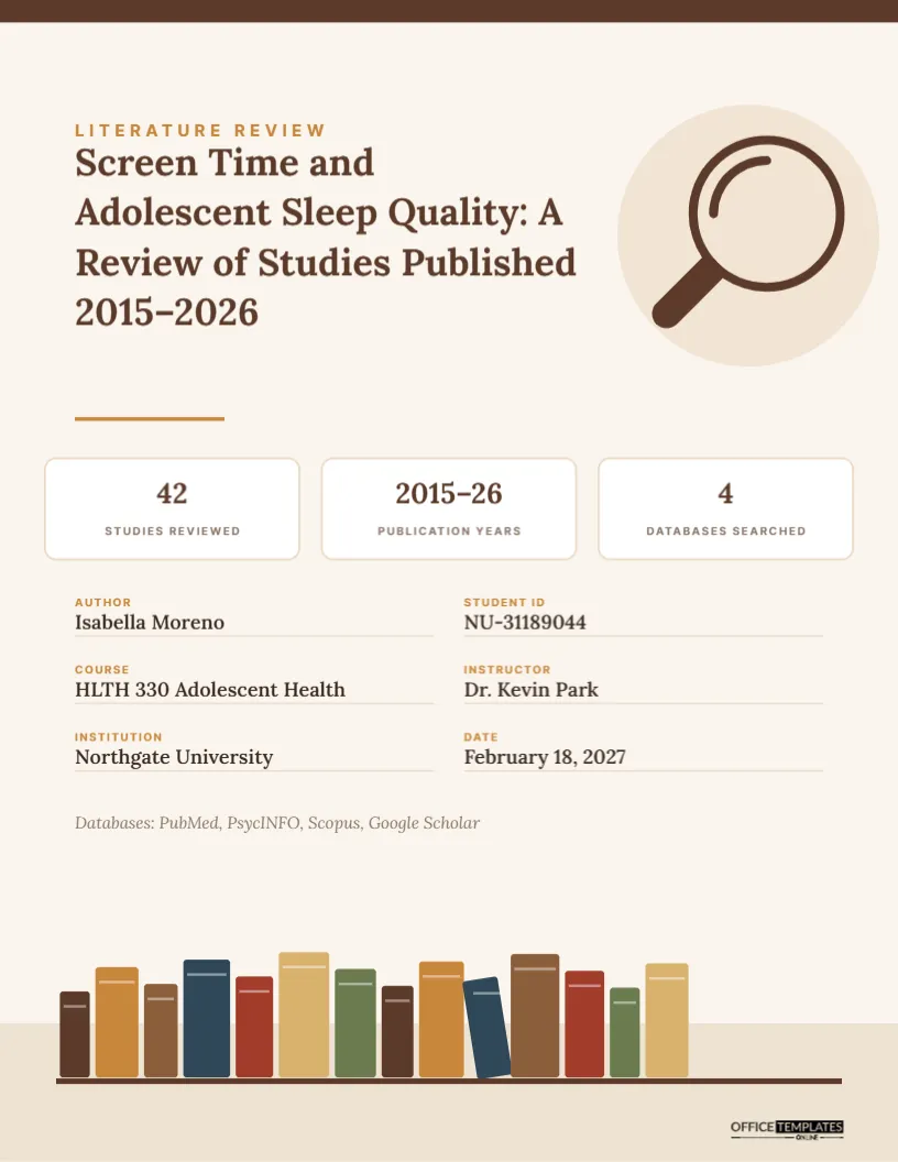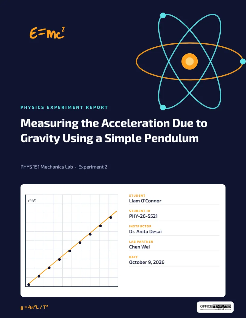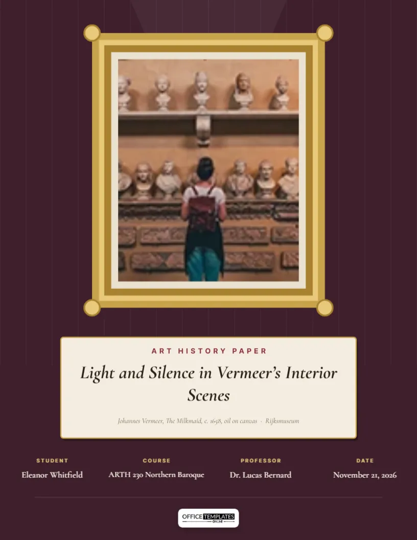
An art history paper is about looking. You spend hours in front of one painting or sculpture, notice what others miss, and argue for its meaning. So the most natural cover for that paper is the artwork itself, hung on a gallery wall with a label beside it. This design does exactly that. A gilded frame hangs on a deep plum wall under a soft spotlight, your chosen artwork fills the frame, and your title appears on a cream museum plaque beneath it, complete with the artwork’s caption.
Walking Into the Gallery
The upper part of the page is a deep plum wall with faint vertical panel lines, like the painted walls of a picture gallery. A pale cone of light falls from the top edge, as if from a ceiling spotlight. A gilded frame hangs in the light: an outer band of gold, a lighter gold moulding, a darker inner edge, round bosses at each corner, and an ivory mat inside. The picture area within the mat is an image slot. Below the frame, a cream plaque with a thin gold outline and a soft shadow holds a small burgundy label, Art History Paper, the italic title, Light and Silence in Vermeer’s Interior Scenes, set in Cormorant Garamond, and a small italic caption. Four details sit in a row beneath, in gold labels and cream text, and the logo sits on a light plate at the foot.
Hanging Your Artwork in the Frame
The picture inside the frame is a photo slot. Select it and choose Replace Image to upload a reproduction of the artwork you are writing about. The frame stays exactly in place; your image is scaled and cropped to the slot’s portrait shape. For landscape paintings, crop the image to a striking detail rather than shrinking it; a detail can be more beautiful than the whole on a small page. For sculpture or architecture, a photograph against a plain background works best.
Finding Images You Are Allowed to Use
Many major museums now release high-resolution images of public-domain works for free use. Good sources include the Rijksmuseum (Rijksstudio), the Metropolitan Museum of Art (Open Access), the National Gallery of Art in Washington (NGA Images), the Art Institute of Chicago, and the Smithsonian Open Access collection. Vermeer’s The Milkmaid, the painting named in the sample caption, is available from the Rijksmuseum. For modern and contemporary works still under copyright, a classroom paper is usually covered by educational fair use, but do not publish the cover online with that image without checking the rights.
Writing the Plaque Caption Like a Curator
Museum labels follow a standard order: artist, title (in italics), date, medium, and collection. The sample reads: Johannes Vermeer, The Milkmaid, c.1658, oil on canvas · Rijksmuseum. The abbreviation c. (circa) means the date is approximate. Use the same order for your artwork, and take the details from the museum’s own website. Getting the medium right matters to art historians: oil on canvas, tempera on panel, fresco, bronze and albumen silver print each describe very different objects.
Caption Examples From Different Periods
| Period | Sample caption |
|---|---|
| Renaissance | Sandro Botticelli, The Birth of Venus, c. 1485, tempera on canvas · Uffizi Gallery |
| Baroque | Caravaggio, The Calling of Saint Matthew, 1599-1600, oil on canvas · San Luigi dei Francesi |
| Impressionism | Claude Monet, Impression, Sunrise, 1872, oil on canvas · Musée Marmottan Monet |
| Japanese print | Katsushika Hokusai, The Great Wave off Kanagawa, c. 1831, woodblock print · Metropolitan Museum of Art |
| Modernism | Georgia O’Keeffe, Black Iris, 1926, oil on canvas · Metropolitan Museum of Art |
| Harlem Renaissance | Jacob Lawrence, The Migration Series, Panel 1, 1940-41, casein tempera on hardboard · Phillips Collection |
Titles That Point at What You Saw
Art history titles often pair a visual quality with an artist or work: Light and Silence in Vermeer’s Interior Scenes names two things the paper examines. Others take an interpretive angle: Labour and Dignity in The Milkmaid, or a comparative one: Two Kinds of Stillness: Vermeer and Hammershøi. Italicise titles of artworks inside your title; since the plaque title is already italic, set artwork titles in roman type to keep them distinct.
The Details Row Beneath the Plaque
Four details sit in a row: Student (Eleanor Whitfield), Course (ARTH 230 Northern Baroque), Professor (Dr. Lucas Bernard), and Date (November 21, 2026). The gold labels and cream values stand out against the plum wall. Click any value to edit it. If you need a fifth item, such as a word count, reduce the spacing slightly or place it on a new line under the row.
Recolouring the Wall and Frame
Galleries paint walls in deep colours to make paintings glow. Plum suits Baroque and Renaissance works; try dark green for landscapes, slate blue for Impressionism, or a warm grey for modern art. Select the wall background and change its colour; the panel lines are a separate group you can recolour or remove. The frame is grouped, so you can ungroup it to switch gold for silver or black, which suits photography and modern prints better. Keep the frame grouped once you are happy so it moves as a unit.
Formal Analysis Checklist Before Writing
Most art history papers rest on formal analysis. Before you write, look at your artwork and note: composition and the path your eye travels; light, its source and what it reveals; colour and how it creates mood; line and brushwork; space, perspective and scale; and the relationship between figures and objects. Then ask what these choices mean in the context of the period and patron. The cover’s spotlight is a reminder of the habit: look first, then interpret.
Printing the Gallery Cover
The page is US Letter, 8.5 x 11 inches, with a dark wall that covers most of the page. Print on a laser printer or a good photo inkjet for rich colour, and use smooth matte paper so the artwork does not glare. Download as a PDF for online submission. If you are printing many copies, check one first to make sure your artwork is bright enough against the dark wall.
Art History Cover Questions
Can I use a photo I took in a museum?
For a class paper, usually yes, if the museum allows photography. Credit it as your own photograph in your list of illustrations.
Will a horizontal painting fit?
The frame is portrait. Use a vertical detail of a horizontal painting, which often looks even more striking.
Is this suitable for a museum studies or visual culture paper?
Yes. Change the label and use an image of an object, poster, or installation.