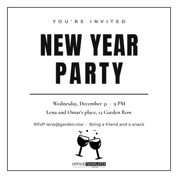
A good invitation can be mostly text. This square card uses a white page, a thin black frame, and two huge lines of condensed capitals, NEW YEAR and PARTY, with a small, spaced YOU’RE INVITED above and a rule beneath. Three serif lines give the date and time, the host’s address, and the RSVP, and a note tells guests to bring a friend and a snack. It is bold, modern, and quick to print at home in black ink, which makes it ideal for house parties, studios, student groups, and offices.
Why Typography Alone Can Be Enough
Large letters communicate clearly and never go out of fashion. Without photographs or illustrations, the invitation is easy to read on any screen and survives photocopying. The focus lands on the message, which is exactly what an invitation needs.
The Thin Frame and Generous White Space
A single black line surrounds the design with a wide white margin. It gives the card the look of a gallery label and keeps the text from feeling crowded. Adjust the stroke weight to suit your taste, or remove the frame for a borderless card.
Editing the Stacked Headline for the Minimal Typographic Invitation
NEW YEAR and PARTY are set in a heavy condensed typeface. You can replace them with HELLO 2027, BIG NIGHT, or the name of your group. Keep each line short so that it fills the width of the card and stays strong.
| Line | Sample text | Edit idea |
|---|---|---|
| Intro | YOU’RE INVITED | JOIN US |
| Date | Wednesday, December 31, 9 PM | Add doors and end time |
| Place | Lena and Omar’s place, 12 Garden Row | Add the buzzer number |
| RSVP | The host’s email; bring a friend and a snack | Add a reply date |
House Parties and Student Gatherings
A simple card suits informal gatherings. Add the host’s phone number and a request to bring a snack. Students can use it for a flat party, adding a note about the building entrance and noise.
Studios, Galleries and Creative Spaces
Artists and designers often prefer minimal invitations. Replace the host line with the gallery name and add a line about an opening exhibition. The black and white style fits the gallery aesthetic.
Offices and Small Teams
A typographic invitation is easy to adapt for work. Add the team name and the room, and print copies on plain paper. It looks professional and takes minutes to update.
Choosing Fonts That Keep the Style
If you change the typeface, choose a heavy condensed sans for the headline and a refined serif for the details. Avoid decorative fonts, which would break the minimal look. Test the card at small and large sizes.
Adding a Colour Accent
A single accent colour, such as red or gold, can highlight the word PARTY or the date. Keep the rest black and white. One accent gives the card personality without losing its simplicity.
Printing in Black and White for the Minimal Typographic Invitation
The card uses very little ink, so it prints well on a home printer. Choose bright white paper of 200 gsm or more. A laser printer gives the sharpest letters for the heavy lines.
Screen Printing and Rubber Stamp Versions
The bold shapes translate easily to stamps or screen prints. Make a batch for a creative party. Hand-printed invitations feel special, and slight imperfections add charm.
Sending the Square Card Digitally for the Minimal Typographic Invitation
The square shape fits social posts and chat apps. Export it as a PNG and send it with a short message. High contrast means it is readable in a thumbnail.
Keeping the Details Accurate for the Minimal Typographic Invitation
Because the card has few words, every detail matters. Double-check the date, time, and address. A single typo stands out on a minimal design, so proofread carefully.
Colour Variations for Other Moods for the Minimal Typographic Invitation
Try white on black for a night version, or navy on cream for a softer look. The structure stays the same. A neon pink accent suits a youthful party.
Final Check Before Sending the Typographic Invitation for the Minimal Typographic Invitation
Read each line aloud, confirm the year and the host’s contact, and print one proof to see how the frame sits on your paper. A clean proof guarantees a clean invitation.
Designing a Matching Playlist Cover and Menu
Reuse the stacked headline for a playlist cover and a small food menu. A consistent look makes your party feel curated. Print the menu on plain paper and pin it near the snacks.
Setting a Simple House Rule Card for the Minimal Typographic Invitation
A tiny card by the door can list a few friendly rules such as shoes off, bring a friend, and share the music. Short rules set expectations without sounding stern, and guests appreciate clear guidance.
Using the Square Format for Stories and Posts
The square card fits most social feeds, and you can create a matching story by extending the background. High-contrast type is legible even when the image is small, which helps replies arrive quickly.
Planning a Low-Cost Party on a Student Budget
Ask each guest to bring one snack and one drink, borrow speakers, and dim the lights. The invitation looks smart even though the budget is small. A simple, well-organised party often beats an expensive one.
Printing Stickers and Stamps With the Headline for the Minimal Typographic Invitation
Turn the headline into a sticker pack or a rubber stamp to seal envelopes. Small branded items make a simple invitation feel like a campaign. Order a small batch from a local print shop.
Creating a Black and White Dress Code
Ask guests to wear black and white to match the invitation, and provide a photo wall with a plain backdrop. The theme makes photographs striking and takes almost no effort to organise.
Collecting Feedback to Improve Next Year’s Party
Send a short message asking guests what they enjoyed. Their ideas help you plan an even better party, and you can reuse the same simple invitation with updated dates.