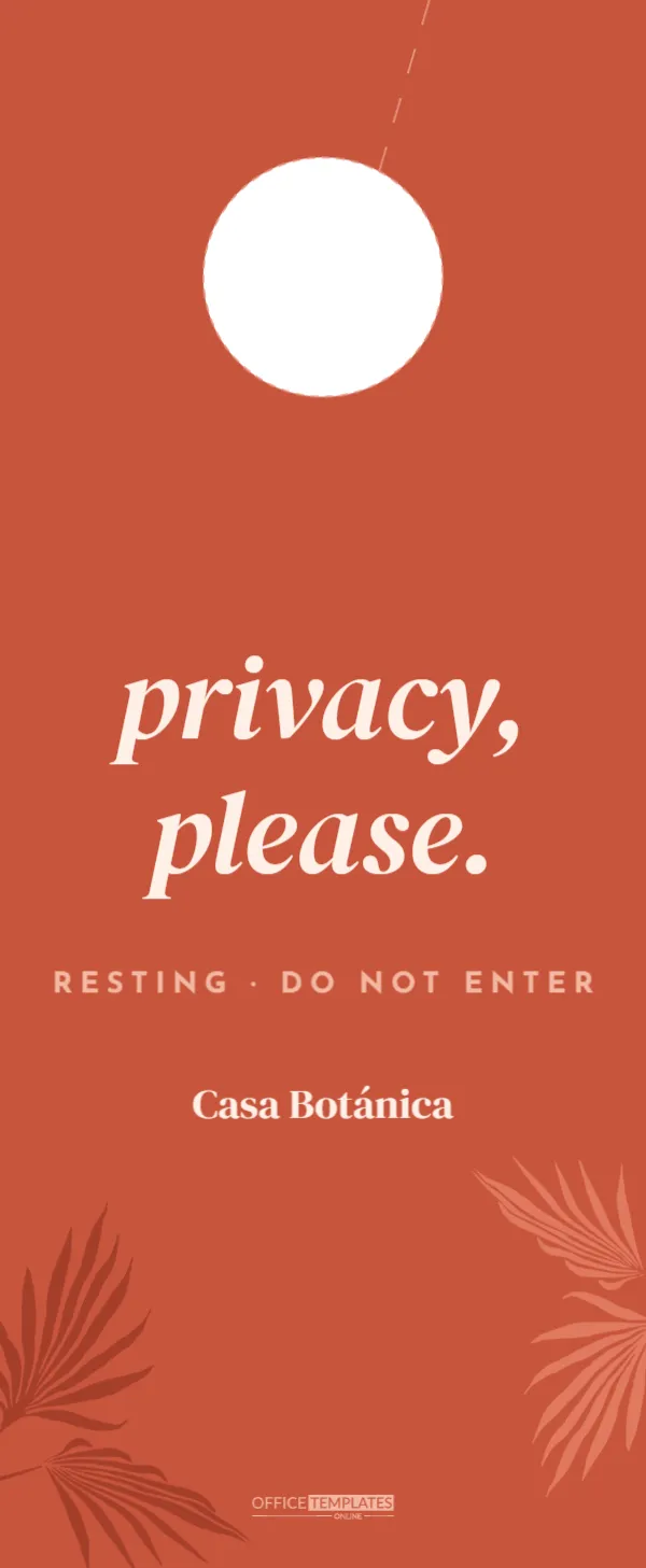
Boutique hotels and design-led guesthouses sell an atmosphere, and every object in the room contributes to it, including the door hanger. A generic plastic Do Not Disturb sign feels out of place in a room with linen sheets and terracotta tiles. This two-sided hanger is designed to match a warm, botanical, Mediterranean style: terracotta and sage, palm fronds and soft serif italics. One side asks for privacy, please; the other invites housekeeping to refresh my room and gently explains the hotel’s towel reuse policy.
Terracotta Side: Privacy, Please
This hanger uses the compact 3.5 x 8.5 inch hotel size, printed on both sides. The front is warm terracotta. Two palm fronds, one in deep rust and one in soft coral, reach in from the lower corners. Below the door hole, privacy and please. are set in large cream DM Serif Display italics, lowercase for a relaxed, modern feel. A line of small-spaced capitals in pale pink reads Resting · Do not enter, and the property name, Casa Botánica, sits underneath in cream serif.
Sage Side: Refresh My Room
The reverse is soft sage green. A small towel icon sits in the upper right, and Refresh and My Room are set in the same cream serif italics. A cream rounded card below explains the towel policy: Little changes, big impact. Towels on the rail: we leave them. Towels on the floor: we replace them. Thank you for helping us save water. The property name sits below the card.
Why “Privacy, Please” Instead of “Do Not Disturb”
Do Not Disturb can sound abrupt. Many boutique and luxury properties prefer softer wording such as Privacy, please, Resting, or Sweet dreams, which matches a calm, welcoming brand voice. The small Resting · Do not enter line keeps the meaning clear for staff and international guests.
The Eco Towel Message
Laundering towels uses a lot of water and energy, and many hotels encourage guests to reuse them. The card on the sage side explains the system in two short, friendly lines, avoiding guilt or lectures. Guests who care about sustainability appreciate the choice; those who want fresh towels simply leave them on the floor.
Sustainability Messages for Hotels
| Initiative | Short message for the hanger |
|---|---|
| Towel reuse | On the rail we leave them, on the floor we replace them |
| Linen change on request | Leave this card on the pillow for fresh sheets |
| Skip-a-clean reward | Skip today’s clean and enjoy a free coffee |
| Refillable amenities | Our bathroom products are refillable, no plastic minis |
| Local sourcing | Our breakfast comes from farms within 50 miles |
Customising Wording and Language
Every line is an editable text box. Change Casa Botánica to your property name, adjust the towel message to your actual policy, or add a second language for international guests. Short phrases work best on a narrow hanger; keep each line to a few words.
Recolouring for Your Interior
Terracotta and sage suit Mediterranean, desert and botanical interiors. Change the page colours to match your rooms: deep blue and sand for a coastal inn, forest green and cream for a mountain lodge, blush and grey for an urban boutique hotel. The palm fronds and towel are editable vectors with their own colour swatches.
Choosing the Botanical Motif
The palm fronds anchor the design and give it a sense of place. If your property is in a different setting, replace them with olive branches, pine sprigs, eucalyptus, or wildflowers from the editor’s library. Keep them in the lower corners so they frame the text without crowding it.
Handle-Friendly Hole
A dashed circle near the top of each side marks the opening for the door handle, and a dashed slit marks where to cut so the hanger can be slipped on. Boutique hotels with lever handles may want a slightly longer slit; ask your printer.
Premium Print Finishes
For a boutique feel, print on a thick uncoated or textured stock, 16 pt or heavier, perhaps with rounded corners. Soft-touch lamination resists fingerprints while keeping a natural feel. Download as a PDF with bleed and crop marks so colours run to the edges, and ask for a printed proof to check the terracotta and sage match your interiors.
Consistent In-Room Stationery
Use the same colours, fonts and botanical motif on your key card sleeves, welcome letters, room service menus and notepads. A coordinated set of in-room stationery makes a small property feel thoughtfully designed and memorable.
Writing in Your Brand Voice
Boutique properties often have a distinct personality, playful, poetic, or understated. The hanger is a chance to show it. A playful hotel might write Recharging, see you later on the privacy side and Make it sparkle on the refresh side. A poetic one might use Dreaming and Fresh linen, please. Keep the message obvious for staff while letting your voice come through.
Housekeeping Timing
Tell guests when the refresh side should be hung, for example, before 2 pm for same-day service, either on the card or in the welcome letter. Clear timing prevents frustration on both sides of the door.
Boutique Hanger Specs
- Compact 3.5 x 8.5 inch hotel format, front and back
- Terracotta privacy side with palm fronds
- Sage refresh side with a towel reuse note
- DM Serif Display italics and Josefin Sans capitals
Boutique Hotel Hanger FAQ
What size is it?
3.5 x 8.5 inches, two-sided.
Can I replace the towel icon?
Yes. Delete it and add another icon, such as a leaf, from the editor’s library.
Can I use it in a vacation rental?
Yes. Change the name and the cleaning message to suit your rental.
Does the terracotta print accurately?
Ask for a printed proof; earthy colours can shift slightly between printers.
Can I add a QR code for guest services?
Yes. Place a small QR code below the property name on the right side.
Is lowercase type hard to read?
No. The italic serif is large and clear; lowercase simply feels friendlier than capitals.
Can staff write the room number on it?
Yes, on uncoated stock; add a small Room line if needed.