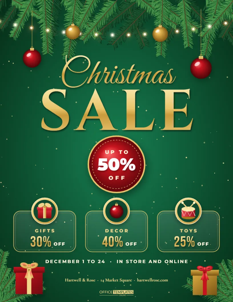
A Christmas sale competes with every other shop in town for the same last-minute shoppers, so the flyer has to look like a gift before anyone reads a word. This design does that with an emerald green glow, a pine garland strung with lights and baubles across the top, and a gold script Christmas sitting above a heavy gold SALE. In the middle, a glossy red medallion carries your discount, and three category offers sit underneath. It is a ready-made layout for a shop, salon, cafe, or online store that wants one clear message: Christmas savings start here.
How the Emerald Christmas Sale Layout Is Organised
The page reads from top to bottom in four steps. The garland frames the headline, the title announces the event, the medallion gives the number, and the category row tells people where to look. Each step has its own band of space, so nothing fights for attention. Because every block is a separate object, you can move the medallion or swap the offers without touching the rest.
Editing the Gold SALE Headline and Script Title
The word Christmas is set in a flowing script and SALE in a bold display face with a metallic gold gradient. If your event has another name, such as Winter Sale or Holiday Savings, replace the script word and keep SALE. Short words look best because the script needs room to breathe. The gold gradient is part of the fill, so new letters inherit the shine.
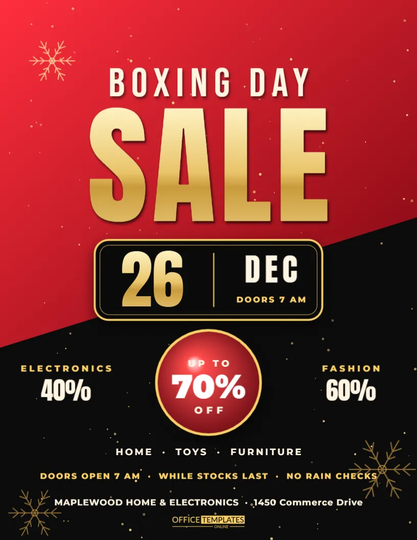
Using the Glossy Red Discount Medallion
The medallion is the focal point. It has a highlight on the upper edge, a thin gold ring, and a big percentage in the centre. Type your own figure, such as 30%, 40% or 50%, and adjust the small line above it, for example UP TO or SAVE. Keep the number bold and the supporting words short so the badge reads from across a shop window.
The Three Category Offers Below the Badge
| Placeholder offer | Typical use | Suggested edit |
|---|---|---|
| Gifts and toys | Retail and gift shops | Name your best-selling range |
| Home and decor | Homeware and garden stores | Swap for your own departments |
| Beauty and wellness | Salons and boutiques | List the treatments or products on offer |
Three offers are a comfortable number for a single page. Fewer looks empty; more turns the flyer into a catalogue.
Picking Sale Dates and Store Hours for the Flyer
A sale needs a start, an end, and the hours people can come in. Put the dates near the bottom in a clear line and keep the format consistent, for example, December 1 to 24. If your hours change on Christmas Eve, say so here, because that is the question most shoppers ask when they see a poster.
Adding Your Store Name, Address and Website
The footer holds your business name, street address, and web link. Use a short address people can type into a map app, and a link that goes straight to the sale page, not just the home page. If you take orders by phone, add the number on the same line.
Wrapped Gifts in the Bottom Corners
Two wrapped gifts with ribbons sit in the lower corners and balance the garland at the top. They are decorative, but they also push the eye back toward the centre of the page. If you prefer a plainer ending, delete them and the layout still holds together.
Colour Choices That Make the Sale Feel Festive
Deep green, bright red and gold are the traditional Christmas trio, and they work because the contrast is high. Gold text on green stays readable at a distance, and red on gold draws attention to the discount. If your brand has its own palette, recolour the glow and medallion while keeping the gold lettering for warmth.
Printing the Christmas Sale Flyer on US Letter
The design is 8.5 by 11 inches, the standard US Letter sheet, so it prints on any office printer. Dark backgrounds use plenty of ink, so for a large run it is cheaper to use a print shop. Export a high-quality file and ask for a slightly heavier paper, such as 100 gsm gloss, to make the colours richer.
Sharing the Sale on Social Media and Email
The portrait shape works well for stories and for email headers when cropped. Post it the day the sale opens and again on the final weekend. Use the same offer wording in your caption so people who see both recognise the sale straight away.
Timing a Christmas Sale for Best Results
Most shoppers start looking in late November and make final purchases in the last ten days before Christmas. A sale that opens in early December catches the middle of that wave. Plan a short reminder just before the last postage dates, then switch to a Boxing Day message once the holiday has passed.
Keeping Discounts Believable and Clear
Customers notice small print. State which items are included, whether the offer can be combined, and the last day it applies. A single plain sentence in the footer prevents arguments at the till and makes people trust the number in the medallion.
Replacing the Fonts and Colours Without Losing the Look
All fonts come from Google Fonts, so they stay editable and render the same on any computer. If you change a typeface, keep one decorative script for the title and one plain sans serif for details. That pairing is what keeps the page festive but easy to read.
Ideas for Using the Same Design Across a Campaign
Print the flyer for the window, hand copies out at the till, and post the image online. Change only the dates and the medallion figure for a second wave, such as a Last Chance edition. Customers then recognise the campaign without you designing anything new.
Who This Christmas Sale Template Suits Best
Independent shops, hair and beauty salons, garden centres, bookshops, online sellers and market stall holders all benefit from a bold, festive offer page. It is equally useful for a charity shop running a seasonal clearance or a restaurant selling gift vouchers at a discount.
Quick Checklist Before You Print the Sale Flyer
Check the discount figure, the start and end dates, the address, and the website. Read the offers aloud once, then print a single test page and look at it from arm’s length. If the medallion and the SALE title are the first two things you see, the flyer is ready for the window.