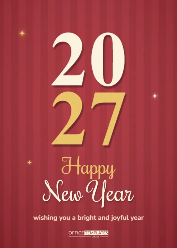
Retro design is back, and this card shows why. Soft vertical red stripes fill the page, a huge cream 20 sits above a gold 27 in a chunky rounded display face, and a Pacifico script Happy New Year, with a short wish, completes the look. It has the friendly feel of a 1970s poster and the warmth of a handmade card. Families, friends, cafes and creative studios can use it to send a cheerful New Year message that stands out from the usual black and gold designs.
Why Retro Colours Feel So Warm
Red, cream and mustard gold recall vintage posters and diner menus. They create a cosy feeling that suits winter. Because the palette is limited, the card looks confident and clean, and the stripes add texture without clutter.
The Soft Red Stripe Background
Twelve stripes in slightly different reds run from top to bottom, with a gentle vignette that darkens the edges. They are simple rectangles, so you can change the colour, width, or number. Try thinner stripes for a more delicate pattern.
Chunky Rounded Numerals
The numerals use a heavy rounded display font that looks like cut-out letters. The upper pair is cream, and the lower pair is gold, each with a hard drop shadow for a pop art effect. Keep the digits stacked and large for the same effect on any year.
Editing the Pacifico Greeting for the Retro Stripes Card
Happy is set in gold and New Year in cream, both in Pacifico, a script that suits surf posters and retro cards. Replace the words with Cheers or Hello, and keep each line short. The font has thick strokes that stay legible even when printed small.
Short Wishes That Suit the Retro Mood
The sample says wishing you a bright and joyful year. Retro cards suit playful lines, such as Groovy things ahead or Make 2027 awesome. Keep the wish short, since the numerals already take most of the page.
| Palette element | Colour | Alternative |
|---|---|---|
| Stripes | Warm red | Mustard or teal |
| Top numerals | Cream | White |
| Bottom numerals | Gold | Orange |
| Script | Gold and cream | Pink and cream |
Cards for Cafes, Shops and Creative Studios
Independent businesses with a vintage brand can use the card as a small poster. Add the logo in place of the OTO mark, and print copies for the window. The warm palette attracts attention on a winter street.
Cards for Friends and Playful Families
The retro style signals fun, so it suits friends who enjoy jokes and music. Add a line about a party or a playlist. A relaxed card sets the tone for a relaxed New Year.
Printing the Striped Background Accurately for the Retro Stripes Card
Fine stripes can show banding if the printer is set to draft quality. Choose the best quality and print on uncoated or matte stock. Because the stripes are subtle, small misalignments will not be noticeable.
Turning the Card Into a Poster or Wall Print
Enlarge the card to A3 or 11 by 17 for a fun wall poster. The vector shapes scale cleanly. Hang it at a party or in an office as a seasonal decoration.
Pairing the Card With Retro Party Themes for the Retro Stripes Card
If you host a seventies or eighties night, use the card as an invitation. Add the date and a dress code line, such as Flares and glitter welcome. The design sets the theme before guests arrive.
Digital Use and Stories for the Retro Stripes Card
The bold numerals make the card legible in tiny thumbnails. Post the card as a story with a sticker or a poll, such as: What is your 2027 theme? Engagement tends to be high for colourful, simple visuals.
Sticker and Merchandise Ideas
Turn the numerals into stickers or a badge for your guests. Print them on sticker paper and cut around the shapes. Small extras like these keep your New Year greeting in people’s minds long after the card is on the shelf.
Accessibility and Contrast for the Retro Stripes Card
Cream and gold on red have good contrast, but check the gold on a printed proof. If the gold looks dull, switch to a lighter yellow. Keep any added text above twelve points.
Colour Variations for a Modern Look for the Retro Stripes Card
Swap the red for teal or deep orange while keeping cream numerals. The retro structure remains, and you gain a new personality. Try a pastel version for a spring-themed greeting.
Final Check Before Printing for the Retro Stripes Card
Check the digits, the spelling of the greeting, and the alignment of the numerals. Hold a printed proof at arm’s length to see that the stripes do not overwhelm the lettering.
Pairing the Card With Retro Fonts for Invitations for the Retro Stripes Card
If you use the same colours on an invitation, choose chunky rounded fonts for headings and clean sans serifs for details. The set will look like a coordinated retro campaign, and guests will recognise the style from the card and arrive ready for fun.
Making a Retro Playlist Card to Match
Print the stripes and numerals on the front of a small card that lists a playlist for a New Year party, with QR codes if you have them. Hand them out at the door, so guests can listen along on their phones. It is a charming addition to the greeting.
Seasonal Pop-Up Shops and Market Stalls
Market stall holders can use the card as a banner behind their table. The bright colours draw attention from a distance, and the big numerals tell shoppers that you are celebrating the new year. Add your name at the bottom in a rounded sans serif.
Working With Retro Textures and Grain
If you want an even more vintage look, add a light paper grain overlay in the editor or print on speckled stock. Subtle texture prevents flat colour from looking digital. Keep grain light so that the numerals stay crisp and the colours stay bright.