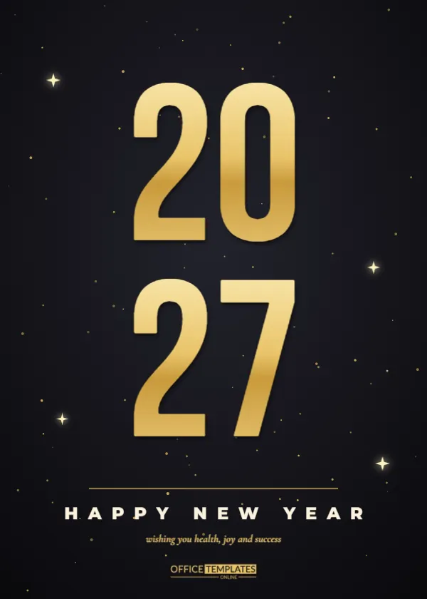
Sometimes the year itself is the best design. This card stacks the number 2027 as two huge pairs of gold digits, 20 above 27, on a soft black background with a few sparkles. Beneath them, a thin rule and the spaced words HAPPY NEW YEAR make the greeting, and a short line in italics adds the wish. It is bold, modern and quick to personalise. The 5 by 7 inch portrait shape works for mailed cards, framed prints and stories on a phone.
The Poster Look of Giant Numerals
Large numerals turn a card into a small poster. They read from a distance, look good pinned to a fridge, and photograph well. The design depends on the shape of the digits, so the font is a tall condensed face that fills the page edge to edge.
Gold Gradient on Tall Condensed Digits
Each pair of digits uses a vertical gold gradient that moves from pale yellow at the top to deep amber at the bottom, with a soft drop shadow. This gives the flat letters a feeling of metal. If you recolour the gradient to silver, the card changes mood instantly.
Changing the Year or Using Other Numbers
You can reuse the layout for any milestone. Replace 20 and 27 with 20 and 28 next year, or with numbers such as 40 and 00 for a birthday card. Keep two digits per line so the stack stays balanced and large.
The Small Sparkle Accents
Four small four-pointed stars hover near the digits. They add a hint of celebration without crowding the numerals. Move them closer to the edges for more breathing room, or add a few extra for a more festive feel.
Setting the HAPPY NEW YEAR Line for the Stacked Numerals Card
The words are set in a bold sans serif with very wide letter spacing, which gives them a confident, modern tone. Keep them in capitals for the best effect. If you want to add a name, put it on the line below in the italic serif.
| Line | Typeface style | Purpose |
|---|---|---|
| Giant numerals | Tall condensed gold | Main visual |
| HAPPY NEW YEAR | Wide-spaced bold sans | The greeting |
| Wish line | Italic serif in gold | Personal touch |
Writing a Short Wish for the Bottom Line for the Stacked Numerals Card
The default says wishing you health, joy, and success. A good wish for this style is short and strong, such as Make 2027 yours or Bigger dreams, brighter days. Because the numerals dominate the page, a modest line balances the design.
Using the Card for Business Greetings for the Stacked Numerals Card
A bold year card suits agencies, tech companies and gyms. Add the company logo at the bottom and send the card to staff and clients by email. The numerals match the visual language of annual reports and presentations, so the card feels on brand.
Turning the Card Into a Social Media Post
Export the card and post it on January 1 as an announcement. Because the numerals are so large, the year is visible even in a tiny feed thumbnail. Add a caption listing your goals for the year to make the post more than a greeting.
Printing the Dark Card With Gold Accents for the Stacked Numerals Card
A matte stock keeps the numerals from reflecting overhead lights. If your printer can add a foil layer, the digits become even more dramatic, but the card also looks fine in ordinary ink. Request a test sheet before printing a batch.
Framing the Card as Wall Art
Print the design at a larger size and frame it for an office wall. The 5 by 7 shape enlarges nicely to 8 by 10 or 11 by 14 without losing quality, because all elements are vectors.
Colour Alternatives for the Numerals for the Stacked Numerals Card
Gold is classic, but silver, rose gold, and electric blue also look sharp on black. Change the gradient stops in the editor to try a new colour, and check that the wish line still has enough contrast.
Pairing the Card With Matching Gift Tags for the Stacked Numerals Card
Use two digits per tag, for example 20 on one tag and 27 on another, so that a pair of gifts spells the year. This small idea is popular at office parties and makes a thoughtful New Year present.
Adding a Photo on the Back for the Stacked Numerals Card
If you print double-sided cards, add a family photo or team picture on the back with a short caption. The front remains clean and bold, while the back adds a personal memory.
Keeping the Card Accessible for the Stacked Numerals Card
High contrast and large type make the card readable for older relatives. Keep any extra text above 12 points on paper and avoid placing it on top of the sparkles, which can reduce legibility.
Final Review Before Sending for the Stacked Numerals Card
Make sure the year is correct, and the wish carries no typos. Check that the digits are centred, then print one sample to see how the gold looks on your paper before you make the full run.
Choosing Fonts That Keep the Numerals Strong
Tall condensed typefaces keep four digits large without shrinking the margins. If you replace the font, test a few options at full size and check that the 7 and the 2 stay distinct. A face with clear counters prevents the digits from blurring together on small prints or tiny screens.
Using the Numerals as a Resolution Reminder
Some people print the card and stick it on the wall with their goals written around the digits. Leave the wish line empty and write a resolution by hand beneath it. The card becomes a daily reminder that is more personal than any generic planner page.
Printing Several Cards for a Team in One Run for the Stacked Numerals Card
Teams often order fifty cards at once. Gang them on one sheet if your printer allows it, and keep the black background full bleed with a small trim margin. Order an extra ten percent to cover mistakes, because dark designs show every small smudge.
Making a Wallpaper or Phone Background From the Card
Export the card as an image and crop it to your phone screen shape. The large numerals work well as a lock screen, and friends often ask where you found it. Share the original card file so they can personalise a version of their own.