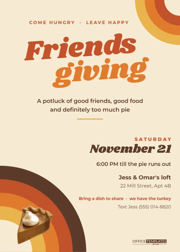
Friendsgiving has its own energy. Nobody’s aunt is asking about your job, the wine is better, and someone always brings a dish they found on the internet that morning. The invitation should feel like that too: relaxed, a little loud, and a lot of fun. This Retro Friendsgiving Invitation borrows its look from a 1970s record sleeve, so it reads as a party before anyone gets to the date.
Seven Things That Make This Friendsgiving Card Work
1. The sunset arcs
Four thick quarter-circle bands rise out of the bottom-left corner of the card: chocolate brown on the outside, then rust, burnt orange and mustard, with a cream quarter circle in the middle. It is the classic 70s sunset stripe, turned into a corner motif. A smaller echo of the same arcs in mustard, orange, and rust curls into the top-right corner, so the card feels framed rather than lopsided.
2. A title with attitude
Friends and giving are set on two lines in Shrikhand, a heavy, bouncy display face with the rounded swagger of old diner signs. The first word is rust, the second burnt orange, and both lines tilt slightly upward, which gives the title movement. Above it, a small spaced line in rust reads COME HUNGRY · LEAVE HAPPY.
3. One honest tagline
A potluck of good friends, good food, and definitely too much pie sits under the title in dark brown. It sets expectations without a list of rules. A short mustard bar underlines it and leads the eye down to the details.
4. Details that hug the right edge
The practical block is right-aligned against the right margin, out of the way of the arcs. SATURDAY sits in spaced rust capitals, November 21 in Shrikhand, then the time (6:00 PM till the pie runs out), the host line (Jess & Omar’s loft), the street and apartment number, a rust note about what to bring, and a text-to-RSVP line.
5. A pie slice where it belongs
A realistic slice of pumpkin pie with a swirl of whipped cream rests on the sunset arcs near the bottom-left corner. It is editable vector art, so you can resize it, rotate it, recolour the crust or the filling from its colour swatches, or swap it for something from the editor’s Elements panel.
6. Colours that photograph well
Warm cream, brown and orange look good on a phone screen and on paper. Most Friendsgiving invitations go out in group chats, so a palette that does not wash out in a thumbnail matters more than people think.
7. Room for real information
The right-hand block has seven lines, which is enough for a date, a time, an address with an apartment number, a dish request, and a contact. You do not have to cram anything onto a second card.
Wording Ideas for Different Friendsgiving Crowds
| Crowd | Tagline idea | What-to-bring line |
|---|---|---|
| College friends | Our fifth Friendsgiving and still nobody can carve | Bring a dish or a bag of ice; both are useful |
| Coworkers | Thankful for the people who survive Mondays with us | Sign up for a side in the group chat |
| New neighbours | Same street, first feast | Bring whatever your family always makes |
| Expats far from home | Home is wherever the gravy is | Bring a dish from where you grew up |
| Book or running club | Carbs first, miles later | Bring a side and your best recommendation |
Customizing the Retro Invitation in the Editor
Every word is a normal text box. Click a line and type over it. The Shrikhand title is wide, so if you change it to something longer, such as a host name (Jess’s Friendsgiving), reduce the font size a few points until it sits on one line without touching the top-right arcs.
The two arc clusters are grouped objects. Select one to move or resize it as a unit, or ungroup it to change single bands. Want a moodier palette? Try plum, rust, mustard and sage for a late-autumn look, or teal, coral and cream for something closer to a 70s kitchen.
The right-aligned text lines keep their right edge when you edit them, so longer addresses grow leftwards into the open space instead of falling off the card.
Size, Paper and Sending
The invitation is 5 x 7 inches, portrait. For group chats and Instagram stories, download it as a PNG; it stays crisp on high-resolution screens. For paper, choose PDF and print two per Letter sheet on matte card. A slightly textured cream stock makes the sunset colours look like screen-printed ink, which suits the theme nicely.
If you post the invitation on social media, crop nothing: the arcs in two corners are part of the design and help the card read as a complete poster even at small sizes.
Hosting Tips for a Smoother Friendsgiving
- Send the invitation two to three weeks ahead. Late-November weekends fill up fast with travel and family plans.
- Create a shared list for dishes so you do not end up with four bags of rolls and no vegetables.
- Set a time when the food will be served, not just when the door opens, so latecomers know what they are risking.
- Ask about allergies in the RSVP line if your group includes vegetarians, vegans, or nut allergies.
- Plan for leftovers. Ask everyone to bring a container, and say so on the card if you like.
Friendsgiving Card Quick Answers
Is this design only for Friendsgiving?
No. Change the title text, and it works as a retro harvest party, a fall potluck, or even a 70s-themed birthday in November.
Can I add a photo?
There is no photo slot in this design. If you want one, the cream quarter circle inside the bottom-left arcs is the natural place to add a rounded photo from the editor’s Elements panel, scaled small.
Is Shrikhand a free font?
Yes, it is a Google Font and loads automatically in the editor, so the title looks the same on any computer.
Pick your date, write the most honest tagline you can, and send it. The best Friendsgivings are the ones people talk about all year, and that starts with an invitation that sounds like you.